react-native-semi-circle-progress
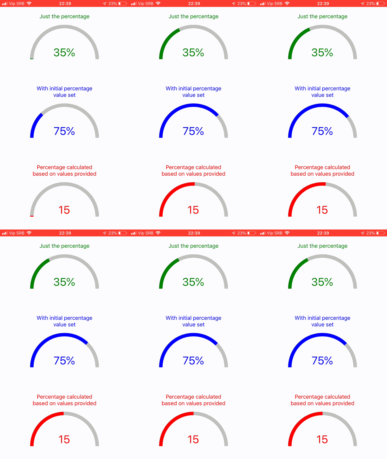
Semi Circle Progress component for React Native which uses only the native Views and requires no external libraries like react-native-svg or similar.
Features
- Fully customizable
- Animated
- Lightweight
Usage
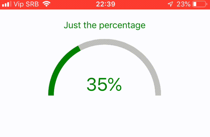
<SemiCircleProgress
    percentage={35}
    progressColor={"green"}
>
    <Text style={{ fontSize: 32, color: "green" }}>35%</Text>
</SemiCircleProgress>
Props
| Prop | Desciption | Type | Default value |
|---|---|---|---|
| progressShadowColor | Color of the unfilled progress bar | string | "silver" |
| progressColor | Color of the filled progress bar | string | "steelblue" |
| interiorCircleColor | Bg color where component children reside | string | "white" |
| circleRadius | Radius of the semi-circle | number | 100 |
| progressWidth | Width of the progress bar | number | 10 |
| percentage | Percentage to show in the circle | number | / |
| exteriorCircleStyle | Style of the whole circle container | ViewPropTypes.style | / |
| interiorCircleStyle | Style of the inner circle container | ViewPropTypes.style | / |
| animationSpeed | Speed of the spring animation | number | 2 |
| initialPercentage | Sets initial percentage from which to animate | number | 0 |
| minValue | Min value of the circle progress | number | / |
| maxValue | Max value of the circle progress | number | / |
| currentValue | Current value of the circle progress | number | / |
Note
Percentage has higher order, if provided component assumes that you calculated it already and ignores minValue, maxValue and currentValue props
