React Native AwesomeButton
react-native-really-awesome-button is a performant, extendable, production ready ReactNative component that renders an animated set of 3D UI buttons.
Installation
npm install --save react-native-really-awesome-button
or
yarn add react-native-really-awesome-button
Usage
Basic
  import AwesomeButton from 'react-native-really-awesome-button';

  function Button() {
    return (
      <AwesomeButton>Text</AwesomeButton>
    );
  }
Progress
  import AwesomeButton from 'react-native-really-awesome-button';

  function Button() {
    return (
     <AwesomeButton
       progress
       onPress={(next) => {
         /** Do Something **/
         next();
       }}
     >
       Text
     </AwesomeButton>
    );
  }
Custom Children
  import AwesomeButton from 'react-native-really-awesome-button';

  function Button() {
    return (
     <AwesomeButton>
       <Image source="require('send-icon.png)" />
       <Text>Send it</Text>
     </AwesomeButton>
    );
  }
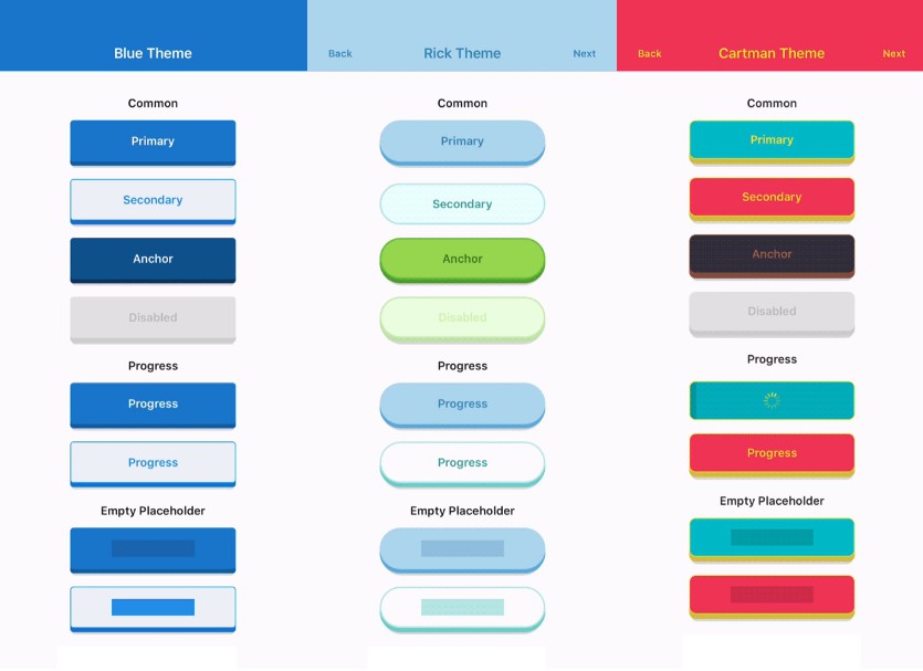
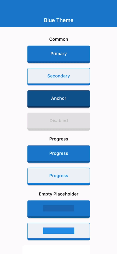
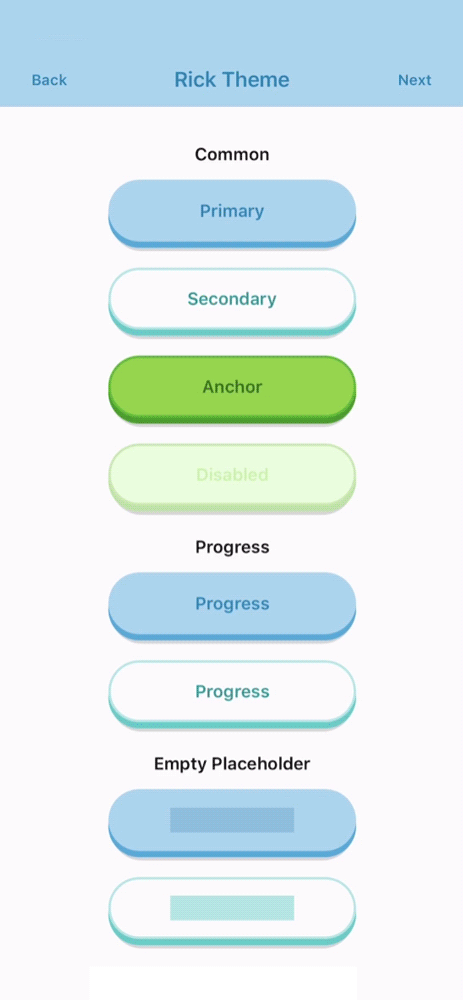
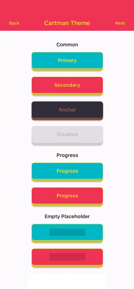
Importing a specific theme
  import AwesomeButtonRick from 'react-native-really-awesome-button/src/themes/rick';

  function Button() {
    return (
     <AwesomeButtonRick type="primary">Rick's Primary Button</AwesomeButtonRick>
     <AwesomeButtonRick type="secondary">Rick's Secondary Button</AwesomeButtonRick>
    );
  }
Props
| Attributes | Type | Default | Description |
|---|---|---|---|
| activityColor | string |
#FFFFFF |
Progress button error label text |
| backgroundActive | string |
#C0C0C0 |
Button active background-color |
| backgroundColor | string |
#C0C0C0 |
Button main background-color |
| backgroundPlaceholder | string |
#C0C0C0 |
Button placeholder background-color |
| backgroundProgress | string |
#C0C0C0 |
Button progress bar background-color |
| backgroundShadow | string |
#C0C0C0 |
Button progress bar background-color |
| backgroundDarker | string |
#9F9F9F |
Button front face background-color |
| borderColor | string |
null |
Button border-color |
| borderRadius | number |
4 |
Button border-radius |
| borderWidth | number |
0 |
Button border-width |
| disabled | bool |
true |
Button disabled state: cancels animation and onPress func |
| height | number |
50 |
Button height |
| onPress | Func |
null |
Button onPress function |
| progress | bool |
false |
Enable progress animation |
| raiseLevel | number |
4 |
Button 3D raise level |
| springRelease | bool |
true |
Button uses spring on the release animation |
| style | Style |
null |
Button container custom styles |
| textColor | string |
#FFFFFF |
Button default label text color |
| textLineHeight | number |
20 |
Button default label text line-height |
| textSize | number |
16 |
Button default label text font-size |
| width | number |
200 |
Button width |