react-native-progress-wheel
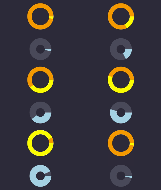
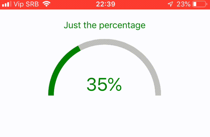
React Native component for creating natively animated, circular progress wheel.
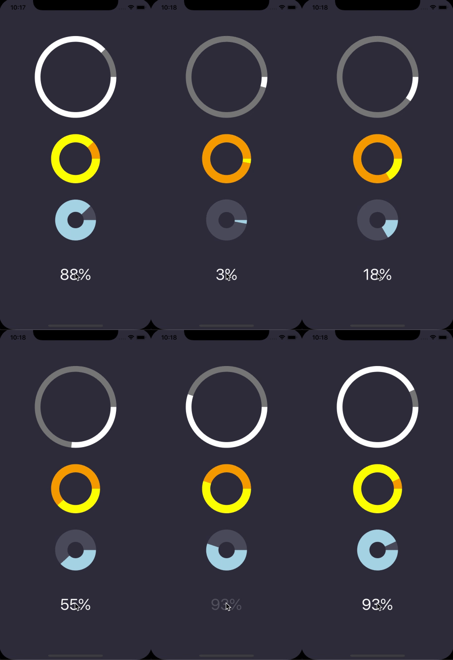
Why use this component
This implementation is 100% JS, meaning you do not need to use any additional libraries such as 'react-native-svg' and you don't need to do any linking. ?
This component also sets useNativeDriver: true, meaning that all animation is done smoothly on the native side.?
Installation
npm i --save react-native-progress-wheel
Usage
import AnimatedProgressWheel from 'react-native-progress-wheel';

<AnimatedProgressWheel
    size={120}
    width={20}
    color={'yellow'}
    progress={45}
    backgroundColor={'orange'}
/>
You can define a progress value, and a value from which to animate when the component is mounted.
The following example will animate from 0% to 45% at a duration of 3 seconds.
<AnimatedProgressWheel
    progress={45}
    animateFromValue={0}
    duration={3000}
/>
If you want the color to change with the progress, you can use the fullColor prop.
<AnimatedProgressWheel
    progress={100}
    animateFromValue={0}
    duration={5000}
    color={'white'}
    fullColor={'red'}
/>
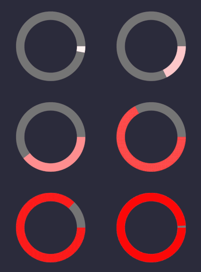
The progress wheel can be updated using state variables.
<AnimatedProgressWheel
    progress={this.state.sliderProgress}
/>
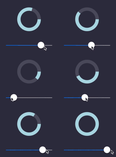
You can also use a ref to call the components 'animateTo' method to update the progress wheel.
this.progressWheel.animateTo(100, 2000, Easing.quad); // Will fill the progress bar linearly in 2 seconds
Configuration
You can configure the component using these props:
| Name | Type | Default value | Description |
|---|---|---|---|
| size | number | 200 | Width and height of circle |
| width | number | 25 | Thickness of the progress line |
| color | string | white | Color of the progress line |
| backgroundColor | string | gray | Color of the background progress line |
| progress | number (0, 100) | 0 | Angle from which the progress starts from |
| animateFromValue | number (0, 100) | -1 | Starting value to animate to progres when component is mounted |
| duration | number | 600 | Duration at which to animate the progress. |
| fullColor | string | null | Color of the progress line when 100% |
AnimatedProgressWheel exposes the following functions:
| Name | Arguments | Description |
|---|---|---|
| animateTo | (toVal: number, duration: number, ease: function) | Animate the progress bar to a specific value |
FAQ
Q: Does it work in Expo?
A: Yes it does.
Enjoy making smooth animated designs that use the native driver and DON'T require any additional dependencies.
If you like this library please give it a star on GitHub! ⭐️
