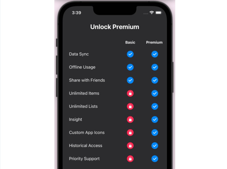
React Native Responsive Table View
A simple and responsive layout component for table views pretty similar to the HTML DOM table element.
Installation
yarn add react-native-responsive-table-view
Motivation
React native doesn’t provide native elements for table layout like HTML, so using the three components Table, Row and Cell we can have a similar UI experience.
Usage
import Table from 'react-native-responsive-table-view'

const App = () => {
  return (
    <SafeAreaView >
      <View>
        <Table>
          <Table.Row>
            <Table.Cell><Text>text 1</Text></Table.Cell>
            <Table.Cell><Text>text 2</Text></Table.Cell>
          </Table.Row>
          <Table.Row>
            <Table.Cell><Text>text 3</Text></Table.Cell>
            <Table.Cell><Text>text 4</Text></Table.Cell>
          </Table.Row>
          <Table.Row>
            <Table.Cell><Text>text 5</Text></Table.Cell>
            <Table.Cell><Text>text 6</Text></Table.Cell>
          </Table.Row>
        </Table>
      </View>
    </SafeAreaView>
  )
}

export default App
How it works
Table
Table represents the container for all our rows, it has some default stylings
{
    width: '100%',
    borderRadius: 4,
    borderStyle: 'solid',
    borderWidth: 1,
    display: 'flex',
    flexDirection: 'column',
    borderColor: BORDER_COLOR,
    backgroundColor: '#FFFFFF',
}
Props
| Name | Required | Default | Description |
|---|---|---|---|
| children | true | - |
The array of rows the table should display, preferably should be the Row element provided by this package but feel free to provide your own |
| style | false | {} |
Override the styles for the given table (border, color….) |
| isScrollable | false | false | Makes the table itself scrollable |
| height | false | undefined | can be used to set the height of the table, should be used with isScrollable can also be provided by the style prop |
Row
The row element in the table, each of it’s children will have equal width and the sum of their total width will equal to the container width (if it has 4 children each will have width of 25% and height of the maximum child’s height). It also comes with some default styles
{
    width: '100%',
    display: 'flex',
    flexDirection: 'row',
    justifyContent: 'center',
    alignItems: 'center',
    borderBottomWidth: 1,
    borderStyle: 'solid',
    borderColor: BORDER_COLOR,
  },
Props
| Name | Required | Default | Description |
|---|---|---|---|
| children | true | - |
The array of cells should be displayed in the row, preferably should be the Cell element provided by this package but feel free to provide your own |
| style | false | {} |
Override the styles for the given row (padding …) |
| lastStyle | false | {} |
Style that will only be applied to the last row |
| firstStyle | false | {} |
Style that will only be applied to the first row |
Cell
The cell element in each row. Also has default stylings
 {
    flexGrow: 1,
    flexShrink: 1,
    display: 'flex',
    justifyContent: 'center',
    alignItems: 'center',
    paddingVertical: 4,
    paddingHorizontal: 4,
 }
Props
| Name | Required | Default | Description |
|---|---|---|---|
| children | true | - |
The children /child to be displayed inside the cell |
| style | false | {} |
Override the styles for the given cell (padding …) |
| lastStyle | false | {} |
Style that will only be applied to the last cell in a row |
| firstStyle | false | {} |
Style that will only be applied to the first cell in a row |
General Notes
- Check out the examples here
Future Improvements
-
add is last style and is first style to
Rowelement to provide different styling for the last or first row as in some cases they might be handled differently. -
add is last style and is first style to
Cellelement to provide different styling for the last or first cell as in some cases they might be handled differently. -
add refs to all the components
-
add
onPressprop for rows and cells


