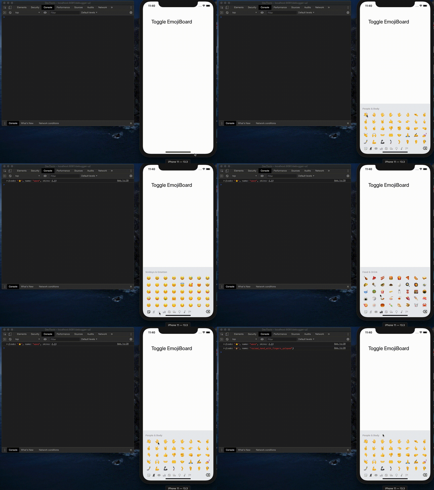
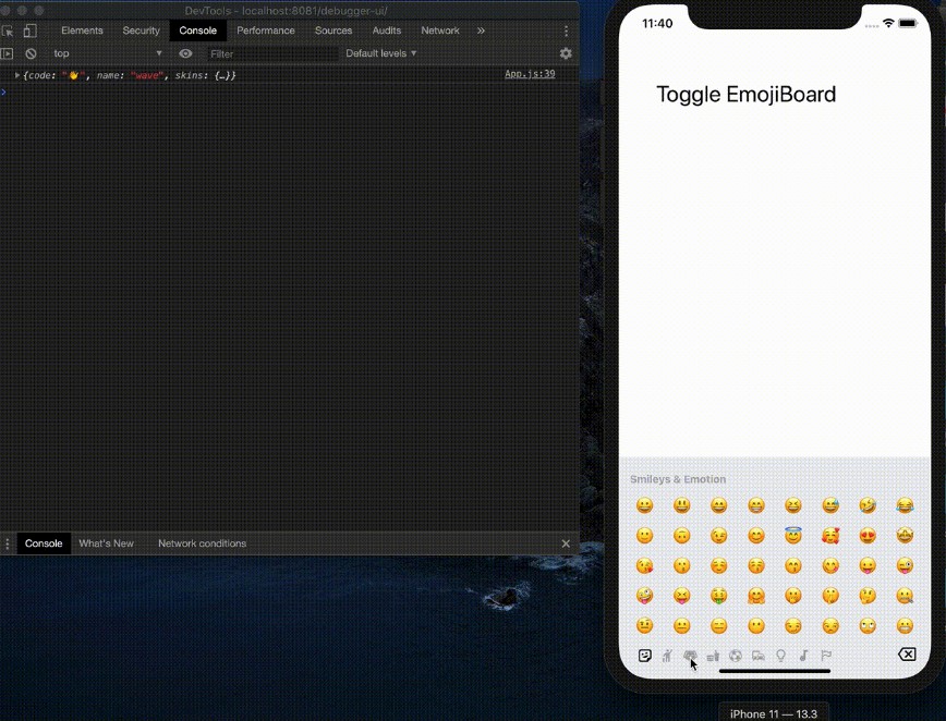
React Native Emoji Board
React Native Emoji Board is a customizable component similar to native keyboard but only with emoji for both iOS and Android. You can use this component as a keyboard input or emoji picker.

Installation
yarn add react-native-emoji-boardyarn add react-native-vector-iconsif you don't have ityarn add @react-native-community/viewpagerif you don't have it
Linking
>= 0.60
Autolinking will just do the job.
< 0.60
react-native link react-native-vector-icons
react-native link @react-native-community/viewpager
Props
Required Props
| Prop | Description | type |
|---|---|---|
onClick |
Call back function when you clciked on emoji | function |
Optional Props
| Prop | Description | type | default value |
|---|---|---|---|
showBoard |
Show or hide Emoji board with animation | boolean | false |
customEmoji |
See Custom Emoji | array | [] |
categories |
Default full categories from emoji-datasource | array | See defaultProps.categories |
blackList |
Exclude emojis based on short_name |
array | [] |
numRows |
Number of emoji rows to display per slide | number | 8 |
numCols |
Number of emoji columns to display per slide | number | 5 |
emojiSize |
Default emoji size | number | 24 |
tabBarPosition |
Default category nav position | string | 'bottom' |
hideBackSpace |
Show or hide backspace icon | boolean | false |
categoryDefautColor |
Default category icon color | string | '#aaa' |
categoryHighlightColor |
Default category icon highlight color | string | '#000' |
categoryIconSize |
Default category icon size | string | 20 |
containerStyle |
Main container style, same as Layout Props | object | {} |
tabBarStyle |
Category bar style, same as Layout Props | object | {} |
labelStyle |
Category label style, same as Text Props | object | {} |
onRemove |
Call back function when backspace get clicked | function | null |
If you want to support less category or modify the icon, here is the categories props:
| Prop | Description | type |
|---|---|---|
name |
Category name | string |
iconType |
Only support MaterialCommunityIcons and FontAwesome, you can use defined iconType |
string |
icon |
Icon/Font name, you can find list from here | string |
Example Code
import EmojiBoard from 'react-native-emoji-board'

const App: () => React$Node = () => {
    const [show, setShow] = useState(false);
    const onClick = emoji => {
        console.log(emoji);
    };

    return (
        <>
            <StatusBar barStyle="dark-content" />
            <TouchableOpacity onPress={() => setShow(!show)}>
                <Text>click here</Text>
            </TouchableOpacity>
            <EmojiBoard showBoard={show} onClick={onClick} />
        </>
    );
};
Custom Emojis
Example:
const customEmojis = [
    {
        code: '??',
        img: 'https://emojipedia-us.s3.dualstack.us-west-1.amazonaws.com/thumbs/160/apple/237/father-christmas_1f385.png',
        name: 'santa',
        category: 'Smileys & Emotion',
        sort_order: 1,
        skins: [
            {
                img: 'https://github.githubassets.com/images/icons/emoji/octocat.png',
                name: 'octocat',
            }
        ]

    }
]
| Prop | Description | type |
|---|---|---|
code |
Native emoji(optional, fallback to image) | string |
img |
If you would like to have custom image instead, don't set code |
string |
name |
Emoji/image name | string |
category |
Emoji category, need to match with what you have in categories props |
string |
sort_order |
Sort order | number |
skins |
Skin support, same props with above | array |


