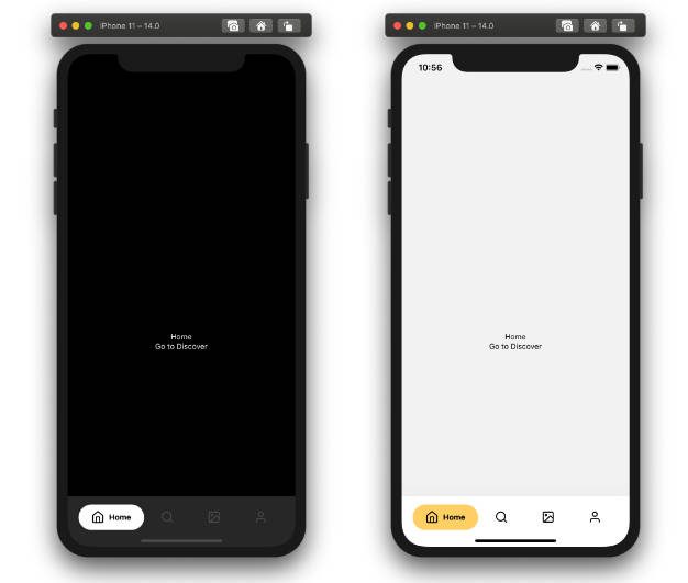
React Native Swipeable Panel
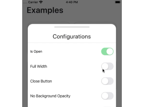
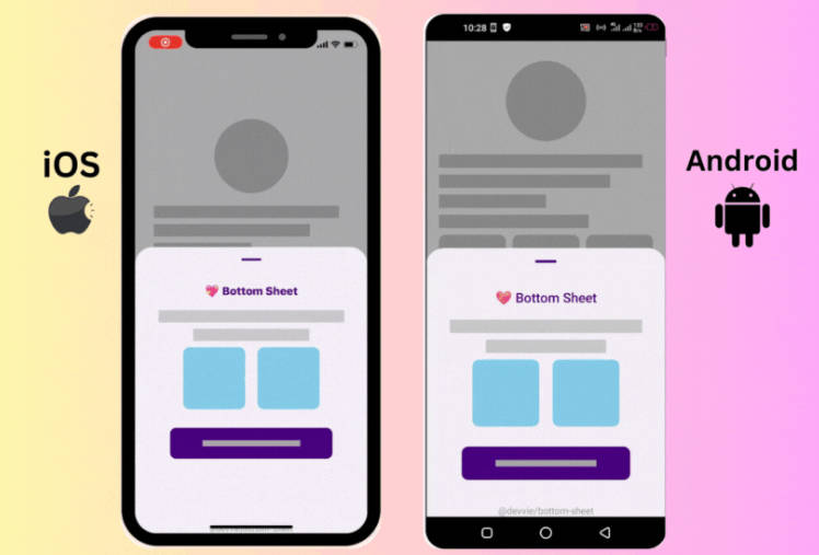
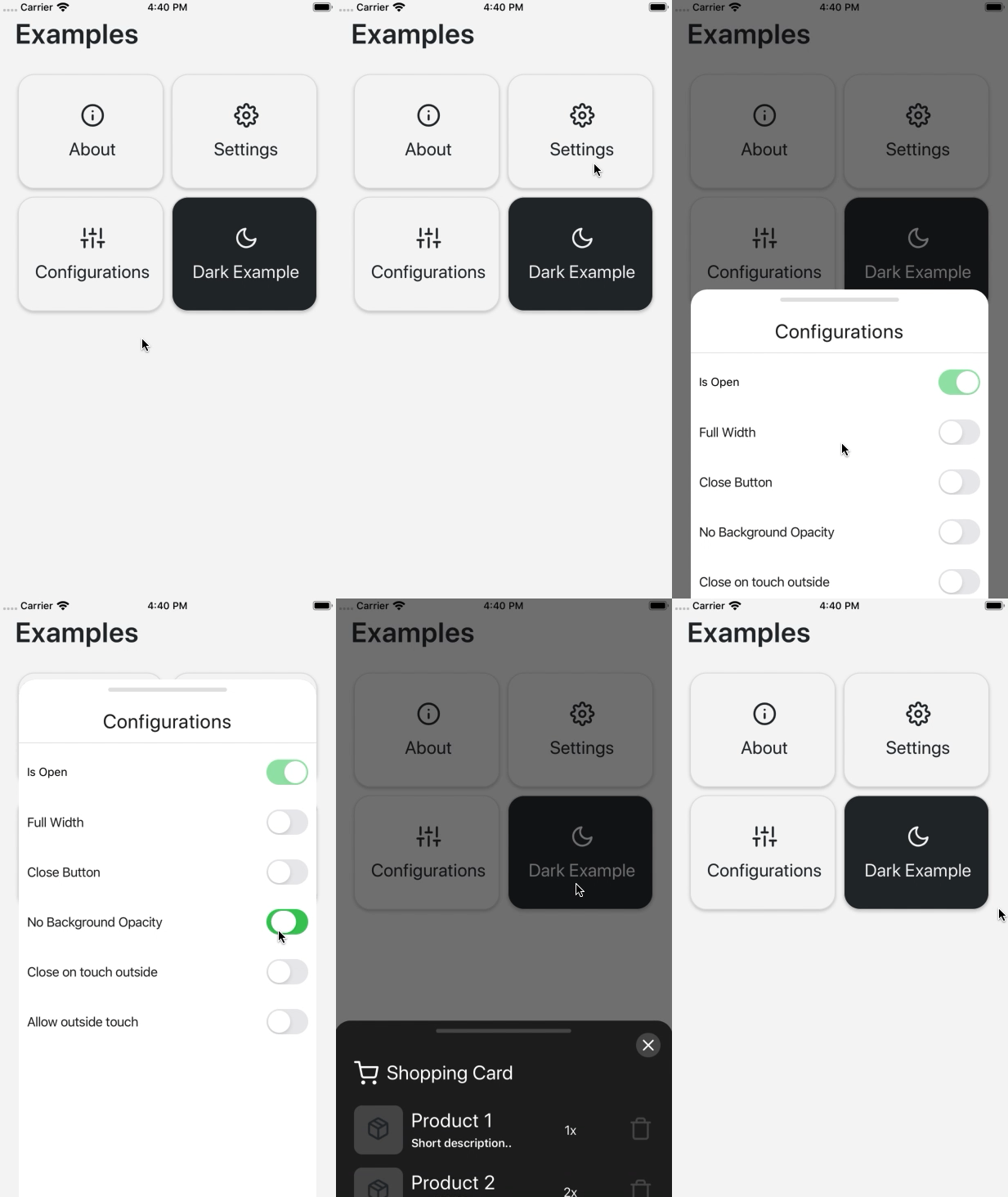
rn-swipeable-panel is a swipeable, easy to use bottom panel for your React Native projects. You can extend panel by swiping up, make it small or close by swiping down with pan gestures. Feel free to redesign inside of the panel.
⚙️ Installation
To install the package;
$ yarn add rn-swipeable-panel
If you use Typescript, you can install types of the rn-swipeable-panel;
$ yarn add @types/rn-swipeable-panel
✅ It is done!
? How to use
import React from 'react';
import { StyleSheet, Text, View } from 'react-native';

import { SwipeablePanel } from 'rn-swipeable-panel';

export default App = () => {
  const [panelProps, setPanelProps] = useState({
    fullWidth: true,
    openLarge: true,
    showCloseButton: true,
    onClose: () => closePanel(),
    onPressCloseButton: () => closePanel(),
    // ...or any prop you want
  });
  const [isPanelActive, setIsPanelActive] = useState(false);

  const openPanel = () => {
    setIsPanelActive(true);
  };

  const closePanel = () => {
    setIsPanelActive(false);
  };

  return (
    <View style={styles.container}>
      <Text style={styles.welcome}>Welcome to React Native!</Text>
      <Text style={styles.instructions}>To get started, edit App.js</Text>
      <SwipeablePanel {...panelProps} isActive={isPanelActive}>
        <PanelContent /> {/* Your Content Here */}
      </SwipeablePanel>
    </View>
  );
};
☝️ Options
| Properties | Type | Description | Default |
|---|---|---|---|
| isActive | bool |
Show/Hide the panel | false |
| onClose | Function |
Fired when the panel is closed | |
| showCloseButton | bool |
Set true if you want to show close button | |
| fullWidth | bool |
Set true if you want to make full with panel | false |
| openLarge | bool |
Set true if you want to open panel large by default | false |
| onlyLarge | bool |
Set true if you want to let panel open just large mode | false |
| onlySmall | bool |
Set true if you want to let panel open just small mode | false |
| noBackgroundOpacity | bool |
Set true if you want to disable black background opacity | false |
| style | Object |
Use this prop to override panel style | {} |
| closeRootStyle | Object |
Use this prop to override close button background style | {} |
| closeIconStyle | Object |
Use this prop to override close button icon style | {} |
| barStyle | Object |
Use this prop to override bar style | {} |
| closeOnTouchOutside | bool |
Set true if you want to close panel by touching outside | false |
| allowTouchOutside | bool |
Set true if you want to make toucable outside of panel | false |
| noBar | bool |
Set true if you want to remove gray bar | false |
