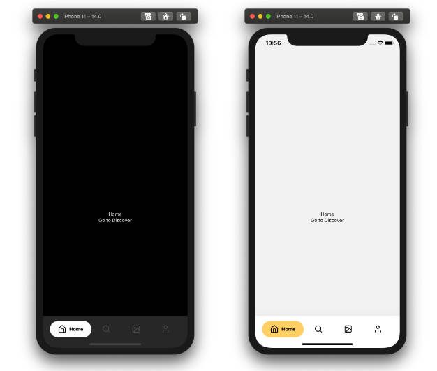
TabNavigator
A tab bar that switches between scenes, written in JS for cross-platform support. It works on iOS and Android.
This component is compatible with React Native 0.16 and newer.
The look and feel is slightly different than the native navigator but it is better in some ways. Also it is pure JavaScript.
Note: This is not the same TabNavigation component that is used in ExNavigation, the API and implementations are slightly different -- react-native-tab-navigator stands on its own and does not depend on any other navigation library.

Install
Make sure that you are in your React Native project directory and run:
npm install react-native-tab-navigator --save
Usage
Import TabNavigator as a JavaScript module:
import TabNavigator from 'react-native-tab-navigator';
This is an example of how to use the component and some of the commonly used props that it supports:
<TabNavigator>
  <TabNavigator.Item
    selected={this.state.selectedTab === 'home'}
    title="Home"
    renderIcon={() => <Image source={...} />}
    renderSelectedIcon={() => <Image source={...} />}
    badgeText="1"
    onPress={() => this.setState({ selectedTab: 'home' })}>
    {homeView}
  </TabNavigator.Item>
  <TabNavigator.Item
    selected={this.state.selectedTab === 'profile'}
    title="Profile"
    renderIcon={() => <Image source={...} />}
    renderSelectedIcon={() => <Image source={...} />}
    renderBadge={() => <CustomBadgeView />}
    onPress={() => this.setState({ selectedTab: 'profile' })}>
    {profileView}
  </TabNavigator.Item>
</TabNavigator>
See TabNavigatorItem's supported props for more info.
Hiding the Tab Bar
You can hide the tab bar by using styles. For example:
let tabBarHeight = 0;
<TabNavigator
  tabBarStyle={{ height: tabBarHeight, overflow: 'hidden' }}
  sceneStyle={{ paddingBottom: tabBarHeight }}
/>
Props
TabNavigator props
| prop | default | type | description |
|---|---|---|---|
| sceneStyle | inherited | object (style) | define for rendered scene |
| tabBarStyle | inherited | object (style) | define style for TabBar |
| tabBarShadowStyle | inherited | object (style) | define shadow style for tabBar |
| hidesTabTouch | false | boolean | disable onPress opacity for Tab |
TabNavigator.Item props
| prop | default | type | description |
|---|---|---|---|
| renderIcon | none | function | returns Item icon |
| renderSelectedIcon | none | function | returns selected Item icon |
| badgeText | none | string or number | text for Item badge |
| renderBadge | none | function | returns Item badge |
| title | none | string | Item title |
| titleStyle | inherited | style | styling for Item title |
| selectedTitleStyle | none | style | styling for selected Item title |
| tabStyle | inherited | style | styling for tab |
| selected | none | boolean | return whether the item is selected |
| onPress | none | function | onPress method for Item |
| allowFontScaling | false | boolean | allow font scaling for title |


