react-native-deck-swiper
Awesome tinder like card swiper for react-native. Highly Customizable!
Installation
npm install react-native-deck-swiper --save
Overview
- [x] Rotation animation
- [x] Opacity animation
- [x] Zoom animation
- [x] Overlay labels
- [x] Show next card while swiping
- [x] Swipe event callbacks
- [x] Trigger swipe animations programmatically
- [x] Jump to a card index
- [x] Swipe to the previous card
- [x] Underlaying cards offset
- [ ] Swipe back to the previous card with a custom animation
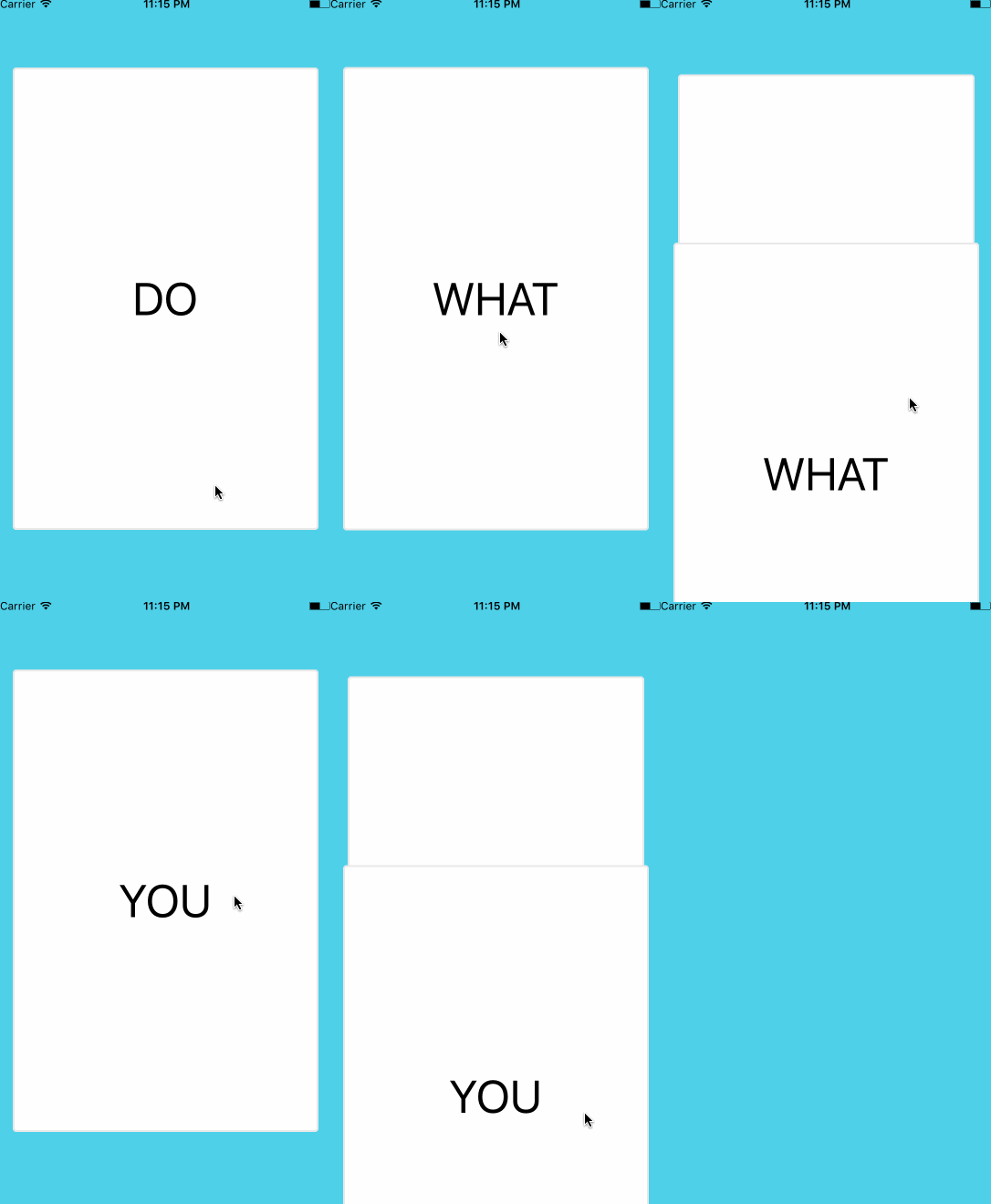
Preview


Props
Card props
| Props |
type |
description |
required |
default |
| cards |
array |
array of data for the cards to be rendered |
required |
|
| renderCard |
func(cardData) |
function to render the card based on the data |
required |
|
| keyExtractor |
func(cardData) |
function to get the card's react key |
|
null |
| cardIndex |
number |
cardIndex to start with |
|
0 |
| infinite |
bool |
keep swiping indefinitely |
|
false |
| horizontalSwipe |
bool |
enable/disable horizontal swiping |
|
true |
| verticalSwipe |
bool |
enable/disable vertical swiping |
|
true |
| showSecondCard |
bool |
enable/disable second card while swiping |
|
true |
| stackSize |
number |
number of underlaying cards to show (showSecondCard must be enabled) |
|
0 |
Event callbacks
| Props |
type |
description |
default |
| onSwipedAll |
func |
function to be called when all cards have been swiped |
|
| onSwiped |
func |
function to be called when a card is swiped. it receives the swiped card index |
|
| onSwipedAborted |
func |
function to be called when a card is released before reaching the threshold |
|
| onSwipedLeft |
func |
function to be called when a card is swiped left. it receives the swiped card index |
|
| onSwipedRight |
func |
function to be called when a card is swiped right. it receives the swiped card index |
|
| onSwipedTop |
func |
function to be called when a card is swiped top. it receives the swiped card index |
|
| onSwipedBottom |
func |
function to be called when a card is swiped bottom. it receives the swiped card index |
|
| onSwiping |
func |
function to be called when a card is being moved. it receives X and Y positions |
|
| onTapCard |
func |
function to be called when tapping a card. it receives the tapped card index |
|
| onTapCardDeadZone |
number |
maximum amount of movement before a tap is no longer recognized as a tap |
5 |
Swipe animation props
| Props |
type |
description |
default |
| verticalThreshold |
number |
vertical swipe threshold |
height / 5 |
| horizontalThreshold |
number |
horizontal swipe threshold |
width / 4 |
| swipeAnimationDuration |
number |
duration of the swipe animation |
350 |
| disableBottomSwipe |
bool |
disable bottom swipe |
false |
| disableLeftSwipe |
bool |
disable left swipe |
false |
| disableRightSwipe |
bool |
disable right swipe |
false |
| disableTopSwipe |
bool |
disable top swipe |
false |
Stack props
| Props |
type |
description |
default |
| stackSeparation |
number |
vertical separation between underlaying cards |
10 |
| stackScale |
number |
percentage to reduce the size of each underlaying card |
3 |
| stackAnimationFriction |
number |
spring animation friction (bounciness) |
7 |
| stackAnimationTension |
number |
spring animation tension (speed) |
40 |
Rotation animation props
| Props |
type |
description |
default |
| inputRotationRange |
array |
x values range for the rotation output |
[-width / 2, 0, width / 2] |
| outputRotationRange |
array |
rotation values for the x values in inputRotationRange |
["-10deg", "0deg", "10deg"] |
Opacity animation props
| Props |
type |
description |
default |
| animateCardOpacity |
bool |
animate card opacity |
false |
| inputCardOpacityRangeX |
array |
pan x card opacity input range |
[-width / 2, -width / 3, 0, width / 3, width / 2] |
| outputCardOpacityRangeX |
array |
opacity values for the values in inputCardOpacityRangeX |
[0.8, 1, 1, 1, 0.8] |
| inputCardOpacityRangeY |
array |
pan y card opacity input range |
[-height / 2, -height / 3, 0, height / 3, height / 2] |
| outputCardOpacityRangeY |
array |
opacity values for the values in inputCardOpacityRangeY |
[0.8, 1, 1, 1, 0.8] |
| animateOverlayLabelsOpacity |
bool |
animate card overlay labels opacity |
false |
| inputOverlayLabelsOpacityRangeX |
array |
pan x overlay labels opacity input range |
[-width / 3, -width / 4, 0, width / 4, width / 3] |
| outputOverlayLabelsOpacityRangeX |
array |
opacity values for the values in inputOverlayLabelsOpacityRangeX |
[1, 0, 0, 0, 1] |
| inputOverlayLabelsOpacityRangeY |
array |
pan x overlay labels opacity input range |
[-height / 4, -height / 5, 0, height / 5, height / 4] |
| outputOverlayLabelsOpacityRangeY |
array |
opacity values for the values in inputOverlayLabelsOpacityRangeY |
[1, 0, 0, 0, 1] |
| overlayOpacityVerticalThreshold |
number |
vertical threshold for overlay label |
height / 5 |
| overlayOpacityHorizontalThreshold |
number |
horizontal threshold for overlay label |
width / 4 |
2 steps of inputOverlayLabelsOpacityRangeX and inputOverlayLabelsOpacityRangeY should match horizontalThreshold and verticalThreshold, respectively.
Swipe overlay labels
| Props |
type |
description |
default |
| overlayLabels |
object |
swipe labels title and style |
null, see below for format |
| overlayLabelStyle |
object |
swipe labels style |
null, see below for format |
| overlayLabelWrapperStyle |
object |
overlay label wrapper style |
see below for default |
overlayLabelStyle
{
  fontSize: 45,
  fontWeight: 'bold',
  borderRadius: 10,
  padding: 10,
  overflow: 'hidden'
}
overlayLabelWrapperStyle default props:
{
  position: 'absolute',
  backgroundColor: 'transparent',
  zIndex: 2,
  flex: 1,
  width: '100%',
  height: '100%'
}
overlayLabels default props :
{
  bottom: {
	element: <Text>BLEAH</Text> /* Optional */
	title: 'BLEAH',
    style: {
      label: {
        backgroundColor: 'black',
        borderColor: 'black',
        color: 'white',
        borderWidth: 1
      },
      wrapper: {
        flexDirection: 'column',
        alignItems: 'center',
        justifyContent: 'center'
      }
    }
  },
  left: {
	element: <Text>NOPE</Text> /* Optional */
	title: 'NOPE',
    style: {
      label: {
        backgroundColor: 'black',
        borderColor: 'black',
        color: 'white',
        borderWidth: 1
      },
      wrapper: {
        flexDirection: 'column',
        alignItems: 'flex-end',
        justifyContent: 'flex-start',
        marginTop: 30,
        marginLeft: -30
      }
    }
  },
  right: {
	element: <Text>LIKE</Text> /* Optional */
	title: 'LIKE',
    style: {
      label: {
        backgroundColor: 'black',
        borderColor: 'black',
        color: 'white',
        borderWidth: 1
      },
      wrapper: {
        flexDirection: 'column',
        alignItems: 'flex-start',
        justifyContent: 'flex-start',
        marginTop: 30,
        marginLeft: 30
      }
    }
  },
  top: {
	element: <Text>SUPER</Text> /* Optional */
	title: 'SUPER LIKE',
    style: {
      label: {
        backgroundColor: 'black',
        borderColor: 'black',
        color: 'white',
        borderWidth: 1
      },
      wrapper: {
        flexDirection: 'column',
        alignItems: 'center',
        justifyContent: 'center'
      }
    }
  }
}
Swipe back to previous card props
Make sure you set showSecondCard={false} for smoother and proper transitions while going back to previous card.
| Props |
type |
description |
default |
| goBackToPreviousCardOnSwipeLeft |
bool |
previous card is rendered on left swipe |
false |
| goBackToPreviousCardOnSwipeRight |
bool |
previous card is rendered on right swipe |
false |
| goBackToPreviousCardOnSwipeTop |
bool |
previous card is rendered on top swipe |
false |
| goBackToPreviousCardOnSwipeBottom |
bool |
previous card is rendered on bottom swipe |
false |
Style props
| Props |
type |
description |
default |
| backgroundColor |
string |
background color for the view containing the cards |
'#4FD0E9' |
| marginTop |
number |
marginTop for the swiper container |
0 |
| marginBottom |
number |
marginBottom for the swiper container |
0 |
| cardVerticalMargin |
number |
card vertical margin |
60 |
| cardHorizontalMargin |
number |
card horizontal margin |
20 |
| childrenOnTop |
bool |
render children on top or not |
false |
| cardStyle |
node |
override swipable card style |
{} |
Methods
To trigger imperative animations, you can use a reference to the Swiper component.
| Props |
arguments |
description |
| swipeLeft |
mustDecrementCardIndex = false |
swipe left to the next card |
| swipeRight |
mustDecrementCardIndex = false |
swipe right to the next card |
| swipeTop |
mustDecrementCardIndex = false |
swipe top to the next card |
| swipeBottom |
mustDecrementCardIndex = false |
swipe bottom to the next card |
| swipeBack |
callback |
swipe back into deck last swiped card |
| jumpToCardIndex |
cardIndex |
set the current card index |
Usage example
render () {
    <View style={styles.container}>
        <Swiper
            cards={['DO', 'MORE', 'OF', 'WHAT', 'MAKES', 'YOU', 'HAPPY']}
            renderCard={(card) => {
                return (
                    <View style={styles.card}>
                        <Text style={styles.text}>{card}</Text>
                    </View>
                )
            }}
            onSwiped={(cardIndex) => {console.log(cardIndex)}}
            onSwipedAll={() => {console.log('onSwipedAll')}}
            cardIndex={0}
            backgroundColor={'#4FD0E9'}
            stackSize= {3}>
            <Button
                onPress={() => {console.log('oulala')}}
                title="Press me">
                You can press me
            </Button>
        </Swiper>
    </View>
}
Demo inside the Exemples Folder
Stylesheet example
const styles = StyleSheet.create({
  container: {
    flex: 1,
    backgroundColor: "#F5FCFF"
  },
  card: {
    flex: 1,
    borderRadius: 4,
    borderWidth: 2,
    borderColor: "#E8E8E8",
    justifyContent: "center",
    backgroundColor: "white"
  },
  text: {
    textAlign: "center",
    fontSize: 50,
    backgroundColor: "transparent"
  }
});
GitHub
