Scroll Bottom Sheet
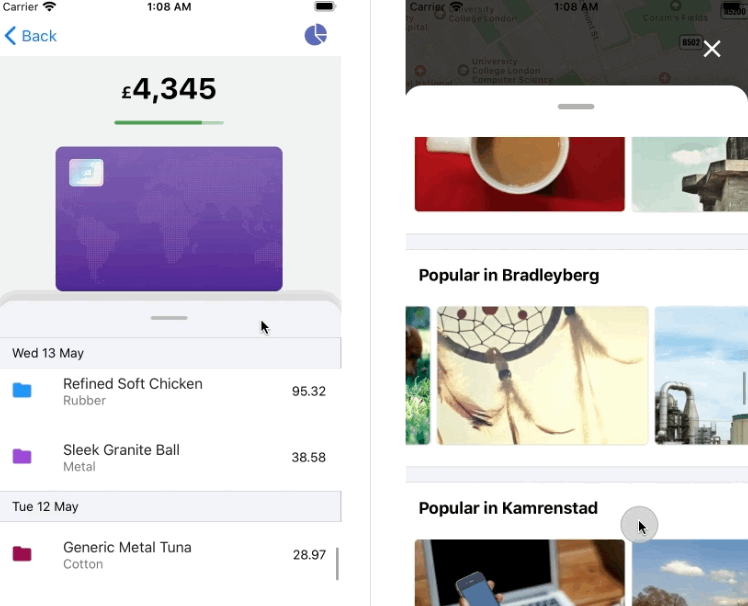
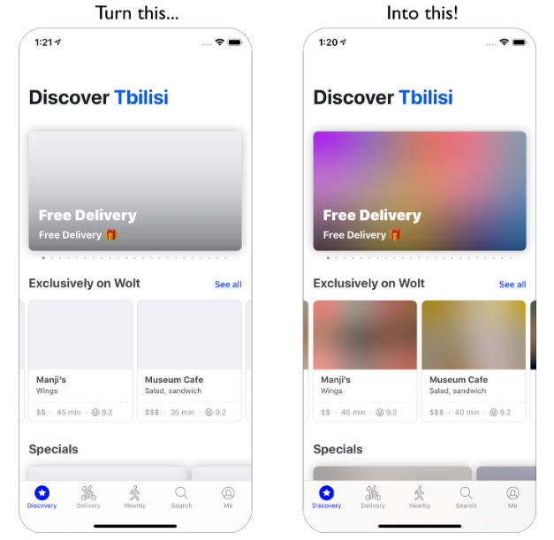
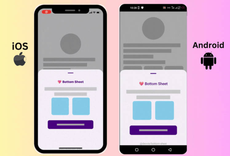
Cross platform scrollable bottom sheet with virtualisation support and fully native animations, that integrates with all core scrollable components from React Native: FlatList, ScrollView and SectionList. Also, it's 100% compatible with Expo.
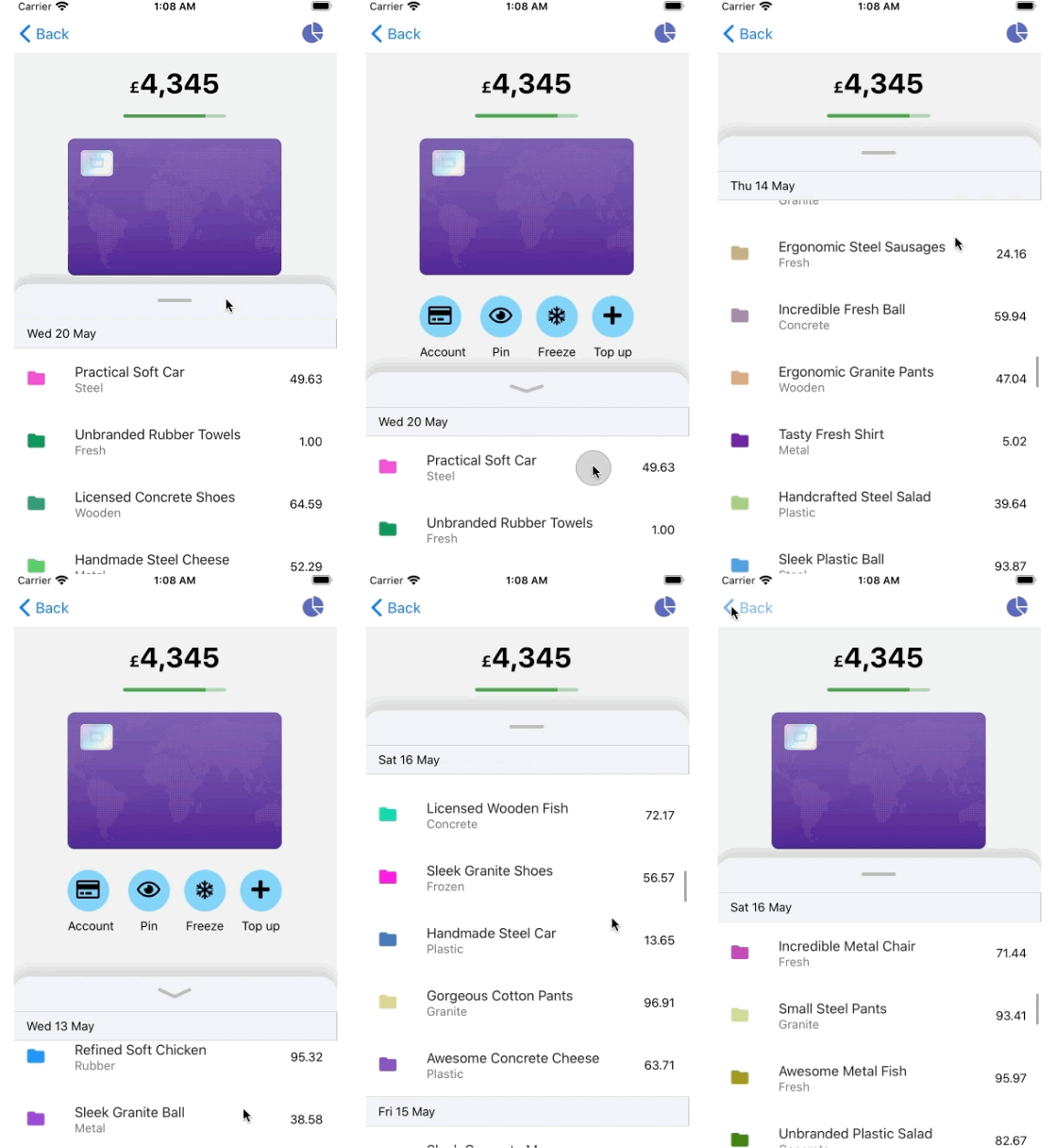 |
 |
|---|
Features
- :electron: Virtualisation support:
FlatListandSectionListcomponents are 1st class citizens, as well asScrollView - :fire: Peformant: runs at 60 FPS even on low grade Android devices
- :white_check_mark: Horizontal mode: allows for nice implementation of Google or Apple Maps bottom sheets types, where you have several horizontal lists embedded
- :gear: Minimalistic: exposes a set of fundamental props to easily control its behaviour
- :point_down: Support for interruptions: animations can be interrupted anytime smoothly without sudden jumps
- :sunglasses: Imperative snapping: for cases where you need to close the bottom sheet by pressing an external touchable
- :rocket: Animate all the things: you can animate other elements on the screen based on the bottom sheet position
- :muscle: No native dependencies: fully implemented in JS land, thanks to the powerful Gesture Handler and Reanimated libraries
- :iphone: Expo compatible: no need to eject to enjoy this component!
- :hammer_and_wrench: TS definitions: For those of you like me who can't look back to start a project in plain JS
Installation
npm
npm i react-native-scroll-bottom-sheet
yarn
yarn add react-native-scroll-bottom-sheet
If you don't use Expo, you also need to install react-native-gesture-handler and react-native-reanimated libraries along with this one.
It's recommended you install a version of gesture handler equal or higher than 1.6.0, and for reanimated, equal or higher than 1.7.0. Otherwise you may run into unexpected errors.
Compatibility table
You may add some touchable components inside the bottom sheet or several FlatList widgets for horizontal mode. Unfortunately, not all interactable React Native components are compatible with this library. This is due to some limitations on react-native-gesture-handler, which this library uses behind the scenes. For that, please follow this compatibility table:
| Import | Touchable | Flatlist |
|---|---|---|
| react-native | iOS | ? |
| react-native-gesture-handler | Android | Android, iOS |
Touchables
As you can see on the table, for any touchable component (TouchableOpacity, TouchableHighlight, ...) you need to have different imports depending on the platform. The below is a snippet you may find useful to abstract that into a component.
import React from "react";
import { Platform, TouchableOpacity } from "react-native";
import { TouchableOpacity as RNGHTouchableOpacity } from "react-native-gesture-handler";

const BottomSheetTouchable = (props) => {
  if (Platform.OS === "android") {
    return (
      <RNGHTouchableOpacity {...props} />
    );
  }

  return <TouchableOpacity {...props} />
};

export default BottomSheetTouchable;
Horizontal Mode
For this mode to work properly, you have to import FlatList from react-native-gesture-handler instead of react-native.
import { FlatList } from 'react-native-gesture-handler';

...
Usage
The below is an example using the core FlatList from React Native as the scrollable component.
import React from 'react';
import { Dimensions, StyleSheet, Text, View } from 'react-native';
import ScrollBottomSheet from 'react-native-scroll-bottom-sheet';

const windowHeight = Dimensions.get('window').height;

function Example() {
  return (
    <View style={styles.container}>
      <ScrollBottomSheet<string> // If you are using TS, that'll infer the renderItem `item` type
        componentType="FlatList"
        snapPoints={[128, '50%', windowHeight - 200]}
        initialSnapIndex={2}
        renderHandle={() => (
          <View style={styles.header}>
            <View style={styles.panelHandle} />
          </View>
        )}
        data={Array.from({ length: 200 }).map((_, i) => String(i))}
        keyExtractor={i => i}
        renderItem={({ item }) => (
          <View style={styles.item}>
            <Text>{`Item ${item}`}</Text>
          </View>
        )}
        contentContainerStyle={styles.contentContainerStyle}
      />
    </View>
  );
}

const styles = StyleSheet.create({
  container: {
    flex: 1,
  },
  contentContainerStyle: {
    padding: 16,
    backgroundColor: '#F3F4F9',
  },
  header: {
    alignItems: 'center',
    backgroundColor: 'white',
    paddingVertical: 20,
    borderTopLeftRadius: 20,
    borderTopRightRadius: 20
  },
  panelHandle: {
    width: 40,
    height: 2,
    backgroundColor: 'rgba(0,0,0,0.3)',
    borderRadius: 4
  },
  item: {
    padding: 20,
    justifyContent: 'center',
    backgroundColor: 'white',
    alignItems: 'center',
    marginVertical: 10,
  },
});
Props
There are 2 types of props this component receives: explicit and inherited.
Explicit
This is the list of exclusive props that are meant to be used to customise the bottom sheet behaviour.
| Name | Required | Type | Description |
|---|---|---|---|
componentType |
yes | string |
'FlatList', 'ScrollView', or 'SectionList' |
snapPoints |
yes | Array<string \| number> |
Array of numbers and/or percentages that indicate the different resting positions of the bottom sheet (in dp or %), starting from the top. If a percentage is used, that would translate to the relative amount of the total window height. If you want that percentage to be calculated based on the parent available space instead, for example to account for safe areas or navigation bars, use it in combination with topInset prop |
initialSnapIndex |
yes | number |
Index that references the initial resting position of the drawer, starting from the top |
renderHandle |
yes | () => React.ReactNode |
Render prop for the handle, should return a React Element |
onSettle |
no | (index: number) => void |
Callback that is executed right after the bottom sheet settles in one of the snapping points. The new index is provided on the callback |
animatedPosition |
no | Animated.Value<number> |
Animated value that tracks the position of the drawer, being: 0 => closed, 1 => fully opened |
animationConfig |
no | { duration: number, easing: Animated.EasingFunction } |
Timing configuration for the animation, by default it uses a duration of 250ms and easing fn Easing.inOut(Easing.linear) |
topInset |
no | number |
This value is useful to provide an offset (in dp) when applying percentages for snapping points |
innerRef |
no | RefObject |
Ref to the inner scrollable component (ScrollView, FlatList or SectionList), so that you can call its imperative methods. For instance, calling scrollTo on a ScrollView. In order to so, you have to use getNode as well, since it's wrapped into an animated component: ref.current.getNode().scrollTo({y: 0, animated: true}) |
containerStyle |
no | StyleProp<ViewStyle> |
Style to be applied to the container (Handle and Content) |
Inherited
Depending on the value of componentType chosen, the bottom sheet component will inherit its underlying props, being one of
FlatListProps, ScrollViewProps or SectionListProps, so that you can tailor the scrollable content behaviour as per your needs.
Methods
snapTo(index)
Imperative method to snap to a specific index, i.e.
bottomSheetRef.current.snapTo(0)
bottomSheetRef refers to the ref passed to the ScrollBottomSheet component.
Limitations
At the moment, the component does not support updating snap points via state, something you may want to achieve when changing device orientation for instance. A temporary workaround is to leverage React keys to force a re-mount of the component. This is some illustrative code to give you an idea how you could handle an orientation change with keys:
import { useDimensions } from '@react-native-community/hooks'

const useOrientation = () => {
  const { width, height } = useDimensions().window;

  if (height > width) {
    return 'portrait'
  }

  return 'landscape'
}

const OrientationAwareBS = () => {
	const orientation = useOrientation();
	const snapPoints = {
		portrait: [...],
		landscape: [...]
	}

	return (
      <ScrollBottomSheet
 		key={orientation}
        componentType="FlatList"
        snapPoints={snapPoints[orientation]}
        initialSnapIndex={2}
        ...
      />
	);
}
Example
There is an Expo example application that you can play with to get a good grasp on the different customisation options. In case of Android, you can directly open the project here. For iOS, head to the example folder and run the project locally:
$ npm install

$ npm start
Typescript
The library has been written in Typescript, so you'll get type checking and autocompletion if you use it as well.
