react-native-form-builder
If you're looking for a better form management library with more advanced features, Please check out React Reactive Form.
Handle your forms in a smart way.
react-native-form-builder


Note:
If you're looking for a better form management library with more advanced features, Please check out React Reactive Form.
Features
- Generate Form Fields UI
- Manage, track state & values of fields
- Automatically manages focus to next field on submit (TextInput)
- Handle all keyboard related problems smartly
- Supports custom validations & nested forms
- Uses Nativebase components
Installation
$ npm i react-native-form-builder --save
Basic Usage
- Install
react-nativefirst
$ npm i react-native -g
- Initialization of a react-native project
$ react-native init myproject
- Then, edit
myproject/index.ios.js, like this:
Example: Login Form consisting of three fields (username, password, country)
import React, { Component } from 'react';
import { AppRegistry } from 'react-native';
import { View, Text, Button } from 'native-base';
import GenerateForm from 'react-native-form-builder';

const styles = {
  wrapper: {
    flex: 1,
    marginTop: 150,
  },
  submitButton: {
    paddingHorizontal: 10,
    paddingTop: 20,
  },
};
// These Fields will create a login form with three fields
const fields = [
  {
    type: 'text',
    name: 'user_name',
    required: true,
    icon: 'ios-person',
    label: 'Username',
  },
  {
    type: 'password',
    name: 'password',
    icon: 'ios-lock',
    required: true,
    label: 'Password',
  },
  {
    type: 'picker',
    name: 'country',
    mode: 'dialog',
    label: 'Select Country',
    defaultValue: 'INDIA',
    options: ['US', 'INDIA', 'UK', 'CHINA', 'FRANCE'],
  },
];
export default class FormGenerator extends Component {
  login() {
    const formValues = this.formGenerator.getValues();
    console.log('FORM VALUES', formValues);
  }
  render() {
    return (
      <View style={styles.wrapper}>
        <View>
          <GenerateForm
            ref={(c) => {
              this.formGenerator = c;
            }}
            fields={fields}
          />
        </View>
        <View style={styles.submitButton}>
          <Button block onPress={() => this.login()}>
            <Text>Login</Text>
          </Button>
        </View>
      </View>
    );
  }
}

AppRegistry.registerComponent('FormGenerator', () => FormGenerator);
Properties
Basic
| Prop | Default | Type | Description |
|---|---|---|---|
| autoValidation | true | bool |
if false then auto validation script will not run i.e formBuilder will not validate form data automatically. |
| onValueChange | N/A | function |
Invoked every time after a field changes it's value |
| customValidation | N/A | function |
This function will be triggered everytime before a field changes it's value, here you can write your custom validation script & set error accordingly. |
| customComponents | N/A | object |
To define your custom type of components. |
| formData | N/A | object |
To prefill the form values. |
| fields | required |
array |
Array of form fields. |
| scrollViewProps | N/A | object |
Scrollview custom props. |
| errorComponent | N/A | React Component |
Custom error display component. |
Methods:
Currently, these methods are available in FormBuilder, you can access them by using ref property.
getValues
To extract the values of form fields.
Returns: An object consisting of field values (fieldName: value).
for e.g
{
  username: 'bietkul'
  password: 'bietkul@git'
}
setValues
Forcefully set values for particular fields.
Parameters: An object of key value pairs(name: value).
name: Field name for which value has to be set.
value: Value for that particular field
For e.g
{ name1: value1, name2: value2, .....}
resetForm
Reset Form values as well as errors.
setToDefault
Forcefully set values to default for particular fields.
Parameters: An array of strings, where every string is the name of a field for which value has to be set as default value.
For e.g
[fieldName1, fieldName2, fieldName3 .....]
Form Fields
Field Structure
A field is an object which has the properties required to generate it.
It looks something like that :
{
  type: 'text',
  name: 'user_name',
  label: 'Username'
}
Common Properties to all Fields
These properties are applicable on all fields.
| Property | Required | Type | Description |
|---|---|---|---|
| type | yes |
enum only possible values are : { text, password, group, email, number, url, select, switch, date } |
To define type of field. |
| name | yes |
string |
Every field should has a name which works as an unique identifier for that field. |
| label | yes |
string |
Field label to display. |
| editable | No |
bool |
To decide that whether a field is editable or not. |
| required | No |
bool |
Helps to decide if a field can has empty value or not. Doesn't work in case of autoValidation = false . |
| defaultValue | No |
Depends on field's type |
Sets the intial value for that field before the form initialization. |
| hidden | No |
bool |
If true then a field will not be displayed. |
Field Types
TextInput
Supports all these kind of types :-
text,
password,
email,
url,
number
Extra Properties
| Props | Default | Type | Description |
|---|---|---|---|
| iconName | N/A | string |
Sets the icon, you can use any icon name which is available in react-native-vector-icons |
| iconOrientaion | left (default) or right |
string |
Adjust icon orientation |
| props | N/A | object |
Here you can define extra props which are applicable for react native TextInput Component. For e.g. { multiline: true, secureTextEntry : true .... } |
Value Type : String ( Except for type number )
Picker
type: picker
Uses native picker
Extra Properties
| Props | Default | Type | Description |
|---|---|---|---|
| options (required) | N/A | array |
An array of strings to define available options for e.g. ['CAR', 'BIKE', 'BICYCLE'] |
| props | N/A | object |
Here you can define extra props which are applicable of react native Picker Component for e.g. { mode: 'dropdown', .... } |
Value Type : String
Default Value Type :
You can set default value as a string which must be present in available options.
For e.g If options are ['CAR', 'BIKE', 'BICYCLE'] then you can define defaultValue = 'BIKE'
Switch
(type: switch)
It's an implement of React Native switch component.
Value Type : Boolean
Date
(type: string)
Extra Properties
| Props | Default | Type | Description |
|---|---|---|---|
| mode | datetime |
string |
To define type of date picker, available values are date, time, datetime |
| maxDate | N/A | string or JS Date object |
To define the maximum date can be select in date picker |
| minDate | N/A | string or JS Date object |
To define the minimum date can be select in date picker |
Value Type : String
Default Value Type : string or JS Date object
Select
Extra Properties
| Props | Required | Default | Type | Description |
|---|---|---|---|---|
| multiple | No |
false |
bool |
To define that the field can accept multple values or not i.e user can select multiple values at a time or not. |
| objectType | No |
false |
string |
To define that the values can be of object or not.If true, then you need to specify labelKey & primaryKey |
| labelKey | Yes if objectType = true |
N/A |
string |
To define the key which value need to be used as label. |
| primaryKey | Yes if objectType = true |
N/A |
string |
To define the key which is unique in all objects. |
| options | Yes |
N/A |
array of objects or strings |
An array of objects or strings containing all available options. |
Value Type : Array of Strings or Objects
Array of Strings
For e.g. options = ['CAR', 'BIKE', 'BICYCLE']
Array of Objects
If you're using array of objects then please don't forget to define these properties:
objectType: true,
labelKey: 'name', // For Below example
primaryKey: 'id,  // For Below example
For e.g.
options: [
        {
          id: 1,
          name: 'CAR',
        },
        {
          id: 2,
          name: 'BIKE',
        },
        {
          id: 3,
          name: 'BICYCLE',
        },
      ]
Default Value Type : string or JS Date object
In case of object values:
defaultValue: [{
        id: 3,
        name: 'kuldeep2',
        title: 'saxena2',
      }],
In case of string values:
defaultValue: ['CAR', 'BIKE'],
Nested Forms
(type: group)
Form Builder also supports nested forms, some times you need to wrap all of your form values in an object or we can say that you have some nested fields, in this case you can define group fields.
An example will better explain it:
{
      type: 'group',
      name: 'address',
      label: 'Address',
      fields: [
        {
          type: 'text',
          name: 'city',
          label: 'City',
        },
        {
          type: 'picker',
          name: 'country',
          label: 'Country',
          defaultValue: 'INDIA',
          options: ['US', 'INDIA', 'UK', 'CHINA', 'FRANCE'],
        },
      ],
    },
Value Type : Object
For above example the return value object will be something like that:
{ city: 'Bangalore', country: 'INDIA' }
Default Value Type : Object
You can set default value for above example like that:
{ city: 'Newyork', country: 'US' }
Prefill Form Values
This feature of formBuilder is very helpful in case of edit mode i.e if you want to edit the values of a form then you can easily prefill the form by using formData prop.
For e.g
formData = {
  first_name : 'Jon',
  last_name: 'Snow',
  house: 'Winterfell',
  status: 'Sad'
}
Add Custom Validations
It's very easy to add your custom validations & error messages with FormBuilder.All you need to do is define a function & pass it as customValidation prop.
For e.g.
 function validate(field) {
   let error = false;
   let errorMsg = '';
   if (field.name === 'username' && !(field.value && field.value.trim())) {
     error = true;
     errorMsg = 'Username is required';
   }
   if (field.name === 'password' && !(field.value && field.value.trim())) {
     error = true;
     errorMsg = 'Password is required';
   }
   return { error, errorMsg };
 }
Note: Always return an object which will have two entities error type of boolean & errorMsg type of string.
Customize your form
- Eject Theme by running this command
node node_modules/react-native-form-builder/ejectTheme.js
It will create a file named form-theme.js in your project's root folder.
Customize your theme.
Import theme from form-them.
Use it by passing as theme prop.
import theme from '../form-theme';
....
 <GenerateForm
  ref={(c) => { this.formGenerator = c; }}
  theme = {theme}
  ....
  />
Add Custom Components
Build your custom type's components & handle them easily with the help of form builder.
Use the customComponents prop of form builder.
Prototype
It's an object of key value pair where key will be the type of the component & value will be your custom Component.
customComponents = { type1: {component: ComponentName1, props: Props }, type2: {component: ComponentName2} .....}
How To Use
- Define your custom
typein field's object. - Form builder extends the props of your component by adding some extra props.
- You can also pass some extra props in your custom components.
- In your component you can access these props to handle the state of the field.
| Props | Type | Description |
|---|---|---|
| attributes | object |
In this prop you can access the field's attributes (value, error, errorMsg ....). |
| updateValue(fieldName, Value) | function |
You need to use this method to update the value of the field |
| onSummitTextInput(fieldName) | function |
If you're using TextInput then you can use this function to automatically manage the text input focus.For example you can define it in the onSubmitEditing prop of TextInput |
| theme | object |
Use the theme variables to style your component |
Add Custom Error Component
- Now you can use your custom error component to display error messages.
- In your custom component you will receive two props
attributes&themevariables. - You can access the error & error message as a property of the attributes object.
Example
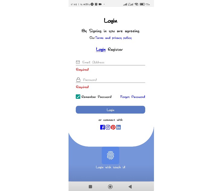
The form in second gif is generated by these fields


