React Native Form Generator
Generate forms with native look and feel in a breeze.
Components
- Picker
- DatePicker
- TimePicker
- Input
- Link
- Separator
- Switch
Features
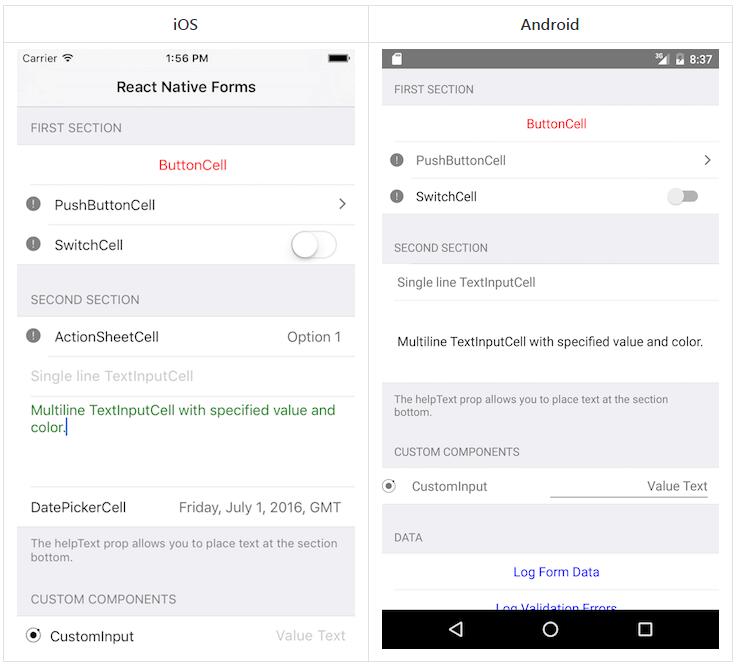
- Android and IOS support, Yeah Baby!
- Pleasant Defaults, totally overridable
- Doesn't have dependencies
- Use your own icon pack
- Easy to use and clean, react style syntax
- Automatic events handling
- Supports custom fields and styles without adding any weird syntax (just create a react component)
- Applies by default the current OS style
- Inspired by tcomb, the good parts
- Performances: just the field changed gets a setState
- You don't need to create a 'Model' or a 'Struct' that contains your data, just create a form component (the React's way)
- Validate InputFields based on keyboardType (can be overridden using validationFunction)
- Multiple validators
- Reset/Set Fields programmatically (setValue, setDate, setTime, focus)
- Custom Wrapper for Picker & DatePicker Components (iOS Only)
My blogpost about React Native Form Generator
Installation
npm install --save react-native-form-generator
I'm actively working on this project
- Pull requests are very very welcome. They make my day ;).
- Master should be considered 'unstable' even if I do my best to keep it nice and safe.
- Every release has its own branch.
- Slider hasn't been created.
- I have to document the code properly and do some housekeeping, i apologize in advance.
Example
Please check the folder examples for an always up to date use case.
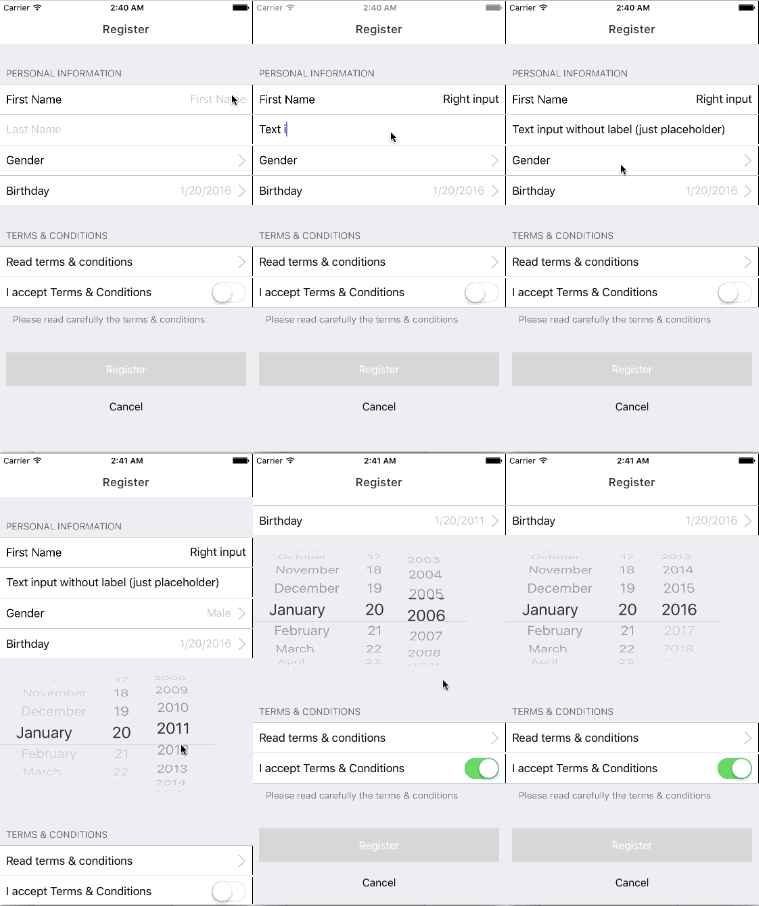
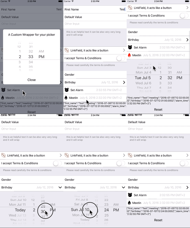
the example below generates the form you see in the animation
/*
This is a view i use in a test app,
very useful to list all the use cases
*/

import React from 'react';

import {
  AppRegistry,
  StyleSheet,
  Text,
  View,ScrollView,
} from 'react-native';


import { Form,
  Separator,InputField, LinkField,
  SwitchField, PickerField,DatePickerField,TimePickerField
} from 'react-native-form-generator';

export class FormView extends React.Component{
  constructor(props){
    super(props);
    this.state = {
      formData:{}
    }
  }
  handleFormChange(formData){
    /*
    formData will contain all the values of the form,
    in this example.

    formData = {
    first_name:"",
    last_name:"",
    gender: '',
    birthday: Date,
    has_accepted_conditions: bool
    }
    */

    this.setState({formData:formData})
    this.props.onFormChange && this.props.onFormChange(formData);
  }
  handleFormFocus(e, component){
    //console.log(e, component);
  }
  openTermsAndConditionsURL(){

  }
  render(){
    return (<ScrollView keyboardShouldPersistTaps={true} style={{paddingLeft:10,paddingRight:10, height:200}}>
      <Form
        ref='registrationForm'
        onFocus={this.handleFormFocus.bind(this)}
        onChange={this.handleFormChange.bind(this)}
        label="Personal Information">
        <Separator />
        <InputField
          ref='first_name'
          label='First Name'
          placeholder='First Name'
          helpText={((self)=>{

            if(Object.keys(self.refs).length !== 0){
              if(!self.refs.registrationForm.refs.first_name.valid){
                return self.refs.registrationForm.refs.first_name.validationErrors.join("\n");
              }

            }
            // if(!!(self.refs && self.refs.first_name.valid)){
            // }
          })(this)}
          validationFunction={[(value)=>{
            /*
            you can have multiple validators in a single function or an array of functions
             */

            if(value == '') return "Required";
            //Initial state is null/undefined
            if(!value) return true;
            // Check if First Name Contains Numbers
            var matches = value.match(/\d+/g);
            if (matches != null) {
                return "First Name can't contain numbers";
            }

            return true;
          }, (value)=>{
            ///Initial state is null/undefined
            if(!value) return true;
            if(value.indexOf('4')!=-1){
              return "I can't stand number 4";
            }
            return true;
          }]}
          />
        <InputField ref='last_name' placeholder='Last Name'/>
        <InputField
          multiline={true}
          ref='other_input'
          placeholder='Other Input'
          helpText='this is an helpful text it can be also very very long and it will wrap' />
        <Separator />
        <LinkField label="test test test" onPress={()=>{}}/>
        <SwitchField label='I accept Terms & Conditions'
          ref="has_accepted_conditions"
          helpText='Please read carefully the terms & conditions'/>
        <PickerField ref='gender'
          label='Gender'
          options={{
            "": '',
            male: 'Male',
            female: 'Female'
          }}/>
          <DatePickerField ref='birthday'
          minimumDate={new Date('1/1/1900')}
          maximumDate={new Date()}
          placeholder='Birthday'/>
        <TimePickerField ref='alarm_time'
      placeholder='Set Alarm'/>
        <DatePickerField ref='meeting'
          minimumDate={new Date('1/1/1900')}
          maximumDate={new Date()} mode="datetime" placeholder='Meeting'/>
        </Form>
        <Text>{JSON.stringify(this.state.formData)}</Text>

      </ScrollView>);
    }
  }
Form
Form automatically attaches on change events so you just have to attach an handle to the onFocus attibute of Form to monitor all the changes.
It's just a wrapper that allows you to attach onFocus (used to track focus events and keyboard events) and onChange (used to track changes in every field)
Separator
  <Separator
    label="Example" // optional: if present it will show the text
    />
InputField
Input fields can be used to receive text, you can add icons (a react component) to the left and the right side of the field.
InputField can validate values based on keyboardType property, validation is not "aggressive", just changes a value inside the class, you can access the value using the ref (ex. this.ref.example_input_field.valid).
InputField automatically provides the attibutes valid and validationErrors to guarantee full control to the developer.
you can customize your validation function by adding a validationFunction prop to the component. validationFunction supports also an array of validators.
Creating a validator
Validators are simple functions have one paramenter (value) and that return true or a string containing an error.
let workingValidator = (value)=>{
  if(value == '') return "Required";
  //Initial state is null/undefined
  if(!value) return true;
  var matches = value.match(/\d+/g);
  if (matches != null) {
    return "First Name can't contain numbers";
  }

  return true;
}
react-native-form-generator doesn't depend on any icon library, that gives you freedom of adding any icon or react component you want.
look at the example here.

  <InputField
    label='Example' // if label is present the field is rendered with the value on the left (see First Name example in the gif), otherwise its rendered with textinput at full width (second name in the gif).
    ref='example_input_field' // used in onChange event to collect the value
    value='default_value' // used as initial value
    keyboardType = '' // undefined, 'email-address',
    validationFunction = {(value)=>{return true;}}
    iconRight={
      <Icon name='checkmark-circled'
        size={30}
        style={[
          {marginTop:7, color:"#61d062" },
          ((self)=>{
            //i can change the style of the component related to the attibute of example_input_field
            if(!!(self.refs && self.refs.example_input_field)){
              if(!self.refs.example_input_field.valid) return {color:'#d52222'}
            }
            }
          )(this)]}
        />
    }  //React Component
    />
KeyboardEvents
react-native-form-generator ships with an implementation ok KeyboardAwareScrollView that make handling keyboard events a breeze.
check here https://medium.com/@michaelcereda/react-native-forms-the-right-way-315802f989d6#.p9oj79vt3

Custom Fields
With react-native-form-generator is extremely easy to create your own custom fields.
You just need to know that:
- Every field is a react component
- Evey field will receive 3 props from the Form object:
- fieldRef: contains the reference of the field (workaround on a react-native bug).
- onChange: must be called every time i want to update the values inside the form component. (required)
- onValueChange: can be used whenever you prefer to pass the values to another component.
Example
'use strict';
import {Field} from '../lib/Field';

export class SimpleInputField extends React.Component{
  constructor(props){
    super();
    }
  }

  handleChange(event){
    var value = event.nativeEvent.text;

    this.setState({value:value});

    // This updates values in form everytime i update
    if(this.props.onChange)      this.props.onChange(this.props.fieldRef, value);
    if(this.props.onValueChange) this.props.onValueChange(value);
  }

  render(){
    return(<Field>
        <TextInput
          {...this.props}
          ref='inputBox'

          onChange={this.handleChange.bind(this)}

          placeholder={this.props.placeholder}
          value={this.state.value}
          />
    </Field>
  )
}

}
Wrapping fields
You can decide to wrap every field in a component to mantain design uniformity and avoid repetitions (ex. Icons ?!).
Battle tested example
import {PickerField, LinkField} from 'react-native-form-generator';
import Icon from 'react-native-vector-icons/Ionicons';

let {
  StyleSheet
} = React;

export class WrappedLinkField extends React.Component{
  render(){

    return <LinkField
      label={this.props.label}
      onPress={this.props.onPress}
      iconRight={<Icon name='ios-arrow-right'
      size={30}
        />
    }
}

export class WrappedPickerField extends React.Component{
    render(){

      return <PickerField
        fieldRef = {this.props.fieldRef}
        value={this.props.value}
        placeholder={this.props.placeholder}
        options={this.props.options}
        onChange={this.props.onChange}
        onValueChange={this.props.onValueChange}
        iconRight={
          <Icon name='ios-arrow-right'
          size={30}

          style={[
            formStyles.alignRight,{color: '#C7C7CC'},
            this.props.iconStyle]}/>
      }
      />
  }
}

let formStyles = StyleSheet.create({
    alignRight:{
      marginTop: 7, position:'absolute', right: 10
    }
  });
