Gifted Chat
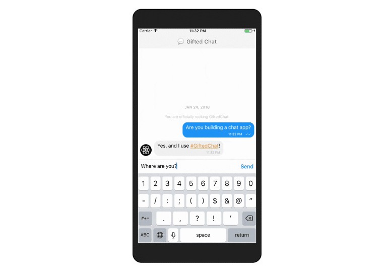
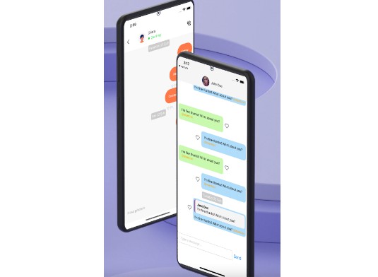
The most complete chat UI for React Native & Web
The future of GiftedChat
Please give us your advice: Related PR
Please vote
GiftedChat depends on other packages and some needs a boost, please vote for PRs will improve it, thanks:
Features
- 
react-native-webable (since 0.10.0) web configuration - Write with TypeScript (since 0.8.0)
- Fully customizable components
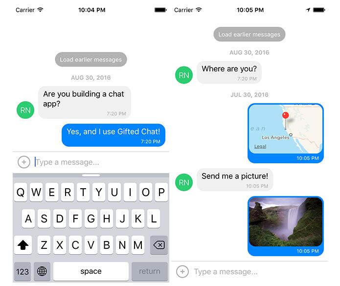
- Composer actions (to attach photos, etc.)
- Load earlier messages
- Copy messages to clipboard
- Touchable links using react-native-parsed-text
- Avatar as user's initials
- Localized dates
- Multi-line TextInput
- InputToolbar avoiding keyboard
- Redux support
- System message
- Quick Reply messages (bot)
- Typying indicatior react-native-typing-animation
Dependency
- Use version
0.2.xfor RN>= 0.44.0 - Use version
0.1.xfor RN>= 0.40.0 - Use version
0.0.10for RN< 0.40.0
Installation
- Using npm:
npm install react-native-gifted-chat --save - Using Yarn:
yarn add react-native-gifted-chat
react-native-video and expo-av
- Both dependencies are removed since
0.11.0. - You still be able to provide a
videobut you need to providerenderMessageVideoprop.
You have a question?
- Please check this readme and may find a response
- Please ask on StackOverflow first: https://stackoverflow.com/questions/tagged/react-native-gifted-chat
- Find response on existing issues
- Try to keep issues for issues
Example
import React, { useState, useCallback, useEffect } from 'react'
import { GiftedChat } from 'react-native-gifted-chat'

export function Example() {
  const [messages, setMessages] = useState([]);

  useEffect(() => {
    setMessages([
      {
        _id: 1,
        text: 'Hello developer',
        createdAt: new Date(),
        user: {
          _id: 2,
          name: 'React Native',
          avatar: 'https://placeimg.com/140/140/any',
        },
      },
    ])
  }, [])

  const onSend = useCallback((messages = []) => {
    setMessages(previousMessages => GiftedChat.append(previousMessages, messages))
  }, [])

  return (
    <GiftedChat
      messages={messages}
      onSend={messages => onSend(messages)}
      user={{
        _id: 1,
      }}
    />
  )
}
Advanced example
See App.tsx for a working demo!
"Slack" example
See the files in example-slack-message for an example of how to override the default UI to make something that looks more like Slack -- with usernames displayed and all messages on the left.
Message object
e.g. Chat Message
export interface IMessage {
  _id: string | number
  text: string
  createdAt: Date | number
  user: User
  image?: string
  video?: string
  audio?: string
  system?: boolean
  sent?: boolean
  received?: boolean
  pending?: boolean
  quickReplies?: QuickReplies
}

{
  _id: 1,
  text: 'My message',
  createdAt: new Date(Date.UTC(2016, 5, 11, 17, 20, 0)),
  user: {
    _id: 2,
    name: 'React Native',
    avatar: '',
  },
  image: '',
  // You can also add a video prop:
  video: 'http://commondatastorage.googleapis.com/gtv-videos-bucket/sample/ElephantsDream.mp4',
  // Mark the message as sent, using one tick
  sent: true,
  // Mark the message as received, using two tick
  received: true,
  // Mark the message as pending with a clock loader
  pending: true,
  // Any additional custom parameters are passed through
}
e.g. System Message
{
  _id: 1,
  text: 'This is a system message',
  createdAt: new Date(Date.UTC(2016, 5, 11, 17, 20, 0)),
  system: true,
  // Any additional custom parameters are passed through
}
e.g. Chat Message with Quick Reply options
See PR #1211
interface Reply {
  title: string
  value: string
  messageId?: any
}

interface QuickReplies {
  type: 'radio' | 'checkbox'
  values: Reply[]
  keepIt?: boolean
}

  {
    _id: 1,
    text: 'This is a quick reply. Do you love Gifted Chat? (radio) KEEP IT',
    createdAt: new Date(),
    quickReplies: {
      type: 'radio', // or 'checkbox',
      keepIt: true,
      values: [
        {
          title: '? Yes',
          value: 'yes',
        },
        {
          title: '? Yes, let me show you with a picture!',
          value: 'yes_picture',
        },
        {
          title: '? Nope. What?',
          value: 'no',
        },
      ],
    },
    user: {
      _id: 2,
      name: 'React Native',
    },
  },
  {
    _id: 2,
    text: 'This is a quick reply. Do you love Gifted Chat? (checkbox)',
    createdAt: new Date(),
    quickReplies: {
      type: 'checkbox', // or 'radio',
      values: [
        {
          title: 'Yes',
          value: 'yes',
        },
        {
          title: 'Yes, let me show you with a picture!',
          value: 'yes_picture',
        },
        {
          title: 'Nope. What?',
          value: 'no',
        },
      ],
    },
    user: {
      _id: 2,
      name: 'React Native',
    },
  }
Props
-
messages(Array) - Messages to display -
isTyping(Bool) - Typing Indicator state; defaultfalse. If you userenderFooterit will override this. -
text(String) - Input text; default isundefined, but if specified, it will override GiftedChat's internal state (e.g. for redux; see notes below) -
placeholder(String) - Placeholder whentextis empty; default is'Type a message...' -
messageIdGenerator(Function) - Generate an id for new messages. Defaults to UUID v4, generated by uuid -
user(Object) - User sending the messages:{ _id, name, avatar } -
onSend(Function) - Callback when sending a message -
alwaysShowSend(Bool) - Always show send button in input text composer; defaultfalse, show only when text input is not empty -
locale(String) - Locale to localize the dates. You need first to import the locale you need (ie.require('dayjs/locale/de')orimport 'dayjs/locale/fr') -
timeFormat(String) - Format to use for rendering times; default is'LT' -
dateFormat(String) - Format to use for rendering dates; default is'll' -
loadEarlier(Bool) - Enables the "load earlier messages" button, required forinfiniteScroll -
isKeyboardInternallyHandled(Bool) - Determine whether to handle keyboard awareness inside the plugin. If you have your own keyboard handling outside the plugin set this to false; default istrue -
onLoadEarlier(Function) - Callback when loading earlier messages -
isLoadingEarlier(Bool) - Display anActivityIndicatorwhen loading earlier messages -
renderLoading(Function) - Render a loading view when initializing -
renderLoadEarlier(Function) - Custom "Load earlier messages" button -
renderAvatar(Function) - Custom message avatar; set tonullto not render any avatar for the message -
showUserAvatar(Bool) - Whether to render an avatar for the current user; default isfalse, only show avatars for other users -
showAvatarForEveryMessage(Bool) - When false, avatars will only be displayed when a consecutive message is from the same user on the same day; default isfalse -
onPressAvatar(Function(user)) - Callback when a message avatar is tapped -
onLongPressAvatar(Function(user)) - Callback when a message avatar is long-pressed -
renderAvatarOnTop(Bool) - Render the message avatar at the top of consecutive messages, rather than the bottom; default isfalse -
renderBubble(Function) - Custom message bubble -
renderTicks(Function(message)) - Custom ticks indicator to display message status -
renderSystemMessage(Function) - Custom system message -
onPress(Function(context,message)) - Callback when a message bubble is pressed -
onLongPress(Function(context,message)) - Callback when a message bubble is long-pressed; default is to show an ActionSheet with "Copy Text" (see example usingshowActionSheetWithOptions()) -
inverted(Bool) - Reverses display order ofmessages; default istrue -
renderUsernameOnMessage(Bool) - Indicate whether to show the user's username inside the message bubble; default isfalse -
renderMessage(Function) - Custom message container -
renderMessageText(Function) - Custom message text -
renderMessageImage(Function) - Custom message image -
renderMessageVideo(Function) - Custom message video -
imageProps(Object) - Extra props to be passed to the<Image>component created by the defaultrenderMessageImage -
videoProps(Object) - Extra props to be passed to the video component created by the requiredrenderMessageVideo -
lightboxProps(Object) - Extra props to be passed to theMessageImage's Lightbox -
isCustomViewBottom(Bool) - Determine whether renderCustomView is displayed before or after the text, image and video views; default isfalse -
renderCustomView(Function) - Custom view inside the bubble -
renderDay(Function) - Custom day above a message -
renderTime(Function) - Custom time inside a message -
renderFooter(Function) - Custom footer component on the ListView, e.g.'User is typing...'; see App.tsx for an example. Overrides default typing indicator that triggers whenisTypingis true. -
renderChatEmpty(Function) - Custom component to render in the ListView when messages are empty -
renderChatFooter(Function) - Custom component to render below the MessageContainer (separate from the ListView) -
renderInputToolbar(Function) - Custom message composer container -
renderComposer(Function) - Custom text input message composer -
renderActions(Function) - Custom action button on the left of the message composer -
renderSend(Function) - Custom send button; you can pass children to the originalSendcomponent quite easily, for example, to use a custom icon (example) -
renderAccessory(Function) - Custom second line of actions below the message composer -
onPressActionButton(Function) - Callback when the Action button is pressed (if set, the defaultactionSheetwill not be used) -
bottomOffset(Integer) - Distance of the chat from the bottom of the screen (e.g. useful if you display a tab bar) -
minInputToolbarHeight(Integer) - Minimum height of the input toolbar; default is44 -
listViewProps(Object) - Extra props to be passed to the messages<ListView>; some props can't be overridden, see the code inMessageContainer.render()for details -
textInputProps(Object) - Extra props to be passed to the<TextInput> -
textInputStyle(Object) - Custom style to be passed to the<TextInput> -
multiline(Bool) - Indicates whether to allow the<TextInput>to be multiple lines or not; defaulttrue. -
keyboardShouldPersistTaps(Enum) - Determines whether the keyboard should stay visible after a tap; see<ScrollView>docs -
onInputTextChanged(Function) - Callback when the input text changes -
maxInputLength(Integer) - Max message composer TextInput length -
parsePatterns(Function) - Custom parse patterns for react-native-parsed-text used to linking message content (like URLs and phone numbers), e.g.:<GiftedChat
parsePatterns={(linkStyle) => [
{ type: 'phone', style: linkStyle, onPress: this.onPressPhoneNumber },
{ pattern: /#(\w+)/, style: { ...linkStyle, styles.hashtag }, onPress: this.onPressHashtag },
]}
/> -
extraData(Object) - Extra props for re-rendering FlatList on demand. This will be useful for rendering footer etc. -
minComposerHeight(Object) - Custom min-height of the composer. -
maxComposerHeight(Object) - Custom max height of the composer. -
scrollToBottom(Bool) - Enables the scroll to bottom Component (Default is false) -
scrollToBottomComponent(Function) - Custom Scroll To Bottom Component container -
scrollToBottomOffset(Integer) - Custom Height Offset upon which to begin showing Scroll To Bottom Component (Default is 200) -
scrollToBottomStyle(Object) - Custom style for Bottom Component container -
alignTop(Boolean) Controls whether or not the message bubbles appear at the top of the chat (Default is false - bubbles align to bottom) -
onQuickReply(Function) - Callback when sending a quick reply (to backend server) -
renderQuickReplies(Function) - Custom all quick reply view -
quickReplyStyle(StyleProp) - Custom quick reply view style -
renderQuickReplySend(Function) - Custom quick reply send view -
shouldUpdateMessage(Function) - Lets the message component know when to update outside of normal cases. -
infiniteScroll(Bool) - infinite scroll up when reach the top of messages container, automatically call onLoadEarlier function if exist (not yet supported for the web). You need to addloadEarlierprop too.
Imperative methods
focusTextInput()- Open the keyboard and focus the text input box
Notes for Redux
The messages prop should work out-of-the-box with Redux. In most cases, this is all you need.
If you decide to specify a text prop, GiftedChat will no longer manage its own internal text state and will defer entirely to your prop. This is great for using a tool like Redux, but there's one extra step you'll need to take: simply implement onInputTextChanged to receive typing events and reset events (e.g. to clear the text onSend):
<GiftedChat
  text={customText}
  onInputTextChanged={text => this.setCustomText(text)}
  /* ... */
/>
Notes for Android
If you are using Create React Native App / Expo, no Android specific installation steps are required -- you can skip this section. Otherwise, we recommend modifying your project configuration as follows.
-
Make sure you have
android:windowSoftInputMode="adjustResize"in yourAndroidManifest.xml:<activity android:name=".MainActivity" android:label="@string/app_name" android:windowSoftInputMode="adjustResize" android:configChanges="keyboard|keyboardHidden|orientation|screenSize"> -
For Expo, there are at least 2 solutions to fix it:
-
Append
KeyboardAvoidingViewafter GiftedChat. This should only be done for Android, asKeyboardAvoidingViewmay conflict with the iOS keyboard avoidance already built into GiftedChat, e.g.:<View style={{ flex: 1 }}>
{
Platform.OS === 'android' &&
}
-
If you use React Navigation, additional handling may be required to account for navigation headers and tabs. KeyboardAvoidingView's keyboardVerticalOffset property can be set to the height of the navigation header and tabBarOptions.keyboardHidesTabBar can be set to keep the tab bar from being shown when the keyboard is up. Due to a bug with calculating height on Android phones with notches, KeyboardAvoidingView is recommended over other solutions that involve calculating the height of the window.
- adding an opaque background status bar on app.json (even though
android:windowSoftInputMode="adjustResize"is set internally on Expo's Android apps, the translucent status bar causes it not to work): https://docs.expo.io/versions/latest/guides/configuration.html#androidstatusbar - If you plan to use
GiftedChatinside aModal, see #200.
Notes for local development
Native
- Install
yarn global add expo-cli - Install dependencies
yarn install expo start
react-native-web
With expo
- Install
yarn global add expo-cli - Install dependencies
yarn install expo start -w
With create-react-app
-
yarn add -D react-app-rewired -
touch config-overrides.jsmodule.exports = function override(config, env) {
config.module.rules.push({
test: /.js$/,
exclude: /node_modules/\/,
use: {
loader: 'babel-loader',
options: {
babelrc: false,
configFile: false,
presets: [
['@babel/preset-env', { useBuiltIns: 'usage' }],
'@babel/preset-react',
],
plugins: ['@babel/plugin-proposal-class-properties'],
},
},
})return config
}
You will find an example and a web demo here: xcarpentier/gifted-chat-web-demo
Another example with Gatsby : xcarpentier/clean-archi-boilerplate
Questions
- How can I set Bubble color for each user?
- How can I pass style props to InputToolbar design and customize its color and other styles properties?
- How can I change the color of the message box?
- Is there a way to manually dismiss the keyboard?
- I want to implement a popover that pops right after clicking on a specific avatar, what is the best implementation in this case and how?
- Why TextInput is hidden on Android?
- How to use renderLoading?
- Can I use MySql to save the message?
License
Author
Feel free to ask me questions on Twitter @FaridSafi! or @xcapetir!
