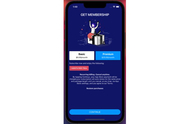
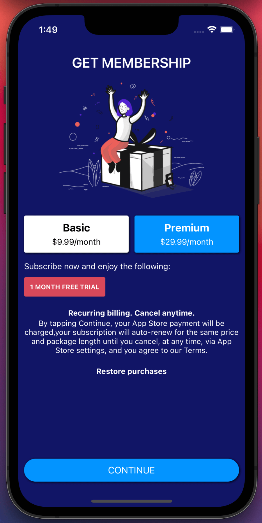
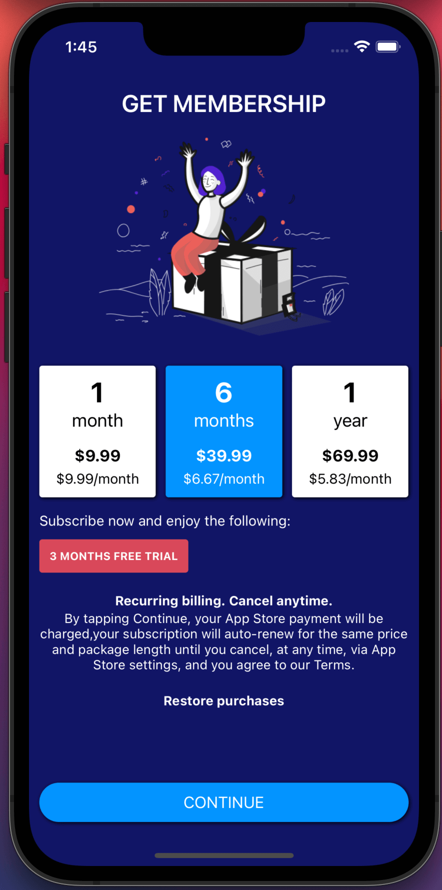
The easiest way to sell In-App purchases and display a beautiful Paywall (highly customizable) for your React Native app.
This component has been made to implement In-App purchases in minutes. It includes everything you usually need to code yourself when using directly react-native-iaphub.
It includes:
- The
IaphubDataProvider/IaphubDataConsumercomponents to easily init IAPHUB and access all the data you need - A beautiful
Paywallcomponent that supports all the features (free trial, intro price…) with all the content translated (including all the errors) in 6 languages (English, Spanish, French, German, Portuguese, Japanese).
Install component
npm install react-native-iaphub-ui --save
npm install react-native-iaphub --save // Peer dependency
IaphubDataProvider/IaphubDataConsumer components
The IaphubDataProvider component will:
- Start IAPHUB
- Provide all the necessary properties (products for sale, active products, different methods (buy, restore…)).
It must be rendered in the main tree of the app (when starting the app).
Whenever the data is needed (like when you’re displaying the paywall or when you need to check if the user has an active subscription), use the IaphubDataConsumer component to get the data.
The IaphubDataConsumer component will be automatically re-rendered everytime the data is updated.
The usage of this component is totally optional but recommended, using directly react-native-iaphub may be more suitable sometimes depending on your app architecture.
import {IaphubDataProvider, IaphubDataConsumer, Paywall} from 'react-native-iaphub-ui';

<IaphubDataProvider
  appId="5e4890f6c61fc971cf46db4d"
  apiKey="SDp7aY220RtzZrsvRpp4BGFm6qZqNkNf"
  lang="en"
  userId="9b30a87b-40c2-4435-8a0a-265145f2870f"
  allowAnonymousPurchase={false}>
    <IaphubDataConsumer>
      {(paywallProps) => <Paywall {...paywallProps} />}
    </IaphubDataConsumer>
</IaphubDataProvider>
| Prop | Type | Description |
|---|---|---|
| appId | String |
The app id is available on the settings page of your app |
| apiKey | String |
The (client) api key is available on the settings page of your app |
| lang | String |
Language ISO code (Possible values: ‘en’, ‘es’, ‘de’, ‘fr’, ‘pt’, ‘jp’) |
| userId | Boolean |
Optional, user ID of the logged user |
| allowAnonymousPurchase | Boolean |
Optional, if you want to allow purchases when the user isn’t logged in (false by default) |
| userTags | Object |
Optional, user tags |
| deviceParams | Object |
Optional, device params |
| onError | Function |
Optional, event triggered when an error occurs |
| onPurchase | Function |
Optional, event triggered when a purchase is successful |
Paywall component
The Paywall component will display a paywall.
(The Get membership title and the image are not part of the Paywall component, you should display there a cool description of what you’re selling).
<Paywall {...props}/>
PaywallSubscriptionGroup component
The PaywallSubscriptionGroup component is just like the Paywall component but it is optimized for a subscription group (same subscription with different durations).
If the data provided doesn’t have one (and only) subscription group, an error message will be displayed.
<PaywallSubscriptionGroup {...props}/>
Paywall properties
| Prop | Type | Description |
|---|---|---|
| style | Object |
Style |
| isLoading | Boolean |
Display a spinner when the data is loading |
| activeProducts | Array |
List of active products |
| productsForSale | Array |
List of products for sale |
| lang | String |
Language ISO code (Possible values: ‘en’, ‘es’, ‘fr’, ‘pt’, ‘jp’) (‘en’ by default) |
| i18n | Object |
i18n data (if you want to provide your own translations) |
| defaultSelectedProductIndex | Number |
Index of the product selected by default (0 by default) |
| theme | Object |
Theme object to customize the styles of the components (see style customization below) |
| display | String |
Orientation of the products for sale list (Possible values: ‘horizontal’, ‘vertical’) (‘horizontal’ by default) |
Paywall events
| Prop | Type | Description |
|---|---|---|
| onBuyStart | Function |
Event triggered when the user clicks on the buy button |
| onBuyEnd | Function |
Event triggered when the user purchase is done |
| onRestoreStart | Function |
Event triggered when the user clicks on the restore button |
| onRestoreEnd | Function |
Event triggered when the user restore is done |
| onShowManageSubscriptions | Function |
Event triggered when the user clicks on the button to manage the subscriptions |
| onRefreshProducts | Function |
Event triggered when the user clicks on the button to refresh the products (when the loading previously failed) |
Paywall style customization
You can customize any style of the component by using the theme property.
You simply have to provide an object containing the name and style of the component you’re looking to customize.
You can find all the components and styles in our codebase here.
<Paywall
  theme={{
    Product: {
      root: {
        backgroundColor: 'red'
      }
    }
  }}
/>
Paywall components customization
If customizing the style isn’t enough, you can easily replace any component of the paywall. We recommend copying the component you’re looking to replace in our codebase first and then modify it as much as you want. The PaywallSubscriptionGroup is a good example of how we’ve customized the Paywall component to modify the UI.
import React, {Component} from 'react';
import {View, Text} from 'react-native';

export default class CustomProductTitle extends Component {

  render() {
    var {product, isSelected, lang, i18n} = this.props;

    return (
      <View>
        <Text>Custom title</Text>
      </View>
    );
  }

}
<Paywal {...props} ProductTitle={CustomProductTitle}/>
Translations
We’re currently supporting 6 languages (English, Spanish, French, German, Portuguese, Japanese), if you need another language please open a new issue and we’ll do our best to implement the language you’ve requested.
