react-native-ratings
Tap and Swipe Ratings component for React Native.

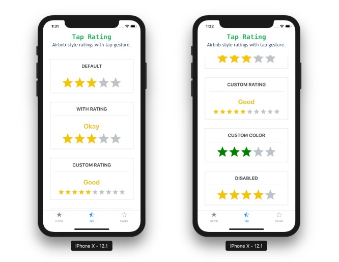
Tap Rating

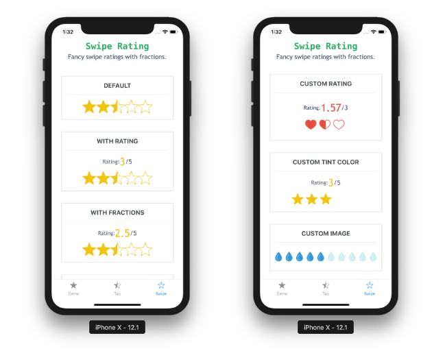
Swipe Rating

Installation
Install the package using yarn or npm:
yarn add react-native-ratings
OR
npm install --save react-native-ratings
Usage
import { Rating, AirbnbRating } from 'react-native-ratings';

const WATER_IMAGE = require('./water.png')

ratingCompleted(rating) {
  console.log("Rating is: " + rating)
}

<AirbnbRating />

<AirbnbRating
  count={11}
  reviews={["Terrible", "Bad", "Meh", "OK", "Good", "Hmm...", "Very Good", "Wow", "Amazing", "Unbelievable", "Jesus"]}
  defaultRating={11}
  size={20}
/>

<Rating
  showRating
  onFinishRating={this.ratingCompleted}
  style={{ paddingVertical: 10 }}
/>

<Rating
  type='heart'
  ratingCount={3}
  imageSize={60}
  showRating
  onFinishRating={this.ratingCompleted}
/>

<Rating
  type='custom'
  ratingImage={WATER_IMAGE}
  ratingColor='#3498db'
  ratingBackgroundColor='#c8c7c8'
  ratingCount={10}
  imageSize={30}
  onFinishRating={this.ratingCompleted}
  style={{ paddingVertical: 10 }}
/>
Also refer to the example app for more detailed usage example.
You can also run the Expo app locally.
API
| prop | default | type | description |
|---|---|---|---|
| onFinishRating | none | function | Callback method when the user finishes rating. Gives you the final rating value as a whole number (required) |
| type | star | string | Choose one of the built-in types: star, rocket, bell, heart or use type custom to render a custom image (optional) |
| ratingImage | star | string | Pass in a custom image source; use this along with type='custom' prop above (optional) |
| ratingColor | #f1c40f | string (color) | Pass in a custom fill-color for the rating icon; use this along with type='custom' prop above (optional) |
| ratingBackgroundColor | white | string (color) | Pass in a custom background-fill-color for the rating icon; use this along with type='custom' prop above (optional) |
| ratingCount | 5 | number | The number of rating images to display (optional) |
| imageSize | 50 | number | The size of each rating image (optional) |
| showRating | none | boolean | Displays the Built-in Rating UI to show the rating value in real-time (optional) |
| style | none | function | Exposes style prop to add additonal styling to the container view (optional) |


