React Native Feather Icons
react-native-feather is a collection of simply beautiful open source icons for React Native. Each icon is designed on a 24x24 grid with an emphasis on simplicity, consistency and readability.
At its core, Feather is a collection of SVG files. To use SVG files on React Native, react-native-svg is needed. This component contains all Feather icons converted to make compatible with react-native-svg package.
Based on Feather Icons v4.28.0
Installation
- Ensure sure you've installed
react-native-svg npm i react-native-feather
Icons
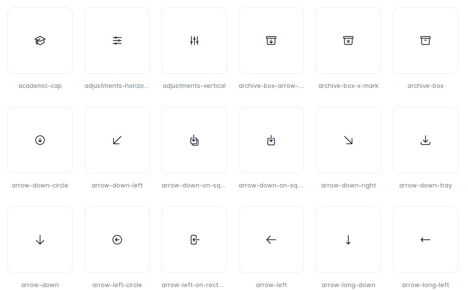
List of available icons in this component. https://feathericons.com
Usage
To use icons as component, all icon names is formatted to Pascal Case. arrow-up-circle => <ArrowUpCircle/>
import { ArrowUpCircle } from "react-native-feather";

const App = () => {
  return <ArrowUpCircle />;
};
Icons can be configured with inline props:
<ArrowUpCircle stroke="red" fill="#fff" width={32} height={32} />
You can also include the whole icon pack:
import * as Icon from "react-native-feather";

const App = () => {
  return <Icon.ArrowUpCircle />;
};
Properties
Any Svg property and the following:
| Prop | Description | Default |
|---|---|---|
| width | Width of the icon. | 24 |
| height | Height of the icon. | 24 |
| stroke | The stroke prop refers to the color outline the icon. | "currentColor" |
| strokeWidth | The strokeWidth prop specifies the width of the outline on the icon. | 2 |
| fill | The fill prop refers to the color inside the icon. | "none" |


