React Native Star Rating Component
A React Native component for generating and displaying interactive star ratings. Compatible with both iOS and Android.
Installation
- install react-native-star-rating and its dependeices
npm install react-native-star-rating --save
or
yarn add react-native-star-rating
- link
react-native-vector-icons
please refer to react-native-vector-icons installation guide
Usage
Props
| Prop | Type | Description | Required | Default |
|---|---|---|---|---|
activeOpacity |
number |
Number between 0 a 1 to determine the opacity of the button. | No |
0.2 |
animation |
string |
Add an animation to the stars when upon selection. Refer to react-native-animatable for the different animation types. | No |
undefined |
buttonStyle |
ViewPropTypes.style |
Style of the button containing the star. | No |
{} |
containerStyle |
ViewPropTypes.style |
Style of the element containing the star rating component. | No |
{} |
disabled |
bool |
Sets the interactivity of the star buttons. | No |
false |
emptyStar |
string or image object |
The name of the icon to represent an empty star. Refer to react-native-vector-icons. Also can be a image object, both {uri:xxx.xxx} and require('xx/xx/xx.xxx'). | No |
star-o |
emptyStarColor |
string |
Color of an empty star. | No |
gray |
fullStar |
string or image object |
The name of the icon to represent a full star. Refer to react-native-vector-icons. Also can be a image object, both {uri:xxx.xxx} and require('xx/xx/xx.xxx'). | No |
star |
fullStarColor |
string |
Color of a filled star. | No |
black |
halfStar |
string or image object |
The name of the icon to represent an half star. Refer to react-native-vector-icons. Also can be a image object, both {uri:xxx.xxx} and require('xx/xx/xx.xxx'). | No |
star-half-o |
halfStarColor |
string |
Color of a half-filled star. Defaults to fullStarColor. |
No |
undefined |
halfStarEnabled |
bool |
Sets ability to select half stars | No |
false |
iconSet |
string |
The name of the icon set the star image belongs to. Refer to react-native-vector-icons. | No |
FontAwesome |
maxStars |
number |
The maximum number of stars possible. | No |
5 |
rating |
number |
The current rating to show. | No |
0 |
reversed |
bool |
Renders stars from right to left | No |
false |
selectedStar |
function |
A function to handle star button presses. | Yes |
() => {} |
starSize |
number |
Size of the star. | No |
40 |
starStyle |
ViewPropTypes.style |
Style to apply to the star. | No |
{} |
For the emptyStar, fullStar, halfStar, and iconSet props, please refer to the react-native-vector-icons package for the valid string names for the star icons. When selecting the icon string names, you must remember to remove the font family name before the first hyphen. For example, if you want to use the ion-ios-star from the Ionicon font set, you would set the fullStar prop to ios-star and the iconSet to Ionicons.
For the animation prop, please refer to the react-native-animatable package for valid string names for the different animations available.
General Star Example
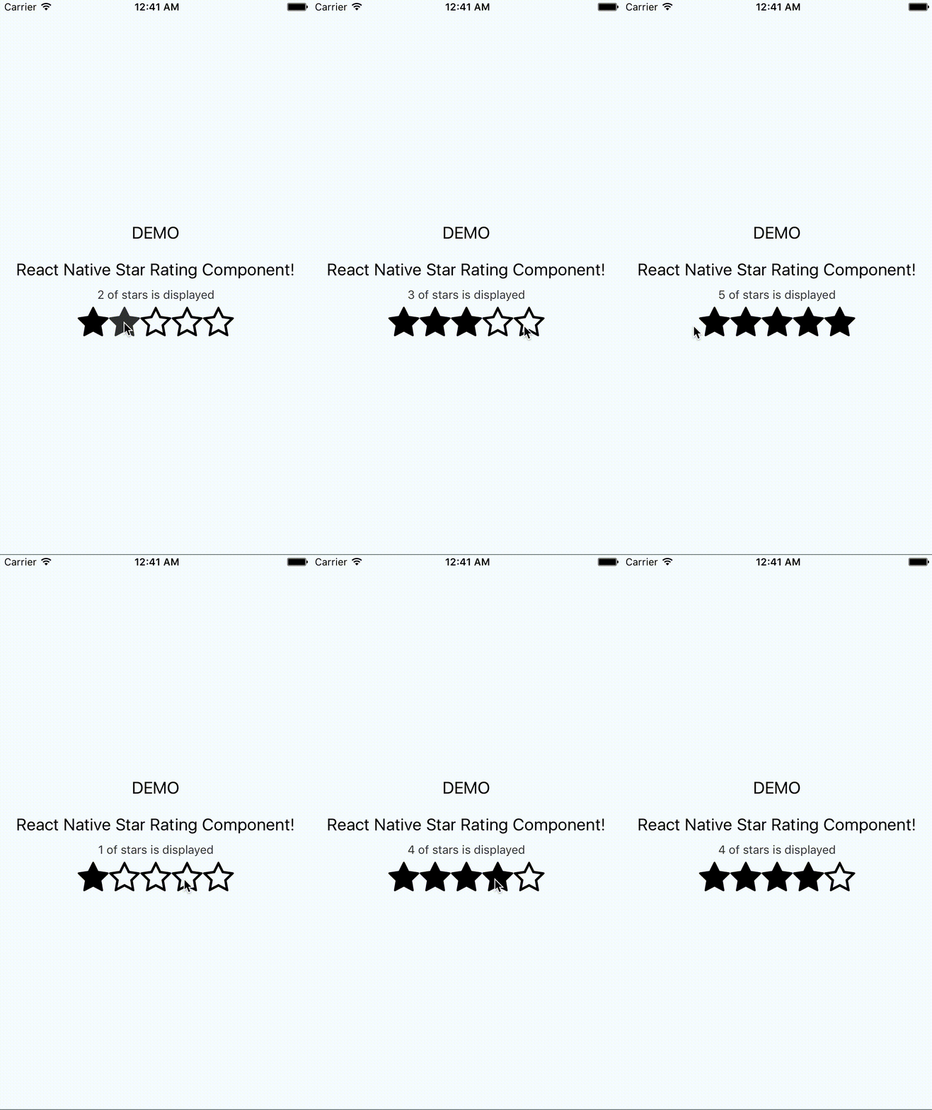
The following example will render 3.5 stars out of 5 stars using the star-o for the empty star icon, star-half-o for the half star icon, and star for the full star icon from the FontAwesome icon set in black color.
import StarRating from 'react-native-star-rating';

class GeneralStarExample extends Component {

  constructor(props) {
    super(props);
    this.state = {
      starCount: 3.5
    };
  }

  onStarRatingPress(rating) {
    this.setState({
      starCount: rating
    });
  }

  render() {
    return (
      <StarRating
        disabled={false}
        maxStars={5}
        rating={this.state.starCount}
        selectedStar={(rating) => this.onStarRatingPress(rating)}
      />
    );
  }
}

export default GeneralStarExample

Custom Star Case
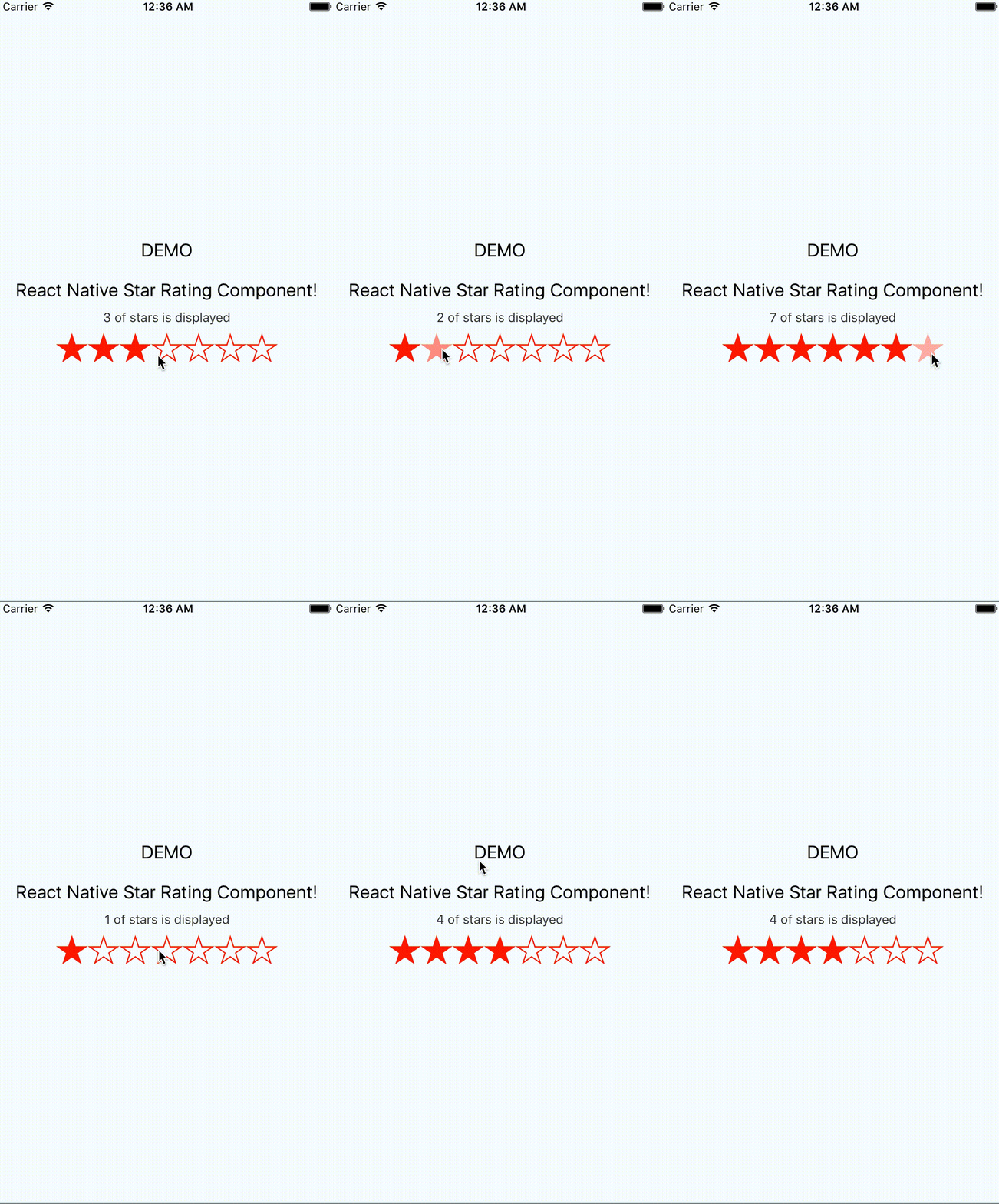
The following example will render 2.5 stars out of 7 stars using the ios-star-outline for the empty star icon, ios-star-half for the half star icon, and ios-star for the full star icon from the Ionicons icon set in red color.
import StarRating from 'react-native-star-rating';

class CustomStarExample extends Component {

  constructor(props) {
    super(props);
    this.state = {
      starCount: 2.5
    };
  }

  onStarRatingPress(rating) {
    this.setState({
      starCount: rating
    });
  }

  render() {
    return (
      <StarRating
        disabled={false}
        emptyStar={'ios-star-outline'}
        fullStar={'ios-star'}
        halfStar={'ios-star-half'}
        iconSet={'Ionicons'}
        maxStars={7}
        rating={this.state.starCount}
        selectedStar={(rating) => this.onStarRatingPress(rating)}
        fullStarColor={'red'}
      />
    );
  }
}

export default CustomStarExample

Running the ExampleApp (WIP)
Navigate to the root of the ExampleApp and install the dependencies
cd ExampleApp && npm install
Run the app on the iOS simulator.
npm run ios
Development Setup (WIP)
Be sure to have create-react-native-app installed.
npm install -g create-react-native-app
Create a development app in the root folder.
create-react-native-app DevelopmentApp
Going into the development app and clone this repo.
cd DevelopmentApp && git clone https://github.com/djchie/react-native-star-rating.git
Go into the react-native-star-rating directory and start developing!
cd react-native-star-rating


