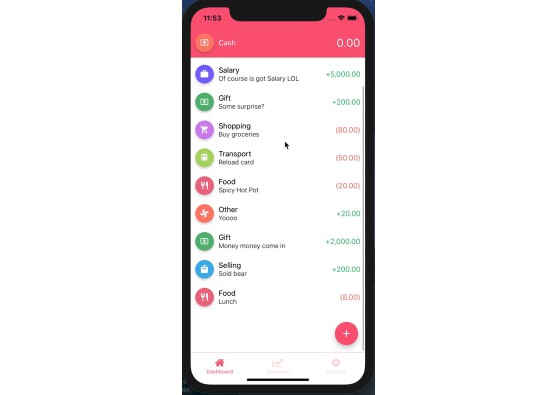
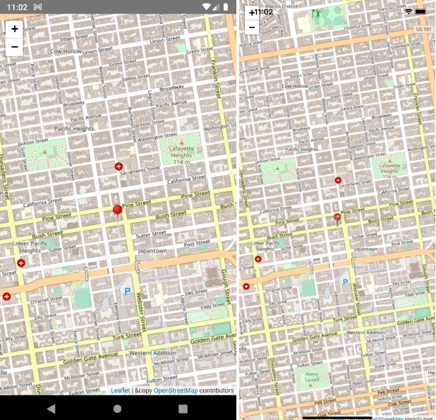
react-native-render-html
An iOS/Android pure javascript react-native component that renders your HTML into 100% native views. It's made to be extremely customizable and easy to use and aims at being able to render anything you throw at it.
Based on the original work of Thomas Beverley, props to him.

Install
npm install react-native-render-html --save or yarn add react-native-render-html
Basic usage
import React, { Component } from 'react';
import { ScrollView, Dimensions } from 'react-native';
import HTML from 'react-native-render-html';

const htmlContent = `
    <h1>This HTML snippet is now rendered with native components !</h1>
    <h2>Enjoy a webview-free and blazing fast application</h2>
    <img src="https://i.imgur.com/dHLmxfO.jpg?2" />
    <em style="textAlign: center;">Look at how happy this native cat is</em>
`;

export default class Demo extends Component {
    render () {
        return (
            <ScrollView style={{ flex: 1 }}>
                <HTML html={htmlContent} imagesMaxWidth={Dimensions.get('window').width} />
            </ScrollView>
        );
    }
}
Props
| Prop | Description | Type | Required/Default |
|---|---|---|---|
renderers |
Your custom renderers | object |
Optional, some default ones are supplied (<a>, <img>...) |
renderersProps |
Set of props accessible into your custom renderers in passProps (4th argument) |
object |
Optional |
html |
HTML string to parse and render | string |
Required |
uri |
(experimental) remote website to parse and render | string |
Optional |
decodeEntities |
Decode HTML entities of your content | bool |
Optional, defaults to true |
imagesMaxWidth |
Resize your images to this maximum width, see images | number |
Optional |
staticContentMaxWidth |
Set a maximum width to non-responsive content (<iframe> for instance) |
number |
Optional |
imagesInitialDimensions |
Default width and height to display while image's dimensions are being retrieved, see images | { width: 100, height: 100 } |
Optional |
onLinkPress |
Fired with the event, the href and an object with all attributes of the tag as its arguments when tapping a link | function |
Optional |
onParsed |
Fired when your HTML content has been parsed. Also useful to tweak your rendering, see onParsed | function |
Optional |
tagsStyles |
Provide your styles for specific HTML tags, see styling | object |
Optional |
classesStyles |
Provide your styles for specific HTML classes, see styling | object |
Optional |
listsPrefixesRenderers |
Your custom renderers from ul and ol bullets, see lists prefixes |
object |
Optional |
containerStyle |
Custom style for the default container of the renderered HTML | object |
Optional |
customWrapper |
Replace the default wrapper with a function that takes your content as the first parameter | function |
Optional |
remoteLoadingView |
Replace the default loader while fetching a remote website's content | function |
Optional |
remoteErrorView |
Replace the default error if a remote website's content could not be fetched | function |
Optional |
emSize |
The default value in pixels for 1em |
number |
14 |
ptSize |
The default value in pixels for 1pt |
number |
1.3 |
baseFontStyle |
The default style applied to <Text> components |
object |
{ fontSize: 14 } |
allowFontScaling |
Specifies whether fonts should scale to respect Text Size accessibility settings | boolean |
true |
textSelectable |
Allow all texts to be selected | boolean |
false |
alterData |
Target some specific texts and change their content, see altering content | function |
Optional |
alterChildren |
Target some specific nested children and change them, see altering content | function |
Optional |
alterNode |
Target a specific node and change it, see altering content | function |
Optional |
ignoredTags |
HTML tags you don't want rendered, see ignoring HTML content | array |
Optional, ['head', 'scripts', ...] |
allowedStyles |
Allow render only certain CSS style properties and ignore every other. If you have some property both in allowedStyles and ignoredStyles, it will be ignored anyway. |
array |
Optional, everything is allowed by default |
ignoredStyles |
CSS styles from the style attribute you don't want rendered, see ignoring HTML content |
array |
Optional |
ignoreNodesFunction |
Return true in this custom function to ignore nodes very precisely, see ignoring HTML content | function |
Optional |
debug |
Prints the parsing result from htmlparser2 and render-html after the initial render | bool |
Optional, defaults to false |
Demo
This component comes with a demo that showcases every feature presented here. It's very useful to keep track of bugs and rendering differences between the different versions of react-native.
It is mandatory to refer to an example of the demo or to provide one when submitting an issue or a pull request for a new feature.
Feel free to write more advanced examples and submit a pull-request for it, it will probably be very useful for other users.
Creating custom renderers
This is very useful if you want to make some very specific styling of your HTML content, or even implement custom HTML tags.
Custom HTML tags
Just pass an object to the renderers prop with the tag name as the key, an a function as its value, like so :
renderers: {
    hr: () => <View style={{ width: '100%', height: 1, backgroundColor: 'blue' }} />
}
Here, we have overriden the default <hr /> renderer and made it a blue line.
You can also create your own tags and use them in your HTML content :
const content = `<bluecircle></bluecircle>`;
...

renderers: {
    bluecircle: () => <View style={{ width: 20, height: 20, borderRadius: 10, backgroundColor: 'blue' }} />
}
Your renderers functions receive several arguments that will be very useful to make some very specific rendering.
htmlAttribs: attributes attached to the node, parsed in a react-native waychildren: array with the children of the nodeconvertedCSSStyles: conversion of thestyleattribute from CSS to react-native's stylesheetpassProps: various useful information : yourrenderersProps,groupInfo,parentTagName,parentIsText...
Making your custom component block or inline
By default, a custom renderer behaves like a block. So if you're rendering it between texts inside a <p>, you'll break your line.
If you want it to be inline, you can slightly change the way you declare it, like this :
renderers: {
    mytag: { renderer: myTagRenderer, wrapper: 'Text' }, // new way, is inline
    myothertag: myOtherTagRenderer // old regular way (still valid, behaves like a block)
}
Note : the only values for
wrapperareTextorView(default). Those don't represent the<View>and<Text>component of react-native but are instead used in the parser to prevent crashes and properly render every HTML markup.
Lists prefixes
The default renderer of the <ul> and <ol> tags will either render a bullet or the count of your elements. If you wish to change this without having to re-write the whole list rendering implementation, you can use the listsPrefixesRenderers prop.
Just like with the renderers prop, supply an object with ul and/or ul as functions that receive the same arguments as your custom HTML tags. For instance, you can swap the default black bullet of <ul> with a blue cross :
// ... your props
ul: (htmlAttribs, children, convertedCSSStyles, passProps) => {
    return (
        <Text style={{ color: 'blue', fontSize: 16 }}>+</Text>
    );
}
Styling
In addition to your custom renderers, you can apply specific styles to HTML tags (tagsStyles) or HTML classes (classesStyles). You can also combine these styles with your custom renderers.
Styling options override themselves, so you might render a custom HTML tag with a custom renderer like <bluecircle>, make it green with a class <bluecircle class="make-me-green"> or make it red by styling the tag itself.
The default style of your custom renderer will be merged to the one from your classesStyles which will also be merged by the style attribute.
IMPORTANT NOTE : Do NOT use the
StyleSheetAPI to create the styles you're going to feed totagsStyleandclassesStyles. Although it might look like it's working at first, the caching logic ofreact-nativemakes it impossible for this module to deep check each of your style to properly apply the precedence and priorities of your nested tags' styles.
Here's a usage example
// props
    tagsStyles: { i: { textAlign: 'center', fontStyle: 'italic', color: 'grey' } },
    classesStyles: { 'last-paragraph': { textAlign: 'right', color: 'teal', fontWeight: '800' } }

const html = `
    <i>Here, we have a style set on the "i" tag with the "tagsStyles" prop.</i>
    <p class="last-paragraph">Finally, this paragraph is styled through the classesStyles prop</p>`;

Images
By default, unstyled images will be rendered with their respective height and width without resizing. You can force their dimensions by using the style attribute in your HTML content or style them with a class or through the <img> tag.
If you can't set the dimension of each image in your content, you might find the imagesMaxWidth prop useful. It resizes (and keeps proportions) your images to a maximum width, ensuring that your images won't overflow out of your viewport.
A nice trick, demonstrated in the basic usage of this module is to use the Dimensions API of react-native : imagesMaxWidth={Dimensions.get('window').width}. You could subtract a value to it to make a margin.
Please note that if you set width AND height through any mean of styling, imagesMaxWidth will be ignored.
Before their dimensions have been properly retrieved, images will temporarily be rendered in 100px wide squares. You can override this default value with prop imagesInitialDimensions.
Images with broken links will render an empty square with a thin border, similar to what safari renders in a webview.
Please note that all of these behaviors are implemented in the default <img> renderer. If you want to provide your own <img> renderer, you'll have to make this happen by yourself. You can use the img function in HTMLRenderers.js as a starting point.
Altering content
alterData and alterChildren props are very useful to make some modifications on the structure of your HTML before it's actually rendered with react components.
They both are functions that receive the parsed node as their first and only parameter. You must return your changes: a string with alterData and an array with alterChildren or a falsy value if you don't need to change anything.
alterData
alterData allows you to change the text content of your nodes. For instance, you can customize the content of <h1> and <h2> to render your titles in uppercase.
Here's how you would do that :
// ... your props
alterData: (node) => {
    let { parent, data } = node;
    if (parent && parent.name === 'h1') {
        // Texts elements are always children of wrappers, this is why we check the tag
        // with "parent.name" and not "name"
        return data.toUpperCase();
    }
    // Don't return anything (eg a falsy value) for anything else than the <h1> tag so nothing is altered
}
alterChildren
alterChildren allows you to change the children wrapped in any node. For instance, you might want to change the content of a list.
Here's an example :
// ... your props
alterChildren: (node) => {
    const { children, name } = node;
    if (name === 'ol' && children && children.length) {
        // Keep only the first two elements of the list
        return children.splice(0, 2);
    }
    // Don't return anything (eg a falsy value) for anything else than the <ol> tag so nothing is altered
}
alterNode
alterNode allows you to change the values parsed from your HTML before it's rendered. It's extremely powerful as a last resort to add some very specific styling or circumvent rendering problems.
Here's an advanced example where you would change the color of links inside a <blockquote> :
alterNode: (node) => {
    const { name, parent } = node;
    // If the tag is an <a> and we've found a parent to be a blockquote
    // (see the utils part of this documentation to know more about getParentsTagsRecursively)
    if (name === 'a' && getParentsTagsRecursively(parent).indexOf('blockquote') !== -1) {
        // Let's assign a specific color to the node's attribs (if there already are)
        node.attribs = { ...(node.attribs || {}), style: `color:lightblue;` };
        return node;
    }
    // Don't return anything (eg a falsy value) for anything else so nothing is altered
}
onParsed
onParsed is a callback and lets you know when your HTML has been parsed. Its first argument is the dom array from htmlparser2, its second is RNElements which is the result of the parsing of this module.
If you want to tweak the parsed values, you can change RNElements and return it. For instance, you could insert one of your custom component although it was not in your HTML content, like this :
onHTMLParsed = (dom, RNElements) => {
    // Find the index of the first paragraph
    const ad = {
        wrapper: 'View',
        tagName: 'mycustomblock',
        attribs: {},
        parent: false,
        parentTag: false,
        nodeIndex: 4
    };
    // Insert the component
    RNElements.splice(4, 0, ad);
    return RNElements;
}
Ignoring HTML content
You can't expect native components to be able to render everything you can find in your browser. And you might not entirely trust your contributors, so here are 3 props allowing you to prevent disasters without sanitizing your HTML on the server-side (that doesn't mean you shouldn't !).
ignoredTags: array of ignored HTML tags, by defaultheadandscriptsare removedignoredStyles: array of ignored CSS rules. Nothing is ignored by defaultignoreNodesFunction: this is a cumbersome, yet powerful, way of ignoring very specific stuff.
Please note that if you supply ignoredTags, you will override the default ignored ones. There are a lot of them, if you want to keep them and add your own, you can do something like :
import { IGNORED_TAGS } from 'react-native-render-html/src/HTMLUtils';
...

// your props
ignoredTags={[ ...IGNORED_TAGS, 'tag1', 'tag2']}
ignoreNodesFunction receives 3 parameters : node, parentTagName and parentIsText.
node is the result of the HTML parsing, which allows you to look for children, check the parent's markup and much more. parentTagName is a convenient way to access the parent of your node, and parentIsText is a great way to make sure you won't be rendering a <View> inside a <Text> which, right now, makes react-native crash.
Useful functions
The API is exposing some functions you can use to write advanced behaviors more easily.
You can import them like so :
import { functionName } from 'react-native-render-html/src/HTMLUtils';
getParentsTagsRecursively(node)- Description : Returns an array with the tagname of every parent of a node or an empty array if nothing is found.
- Parameters : -
node: a parsed HTML node fromalterChildrenfor example - Returns : An empty array or an array of strings.
- Notes : this is very useful to check if a node is nested in a specific parent. See alterNode for an advanced example.
getClosestNodeParentByTag(node, tag)- Description: Returns the closest parent of a node with a specific tag.
- Parameters : -
node: a parsed HTML node fromalterChildrenfor example - Returns : An HTML node if found.


