React Native Dark
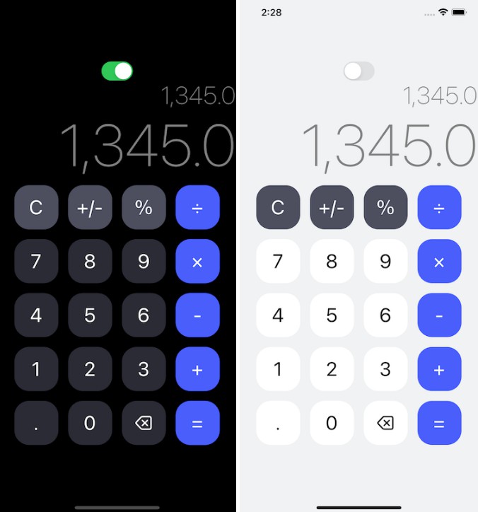
react-native-dark aims to be a slim, drop-in replacement for React Native’s StyleSheet.create method that supports dynamic dark-mode styling with little hassle.
A little, illustrative example:
import { StyleSheet, Text, View } from "react-native";
import { createStyleSheet, useDynamicDarkModeStyles } from "react-native-dark";

export default function App() {
  // Need this ? for dynamic styles
  useDynamicDarkModeStyles();

  return (
    <View style={styles.container}>
      <Text style={styles.title}>Hello, world!</Text>
    </View>
  );
}

const styles = createStyleSheet({
  container: {
    flex: 1,
    backgroundColor: "white",
    // ? dark mode ?
    $dark: {
      backgroundColor: "black",
    },
  },

  title: {
    color: "black",
    // ? dark mode ?
    $dark: {
      color: "white",
    },
  },
});
Setup
From a React Native (or Expo) project, install react-native-dark from npm:
npm install react-native-dark # npm
yarn add react-native-dark # yarn
pnpm add react-native-dark # pnpm
That’s it.
API
createStyleSheet
A StyleSheet.create replacement where each key’s value can also accept a $dark field with a set of styles to be applied when in dark mode.
import { createStyleSheet } from "react-native-dark";

const styles = createStyleSheet({
  container: { flex: 1 }, // ? can use like normal StyleSheet.create style

  // ? Or use $dark field to apply styles in dark mode.
  title: {
    color: "black",
    $dark: {
      color: "white",
      fontSize: 24
    }
  }
});

styles.title; // has black color in light mode, and (larger) white color in dark mode
useDynamicDarkModeStyles
An argument-less hook that subscribes to changes to the user’s color scheme preference, and triggers a re-render accordingly. This is needed to inform React when the color scheme preference changes, otherwise your UI’s display will be “stale” when color scheme preference changes.
import { createStyleSheet, useDynamicDarkModeStyles } from "react-native-dark";
import { View, Text } from "react-native";

export const MyComponent = () => {
  useDynamicDarkModeStyles(); // ? Need this if you want styles to update on color scheme change.

  return (
    <View style={styles.container}>
      <Text style={styles.title}>HELLO WORLD!</Text>
    </View>
  )
}

const styles = createStyleSheet({
  container: { flex: 1 },
  title: {
    color: "black",
    $dark: {
      color: "white",
      fontSize: 24
    }
  }
});
setColorScheme
A method to override the system default color scheme.
setColorScheme: (override: "light" | "dark" | "auto") => void;
E.g. call setColorScheme("dark") to apply dark-mode styles even if system color scheme preference is “light”.


