react-native-swipe-up-down
React Native Swipe Up Down Component.
This module support iOS & Android
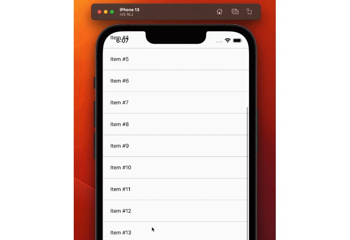
Demo

When hidden component

Getting started
$ npm install react-native-swipe-up-down --save
- OR
$ yarn add react-native-swipe-up-down
Usage
import SwipeUpDown from 'react-native-swipe-up-down';

// TODO: What to do with the module?
<SwipeUpDown
	itemMini={<ItemMini />} // Pass props component when collapsed
	itemFull={<ItemFull />} // Pass props component when show full
	onShowMini={() => console.log('mini')}
	onShowFull={() => console.log('full')}
	onMoveDown={() => console.log('down')}
	onMoveUp={() => console.log('up')}
	disablePressToShow={false} // Press item mini to show full
	style={{ backgroundColor: 'green' }} // style for swipe
/>
More Props
Note
If you want hidden component just don't pass props itemMini. It's will hidden. And then you can use hasRef to show it when you want.
hasRef
 hasRef={ref => (this.swipeUpDownRef = ref)}
 // This ref can help you show component when hidden component
 <Text onPress={() => this.swipeUpDownRef.showFull()}>Show</Text>
animation
animation="easeInEaseOut"
Optional
- 'linear'
- 'spring'
- 'easeInEaseOut'
- 'none'
swipeHeight
swipeHeight={100} // Default 60