React Native: Native Styled Dialogs
React Native Library that shows a beautiful and customizable designed dialog with header. This library is a bridge around Android: MaterialStyledDialogs & iOS: PMAlertController
Getting started
$ npm install react-native-styled-dialogs --save
$ react-native link react-native-styled-dialogs
- Android
Library id supported SDK 25 > above
Please add below snippet into your app build.gradle
allprojects {
    repositories {
        mavenLocal()
        jcenter()
        maven {
            url "https://jitpack.io"
        }
    }
}
-
iOS
-
Run Command: cd ../node_modules/react-native-styled-dialogs/ios && pod install. If it has error => try pod repo update then pod install
-
Add PMAlertController in your app Embedded Binaries & Linked Frameworks and Libraries. Please follow below video in order to achieve the same:

-
Now build your iOS app through Xcode
-
If you receive below error, please check video below in order to resolve the same:

SOLUTION

-
Usage
import RNStyledDialogs from 'react-native-styled-dialogs';
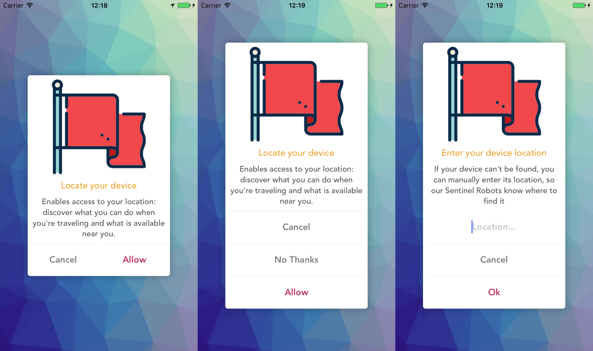
RNStyledDialogs.Show({
title: "Awesome!",
description:
"Glad to you like RNStyledDialogs! If you are up for it, we would like to appreciate you receiving us.",
positiveText: "Go",
neutralText: "Close",
negativeText: "Later",
onPositive: () => { },
onNeutral: () => { },
onNegative: () => { },
onCancellable: () => { }
});
Props
- Props: Generic
| Prop | Type | Default | Note |
|---|---|---|---|
title |
string |
Specify title on dialogs | |
description |
string |
Specify description on dialog | |
positiveText |
string |
Specify positive button text | |
neutralText |
string |
Specify neutral button text | |
negativeText |
string |
Specify positive negative button text | |
headerBackgroundColor |
string - HEX COLOR |
#FFFFFF |
Specify header background color |
headerIcon |
string |
Specify header icon | |
dialogAnimation |
bool |
true |
Specify dialog animation (enable/disable) |
darkerOverlay |
bool |
false |
Specify dialog overlay (enable/disable) |
cancelable |
bool |
Specify cancelable of dialog behaviour (enable/disable) | |
autoDismiss |
bool |
false |
Specify dialog should get automatically dismiss or not (enable/disable) |
onPositive |
func |
Specify positive click callback function | |
onNeutral |
bool |
Specify netural click callback function | |
onNegative |
bool |
Specify negative click callback function | |
onCancellation |
bool |
true |
Specify cancellation callback function |
- Props: Android
| Prop | Type | Default | Note |
|---|---|---|---|
headerBackgroundImage |
string |
Specify header background image | |
headerTitle |
string |
Specify header title | |
headerIconAnimation |
bool |
true |
Specify header icon animation (enable/disable) |
scrollable |
bool |
false |
Specify description scrollable (enable/disable) |
maxLines |
number |
5 |
Specify description max number of lines |
- Props: iOS
| Prop | Type | Default | Note |
|---|---|---|---|
positiveTextColor |
string - HEX COLOR |
Specify positive button text color | |
positiveBackgroundColor |
string - HEX COLOR |
#FFFFFF |
Specify positive button background color |
neutralTextColor |
string - HEX COLOR |
Specify neutral button text color | |
neutralBackgroundColor |
string - HEX COLOR |
#FFFFFF |
Specify neutral button background color |
negativeTextColor |
string - HEX COLOR |
Specify negative button text color | |
negativeBackgroundColor |
string - HEX COLOR |
#FFFFFF |
Specify negative button background color |
Providing Images
Note: Since we are using native libraries, we have not found a solution in order to render RN Images in production, therefore please copy all your image assets in platform specific folders:
- Android: Please copy your image assets in app resource drawable folder
- iOS: Please copy your image assets in app resources folder
Please refer example application for the image usage.