react-native-collapsible-tab-view
A cross-platform Collapsible Tab View component for React Native.
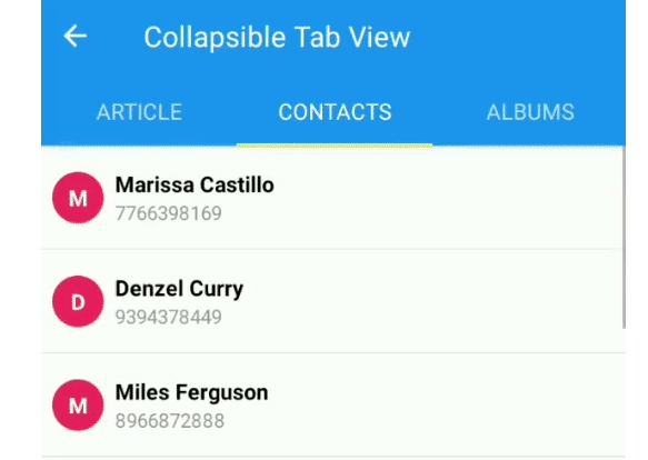
Expo app
A simple wrapper for react-native-tab-view that helps to build a collapsible tab view.
- View it with Expo.
- Checkout the examples for the source code of the Expo app.
Demo

Features
From react-native-tab-view
- Smooth animations and gestures
- Scrollable tabs
- Supports
both top andbottom tab bars - Follows Material Design spec
- Highly customizable
- Fully typed with TypeScript
From this package
- Integration with react-navigation - optional
- Collapsible Tabs
Installation
Open a Terminal in the project root and run:
yarn add react-native-collapsible-tab-view
Now add react-native-tab-view and all it's peer dependencies:
yarn add react-native-tab-view
For the peer dependencies, if using expo:
expo install react-native-gesture-handler react-native-reanimated
If not using expo, follow these instructions.
React Navigation Integration - Optional
If you want to integrate with react-navigation:
yarn add @react-navigation/native @react-navigation/material-top-tabs
Quick Start
import * as React from 'react';
import { StyleSheet, View, Text, Animated } from 'react-native';
import {
  CollapsibleTabView,
  useCollapsibleScene,
} from 'react-native-collapsible-tab-view';
import { SceneMap } from 'react-native-tab-view';

type Route = {
  key: string;
  title: string;
};

const SomeRoute: React.FC<{ routeKey: string; color: string }> = ({
  routeKey,
  color,
}) => {
  const scrollPropsAndRef = useCollapsibleScene(routeKey);

  return (
    <Animated.ScrollView
      style={{ backgroundColor: color }}
      {...scrollPropsAndRef}
    >
      <View style={styles.content} />
    </Animated.ScrollView>
  );
};

const FirstScene = () => <SomeRoute routeKey="first" color="white" />;
const SecondScene = () => <SomeRoute routeKey="second" color="black" />;

const HEADER_HEIGHT = 250;

const renderHeader = () => (
  <View style={styles.header}>
    <Text style={styles.headerText}>COLLAPSIBLE</Text>
  </View>
);

const renderScene = SceneMap({
  first: FirstScene,
  second: SecondScene,
});

const App: React.FC<object> = () => {
  const [index, setIndex] = React.useState(0);
  const [routes] = React.useState<Route[]>([
    { key: 'first', title: 'First' },
    { key: 'second', title: 'Second' },
  ]);

  const handleIndexChange = (index: number) => {
    setIndex(index);
  };

  return (
    <CollapsibleTabView<Route>
      navigationState={{ index, routes }}
      renderScene={renderScene}
      onIndexChange={handleIndexChange}
      renderHeader={renderHeader} // optional
      headerHeight={HEADER_HEIGHT} // optional, will be computed.
    />
  );
};

export default App;

const styles = StyleSheet.create({
  header: {
    height: HEADER_HEIGHT,
    backgroundColor: '#2196f3',
    justifyContent: 'center',
    alignItems: 'center',
    elevation: 4,
  },
  headerText: {
    color: 'white',
    fontSize: 24,
  },
  content: {
    height: 1500,
  },
});
API reference
The package has 3 main exports:
| export | description |
|---|---|
| CollapsibleTabView | Component which is the one you'd use to render the collapsible tab view. |
| useCollapsibleScene | Hook which you use to get props and ref for ScrollView or FlatList. |
| createMaterialCollapsibleTopTabNavigator | Function to create the Navigator, if you are integrating with react-navigation |
CollapsibleTabView
Simple wrapper of the original TabView.
Basic usage looks like this:
<CollapsibleTabView
  navigationState={{ index, routes }}
  onIndexChange={setIndex}
  renderScene={SceneMap({
    first: FirstRoute,
    second: SecondRoute,
  })}
  renderHeader={() => <MyHeader />} // optional
  headerHeight={HEADER_HEIGHT} // optional
/>
Props
All props are optional, but if you are not rendering a header, you'd be probably better with the original TabView.
| prop | description | default |
|---|---|---|
animatedValue? |
Optionally controlled animated value. | new Animated.Value(0) |
headerHeight? |
Header component height. It is computed on layout. Providing it is just an optimization. | 0 |
tabBarHeight? |
Tab bar height. | 49 |
tabBarProps? |
Props passed to the tab bar component. | undefined |
renderHeader? |
Header rendered on top of the tab bar. | () => null |
headerContainerStyle? |
Styles applied to header and tabbar container. | undefined |
preventTabPressOnGliding? |
Prevent tab press if screen is gliding. Ignored if renderTabBar is provided. |
true |
disableSnap? |
Disable the snap animation. | false |
renderTabBar? |
Same as renderTabBar of the original TabView, but with the additional isGliding property. |
undefined |
snapThreshold? |
Percentage of header height to make the snap effect. A number between 0 and 1. | 0.5 |
onHeaderHeightChange? |
Callback fired when the headerHeight state value inside CollapsibleTabView will be updated in the onLayout event from the tab/header container.Useful to call layout animations. Example: () => {LayoutAnimation.configureNext(preset)}; |
undefined |
routeKeyProp? |
The property from the routes map to use for the active route key. |
key |
useCollapsibleScene
A hook to get all props and ref for the animated component in order to make the collapsible tabs work.
Works with:
- Animated.ScrollView
- Animated.FlatList
const FirstScene: React.FC<object> = ({ children }) => {
  const scrollPropsAndRef = useCollapsibleScene('firstScene');

  return (
    <Animated.ScrollView {...scrollPropsAndRef}>{children}</Animated.ScrollView>
  );
};
It includes de following values:
| value | description |
|---|---|
ref |
Function to get ref from scrollable components inside the scene, and track in the Collapsible Tab View. |
onScroll |
Scroll event, enabled only for the focused route. |
scrollEnabled |
Disable scroll for unfocused routes is optional, but prevents weird/delayed animations if the user changes tabs and quickly start scrolling the new tab, before the animated value starting to track the new focused route. |
contentContainerStyle |
Content container style with top padding with the same height as the tab bar + header height. |
progressViewOffset |
Needed for the loading indicator to show correctly on android. |
| onMomentumScrollBegin | Callback to set isGliding to true. |
onScrollEndDrag |
Callback to sync the scroll of unfocused routes. |
onMomentumScrollEnd |
Callback to sync the scroll of unfocused routes. |
createMaterialCollapsibleTopTabNavigator
Same API as the createMaterialTopTabNavigator (not-collapsible), with aditional collapsibleOptions prop, extending all props of CollapsibleTabView.
Contributing
While developing, you can run the example app to test your changes.
Please follow the angular commit message format.
Make sure your code passes TypeScript and ESLint. Run the following to verify:
yarn typescript
yarn lint
To fix formatting errors, run the following:
yarn lint -- --fix