React-Native-Material-Cards
A material design card component, customizable and versatile.
Installation
npm install --save react-native-material-cards
Basic Usage
import { Card, CardTitle, CardContent, CardAction, CardButton, CardImage } from 'react-native-material-cards'
Code
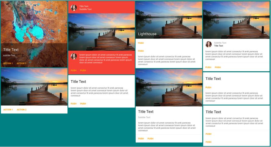
<Card>
  <CardImage source={{uri: 'http://placehold.it/480x270'}} title="Above all i am here"/>
  <CardTitle title="This is title" subtitle="This is sub title"/>
  <CardContent text="Your device will reboot in few seconds once successful, be patient meanwhile"/>
  <CardAction seperator={true} inColumn={false}>
    <CardButton
      onPress={() => {}}
      title="Push"
      color='blue'
    />
    <CardButton
      onPress={() => {}}
      title="Later"
      color='blue'
    />
  </CardAction>
</Card>
Card Component Options
| Prop | Type | Effect | Default Value |
|---|---|---|---|
| isDark | boolean | If the card background dark, requiring light text color, this passes isDark true to all children sub-components | true |
| mediaSource | object | The image to show in background of card, with content overlayed, passed to Image's source prop | undefined |
| avatarSource | object | The avatar image to be shown in card's content or header section, whichever comes first, passed to Image's source prop | undefined |
| style | object | The style object to be merged with default style | undefined |
CardTitle Component Options
| Prop | Type | Effect | Default Value |
|---|---|---|---|
| title | string | The title text | undefined |
| subtitle | string | The subtitle text | undefined |
| subtitleAbove | boolean | If the subtitle is to be shown above title | false |
| avatarSource | object | The avatar image to be shown, passed to Image's source prop | undefined |
| style | color | The style object to be merged with default style | undefined |
CardContent Component Options
| Prop | Type | Effect | Default Value |
|---|---|---|---|
| text | string | The content text | undefined |
| avatarSource | object | The avatar image to be shown, passed to Image's source prop | undefined |
| style | color | The style object to be merged with default style | undefined |
CardImage Component Options
| Prop | Type | Effect | Default Value |
|---|---|---|---|
| source | object | The image to be shown, passed to Image's source prop | undefined |
| style | color | The style object to be merged with default style | undefined |
CardAction Component Options
| Prop | Type | Effect | Default Value |
|---|---|---|---|
| seperator | boolean | If separator is to be shown | true |
| inColumn | boolean | If buttons are to be in column | false |
| style | color | The style object to be merged with default style | undefined |
CardButton Component Options
| Prop | Type | Effect | Default Value |
|---|---|---|---|
| title | string | The button's text | undefined |
| color | string | The color of button text | 'orange' |
| onPress | function | The function to be called when button is pressed | noop |
| style | color | The style object to be merged with default style | undefined |
ToDo
- Add cards with side media
PRs are welcome :)