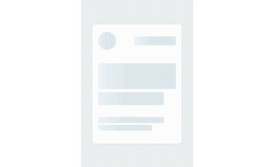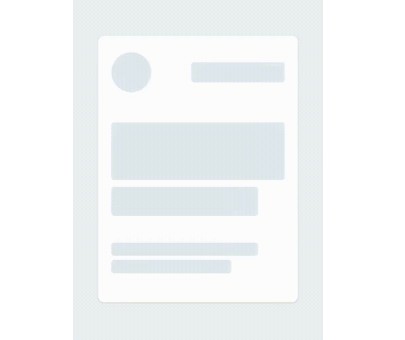
React Native Skeleton Content
React native Skeleton Content, a simple yet fully customizable component made to achieve loading animation in a Skeleton-style. Works in both iOS and Android.
Installation
npm install react-native-skeleton-content
Usage
- Import react-native-skeleton-content:
import SkeletonContent from "react-native-skeleton-content";
- Once you create the SkeletonContent, you have two options:
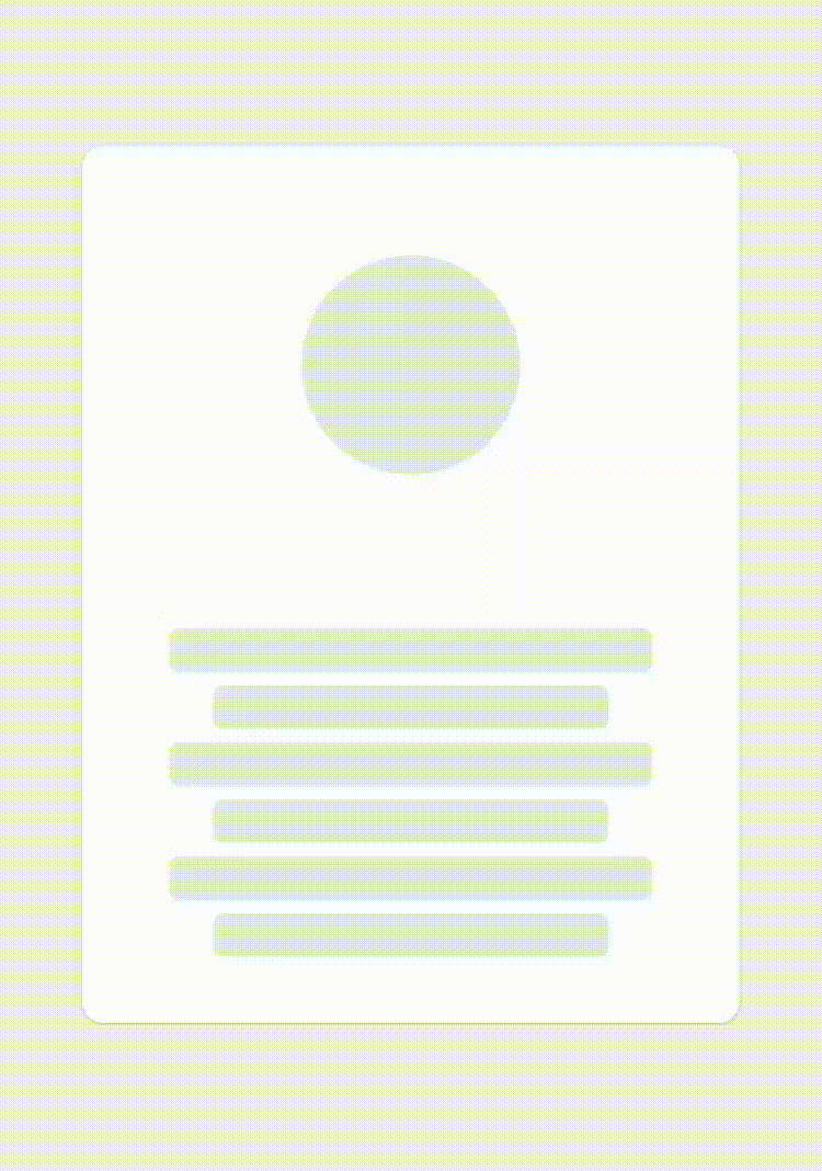
- Child Layout : The component will figure out the layout of its bones with the dimensions of its direct children (make sure to wrap them in sized-views, with width and height properties, otherwise, shiver animation might not work).
- Custom Layout : You provide a prop
layoutto the component specifying the size of the bones (see the Examples section below). Herunder is the example with a custom layout.
render () {
return (
<SkeletonContent
    containerStyle={{flex: 1, width: 300}}
    isLoading={false}
    layout={[
    { width: 220, height: 20, marginBottom: 6 },
    { width: 180, height: 20, marginBottom: 6 },
    ]}
    >

    <Text style={styles.normalText}>
        Your content
    </Text>

    <Text style={styles.bigText}>
        Other content
    </Text>

</SkeletonContent>
)
}
- Then simply sync the prop
isLoadingto your state to show/hide the SkeletonContent when the assets/data are available to the user.
render () {
    const { isLoading } = this.state;
    return (
    <SkeletonContent
        containerStyle={{flex: 1, width: 300}}
        isLoading={isLoading}>
        ...
    />
)
}
Props
| Name | Type | Default | Description |
|---|---|---|---|
| isLoading | bool | required | Shows the Skeleton bones when true |
| layout | array of objects | [] | A custom layout for the Skeleton bones |
| duration | number | 1200 ms | Duration of one cycle of animation |
| containerStyle | object | flex: 1 | The style applied to the View containing the bones |
| easing | Easing | bezier(0.5, 0, 0.25, 1) | Easing of the bones animation |
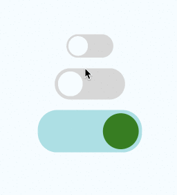
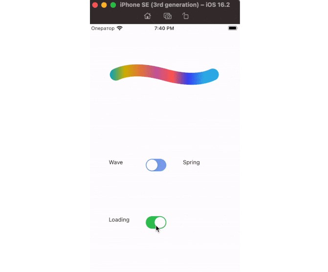
| animationType | string | "shiver" | The animation to be used for animating the bones (see demos below) |
| animationDirection | string | "horizontalRight" | Used only for shiver animation, describes the direction and end-point (ex: horizontalRight goes on the x-axis from left to right) |
| boneColor | string | "#E1E9EE" | Color of the bones |
| highlightColor | string | "#F2F8FC" | Color of the highlight of the bones |
Examples
See the playground section to experiment :
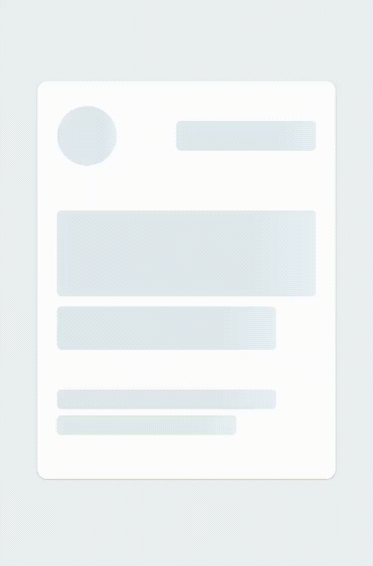
1 - Changing the direction of the animation (animationDirection prop) :
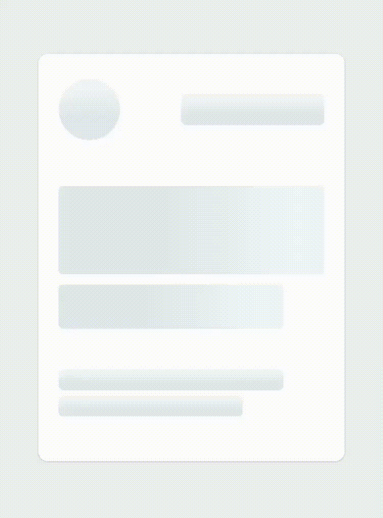
render () {
    return (
    <SkeletonContent
        containerStyle={{flex: 1, width: 300}}
        animationDirection="horizontalLeft"
        isLoading={true}>
        ...
    />
    )
}
2 - Changing the colors and switching to "pulse" animation (boneColor, highlightColor and animationType prop) :
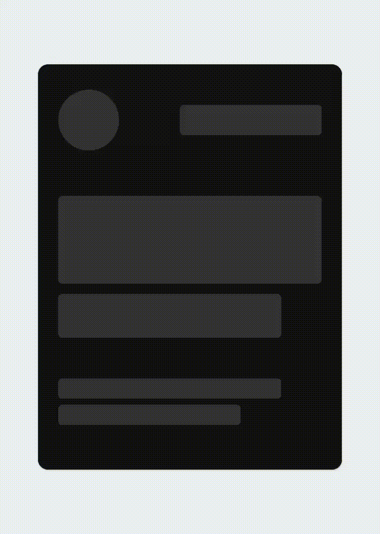
render () {
    return (
    <SkeletonContent
        containerStyle={{flex: 1, width: 300}}
        boneColor="#121212"
        highlightColor="#333333"
        animationType="pulse"
        isLoading={true}>
        ...
    />
    )
}
3 - Customizing the layout of the bones (layout prop) :
render () {
    return (
    <SkeletonContent
        containerStyle={{flex: 1, width: 300}}
        animationDirection="horizontalLeft"
        layout={[
        // long line
        { width: 220, height: 20, marginBottom: 6 },
        // short line
        { width: 180, height: 20, marginBottom: 6 },
        ...
        ]}
        isLoading={true}>
        ...
    />
    )
}