`JSThread` to `JSThread`, `UIThread` to `UIThread`.
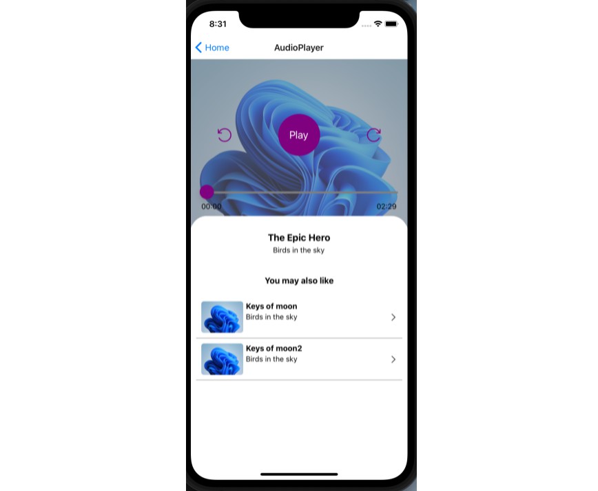
React Native Reanimated Expo Player
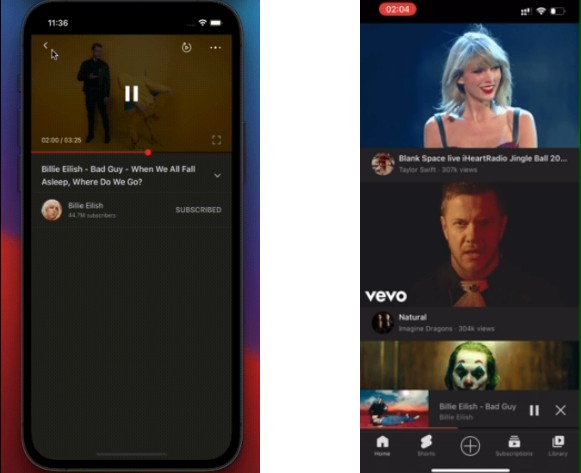
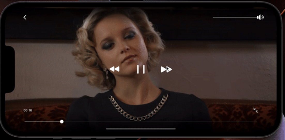
100% written in Typescript video player component, interaction is like Youtube player.
Player basic usage |
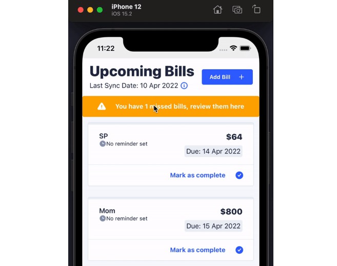
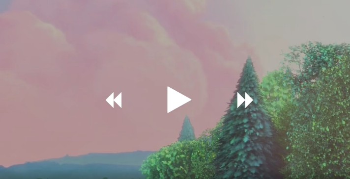
▶️ Custom usage for example |
 |
 |
▶️ Watch example video
Installation
First you have to follow installation instructions of:
- react-native-reanimated v2
- react-native-gesture-handler v2
- expo-screen-orientation
- react-native-safe-area-context
- expo-av
yarn add expo-reanimated-av-player
Example usage
import VideoPlayer from 'expo-reanimated-av-player';
import { useSharedValue } from 'react-native-reanimated';
export const Example = () => {
  const videoHeight = useSharedValue(0);
  const isFullScreen = useSharedValue(false);

  return (
    <VideoPlayer
      source={videoInfo.source}
      headerBarTitle={`fullscreen title`}
      onToggleAutoPlay={(state: boolean) => {
        console.log(`onToggleAutoPlay state: ${state}`);
      }}
      videoDefaultHeight={VIDEO_DEFAULT_HEIGHT}
      videoHeight={videoHeight}
      resizeMode="cover"
      isFullScreen={isFullScreen}
      onTapBack={() => {
        console.log('onTapBack');
      }}
      onTapMore={() => {
        console.log('onTapMore');
      }}
    />
  );
};
Features
- 100% written in
TypeScript. - 100% built upon
react-native-reanimatedandreact-native-gusture-handler. - Support gestures switch full screen.
- Support double tap seek to back or ahead.
- …
Configuration
The <VideoPlayer/> component has the following configuration properties:
| Name | Type | Description | Required | Default Value |
| theme | object | The slider theme color | ❌ | { // Color to fill the progress in the seekbar minimumTrackTintColor: string, // Color to fill the background in the seekbar maximumTrackTintColor: string, // Color to fill the cache in the seekbar cacheTrackTintColor: string, // Color to fill the bubble backgroundColor disableMinTrackTintColor: string, // Disabled color to fill the progress in the seekbar bubbleBackgroundColor: string } |
| showOnStart | boolean | control view init show | ❌ | false |
| onEnterFullscreen | function | on enter fullscreen callback | ❌ | undefined |
| onExitFullscreen | function | on exit fullscreen callback | ❌ | undefined |
| controlTimeout | nubmer | How long to hide the control view after showing | ❌ | 2000 |
| videoDefaultHeight | number | video default height | ❌ | screenWidth * (9 / 16) |
| headerBarTitle | string | header bar title on fullscreen mode | ❌ | undefined |
| onTapBack | function | tap header bar Icon-‘Back’ callback | ❌ | undefined |
| navigation | any | navigation | ❌ | undefined |
| autoPlay | boolean | auto play | ❌ | false |
| onToggleAutoPlay | function | on toggle auto play | ❌ | undefined |
| onTapMore | function | tap headerbar Icon-‘More’ callback | ❌ | undefined |
| doubleTapInterval | number | double tap interval | ❌ | undefined |
| paused | boolean | video paused | ✅ | undefined |
| onPausedChange | boolean | on change video paused | ❌ | undefined |
| onTapPause | function | on tap video paused | ❌ | undefined |
| sliderProps | object | react-native-awesome-slider props | ❌ | undefined |
| videoHeight | Animated.SharedValue | video height | ✅ | width * (9 / 16); |
| customAnimationStyle | Animated Viewstyle | video height | ❌ | width * (9 / 16); |
| onCustomPanGesture | PanGesture | custom pan gesture | ❌ | width * (9 / 16); |
| isFullScreen | Animated ShareValue | fullScreen status | ✅ | undefined |
| disableControl | boolean | control view status | ❌ | undefined |
| renderBackIcon | JSX | custom back icon | ❌ | undefined |
| renderFullScreenBackIcon | JSX | custom full’s fullscreen icon | ❌ | undefined |
| renderMore | JSX | custom more icon | ❌ | undefined |
| renderFullScreen | JSX | custom fullscreen icon | ❌ | undefined |
