React Native Web UI Components
React Native Web UI Components is a library of customized React Native/React Native Web components for mobile and web UI. This library is used by React Native Web Jsonschema Form.
Setup
React Native Web UI Components was created to facilitate the development of write once, run anywhere web and mobile apps. In order to accomplish that, this library heavily based on React Native, React Native Web and Expo.
Requirements
First you need to install react ^16.8.3 (this library uses react-hooks).
yarn add react react-dom react-router react-router-dom react-router-native expo
Expo uses a custom version of react-native and therefore you need to check what is the React Native repository for the Expo version you're using. For Expo v33.x.x you'd run:
yarn add https://github.com/expo/react-native/archive/sdk-33.0.0.tar.gz
If your project is also being used for web, please install React Native Web. Make sure your babel/webpack build replace all react-native imports with react-native-web (details here). If you used React Create App, aliasing is already taken care off for you.
yarn add react-native-web
Installation
First, install the library.
yarn add react-native-web-ui-components
Mobile
- You need to import the fonts. First, download the font files and add them to
src/assets/fontsin your project. Then, make sure you import the font atApp.js. - Wrap your entry screen with
UIProvider. Note thatUIProvidermust be withinRouter.
import React from 'react';
import { StyleSheet } from 'react-native';
import { UIProvider, Router, Switch } from 'react-native-web-ui-components';
import { createMemoryHistory } from 'history';

const history = createMemoryHistory();

const theme = {
  input: {
    focused: StyleSheet.create({
      border: {
        borderColor: 'yellow',
      },
    }),
  },
};

class App extends React.Component {
  state = {
    fontLoaded: false,
  };

  async componentDidMount() {
    await Font.loadAsync({
      'Lucida Sans': require('./src/assets/fonts/Lucida-Sans.ttf'),
      'Lucida Sans Bold': require('./src/assets/fonts/Lucida-Sans-Bold.ttf'),
    });
    this.setState({ fontLoaded: true });
  }

  render() {
    const { fontLoaded } = this.state;
    if (fontLoaded) {
      return (
        <Router history={history}>
          <Switch history={history}>
            <UIProvider theme={theme} amp={false}>
              <AMPProvider
              <EntryScreen {...props} />
            </UIProvider>
          </Switch>
        </Router>
      );
    }
    return null;
  }
}

export default App;
Web
This library was built with Google's new standard Accelerated Mobile Page in mind. Although most components exported by this library are AMP compatible by default, some components will have different implementations for AMP and non-AMP pages. This usually happens when the usabability would be degraded by complying with AMP requirements. If you're using server-side rendering (SSR), set amp to true for AMP pages.
- Wrap your entry screen with
UIProvider. Note thatUIProvidermust be withinRouter.
import React from 'react';
import { StyleSheet } from 'react-native';
import { UIProvider, Router, Switch } from 'react-native-web-ui-components';
import { createMemoryHistory } from 'history';

const history = createMemoryHistory();

const theme = {
  input: {
    focused: StyleSheet.create({
      border: {
        borderColor: 'yellow',
      },
    }),
  },
};

const App = props => (
  <Router history={history}>
    <Switch history={history}>
      <UIProvider theme={theme} amp={false}>
        <AMPProvider
        <EntryScreen {...props} />
      </UIProvider>
    </Switch>
  </Router>
);

export default App;
Usage
React Native Web UI Components was developed with file size in mind and therefore exports individual components without the need of using the entire library.
import Autocomplete from 'react-native-web-ui-components/Autocomplete';
Or using babel-plugin-lodash. This can be done by updating lodash config in .babelrc.
{
  "plugins": [
    ["lodash", { "id": ["lodash", "react-native-web-ui-components"] }]
  ]
}
After that, you can do imports like below without actually include the entire library content.
import { Autocomplete } from 'react-native-web-ui-components';
Class Names
While mobile components are indiferent to the className property, that is very useful for the web. React Native Web components no longer accept class names but for convenience, this library accepts the className property for all exported components. Please note that class names are converted into data-class attribute.
import React from 'react';
import { Row } from 'react-native-web-ui-components';

// You must use the Helmet export by this library to avoid conflicts.
import Helmet, { style } from 'react-native-web-ui-components/Helmet';

const MyComponent = () => (
  <React.Fragment>
    <Helmet>
      <style>
        {`
          [data-class~="MyComponent__Row"] {
            width: calc(100% - 20px);
          }
        `}
      </style>
    </Helmet>
    <Row className="MyComponent__Row" />
  </React.Fragment>
);
Components
Alert
Opens an Alert popup. This library uses React Modal to display modals for web.

Autocomplete
Displays a text input with autocomplete functionality.

Banner
Displays a banner/background image that adjusts with the screen size. You can display other components within the banner.

Bold
Same as Text but using the bold font defined in the theme fontFamily.bold.
Box
Container used to wrap BoxHeader and BoxItem.

BoxHeader
Displays a header within the Box.
BoxItem
Displays an item within the Box.
BoxTitle
Displays the title of the BoxHeader.
Button
Displays a button.

Carousel
Displays a carousel. If amp is true, then it will automatically use Google AMP Carousel.

Checkbox
Displays a checkbox.

Column
Column is a View with flexDirection: "column" that follows Bootstrap's grid system. You can define the percentage of the width that should be used in different screen sizes. For example:
<Row>
  <Column xs={12} sm={4} md={3} lg={2} style={{ backgroundColor: 'red', height: 25 }} />
  <Column xs={12} sm={4} md={3} lg={2} style={{ backgroundColor: 'green', height: 25 }} />
  <Column xs={12} sm={4} md={3} lg={2} style={{ backgroundColor: 'blue', height: 25 }}/>
  <Column xs={12} sm={4} md={3} lg={2} style={{ backgroundColor: 'purple', height: 25 }} />
  <Column xs={12} sm={4} md={3} lg={2} style={{ backgroundColor: 'yellow', height: 25 }} />
  <Column xs={12} sm={4} md={3} lg={2} style={{ backgroundColor: 'pink', height: 25 }} />
</Row>

Confirm
Opens a confirmation popup. This library uses React Modal to render modals for web.

Container
Container is a useful grid structure for mobile and web. It is a view that for reduced screens (xs and sm), it uses 95% of the width. For larger screens (md and lg) it uses up to 960px.
Datepicker
Displays a text input with datepicker functionality. This library uses React Datepicker and React Native Datepicker to render datepickers for web and mobile respectively.


Draggable
Turns a component into a draggable component. This library uses React Draggable to render draggable components for web.

Dropzone
Displays a dropzone to upload files. This library uses React Dropzone to render the dropzone containers for web.


Helmet
This library exports React Helmet. For mobile, Helmet won't do anything.
import React from 'react';
import { Row } from 'react-native-web-ui-components';

// You must use the Helmet export by this library to avoid conflicts.
import Helmet, { style } from 'react-native-web-ui-components/Helmet';

const MyComponent = () => (
  <React.Fragment>
    <Helmet>
      <style>
        {`
          [data-class~="MyComponent__Row"] {
            width: calc(100% - 20px);
          }
        `}
      </style>
    </Helmet>
    <Row className="MyComponent__Row" />
  </React.Fragment>
);
HideShowText
Displays summary of a text with a link to show more.

Hr
Displays a horizontal rule.

Icon
Displays an icon. This library uses React Fontawesome and Expo Vector Icons to render icons for web and mobile respectively.
IconLink
Displays a link with an icon. This library uses React Fontawesome and Expo Vector Icons to render icons for web and mobile respectively.

IconText
Displays a text with an icon. This library uses React Fontawesome and Expo Vector Icons to render icons for web and mobile respectively.

Image
Displays an image. This library uses react-native-expo-image-cache and <amp-img> to render images for mobile and AMP pages respectively.

Link
Displays a link. This library uses React Router to render links.

Loading
Displays a popup with a loading spinner. This library uses React Modal to display modals for web.

MainContainer
Displays a Row that uses the entire window height.
NavLink
Displays a link with active/inactive state (useful for menus). This library uses React Router to render links.
Popup
Displays a popup.

Radiobox
Displays a radiobox.

Row
Row is a View with flexDirection: "row" that follows Bootstrap's grid system. You can define the percentage of the width that should be used in different screen sizes. For example:
<Row>
  <Row xs={12} sm={4} md={3} lg={2} style={{ backgroundColor: 'red', height: 25 }} />
  <Row xs={12} sm={4} md={3} lg={2} style={{ backgroundColor: 'green', height: 25 }} />
  <Row xs={12} sm={4} md={3} lg={2} style={{ backgroundColor: 'blue', height: 25 }}/>
  <Row xs={12} sm={4} md={3} lg={2} style={{ backgroundColor: 'purple', height: 25 }} />
  <Row xs={12} sm={4} md={3} lg={2} style={{ backgroundColor: 'yellow', height: 25 }} />
  <Row xs={12} sm={4} md={3} lg={2} style={{ backgroundColor: 'pink', height: 25 }} />
</Row>
Screen
Helper to get screen properties.
ScrollView
See React Native's ScrollView. For mobile, the ScrollView exported by this library automatically dismiss the keyboard on scroll.
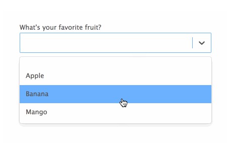
Select
Displays a select input. This library uses React Select to render selects for web.


Sidebar
Displays a sidebar. This library uses React Sidebar and React Native Side Menu to render sidebars for web and mobile respectively.

Slider
Displays a slider. This library uses React Slider and React Native Multi Slider to render sidebars for web and mobile respectively.

Spinner
Displays a spinner.
StylePropType
Prop type for styles.
import { StylePropType } from 'react-native-web-ui-components';

// ...
MyComponent.propTypes = {
  style: StylePropType.isRequired,
};
Switch
See React Router's Switch.
TagInput
Displays a tag input.

Text
Displays a text. It automatically parses [tag](url) into Link components.
TextInput
Displays a text input.
TimeRangePicker
Displays a time range picker.

Title
Displays a title text.
Tooltip
Displays a tooltip when hovering over a component. This library uses Tippy.js React to render tooltips for web. For mobile, this component is ignored.

View
See React Native's View.
WebOnly
Shows a component only for web platforms.
WebView
See React Native's WebView. For web, this component is ignored.
Theme
React Native Web UI Components theme can be customized at a globally and for each individual component. Please access https://github.com/CareLuLu/react-native-web-ui-components for the complete theme documentation.
Global
A set of theme attributes can be defined globally and components will use these definitions as necessary.
const theme = {
  // All components will receive the prop fontFamily
  '*': {
    fontFamily: {
      regular: 'Lucida Sans',
      bold: 'Lucida Sans Bold',
    },
  },
}
Platform
Themes can be overwritten by platform.
const theme = {
  // All components will receive the prop fontFamily
  '*': {
    fontFamily: {
      regular: 'Lucida Sans',
      bold: 'Lucida Sans Bold',
    },
  },
  platform: {
    // When running on web, the fontFamily property will be overwritten by the following.
    web: {
      '*': {
        fontFamily: {
          regular: '"Lucida Sans Unicode","Lucida Grande",Arial,Helvetica,clean,sans-serif',
          bold: '"Lucida Grande", "Lucida Sans Unicode","Lucida Grande",Arial,Helvetica,clean,sans-serif',
        },
      },
    },
  },
}
Component
Themes can be overwritten by component.
const theme = {
  // All components will receive the prop fontFamily
  '*': {
    fontFamily: {
      regular: 'Lucida Sans',
      bold: 'Lucida Sans Bold',
    },
  },
  Title: {
    // Title will receive the following fontFamily.
    fontFamily: {
      regular: 'Arial',
      bold: 'Arial Bold',
    },
  },
}