Paper Onboarding
Paper Onboarding is a material design UI slider for React Native inspired by Ramotion Paper Onboarding.
Installation
yarn add @gorhom/paper-onboarding
# or
npm install @gorhom/paper-onboarding
Also, you need to install react-native-reanimated, react-native-gesture-handler & react-native-svg, and follow their installation instructions.
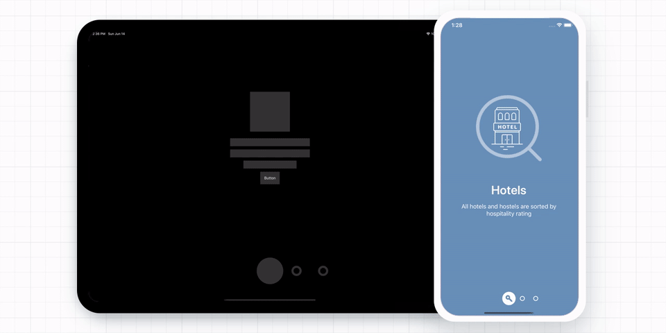
Usage
import PaperOnboarding, {PaperOnboardingItemType} from "@gorhom/paper-onboarding";
const data: PaperOnboardingItemType[] = [
{
title: 'Hotels',
description: 'All hotels and hostels are sorted by hospitality rating',
backgroundColor: '#698FB8',
image: /* IMAGE COMPONENT */,
icon: /* ICON COMPONENT */,
content: /* CUSTOM COMPONENT */,
},
{
title: 'Banks',
description: 'We carefully verify all banks before add them into the app',
backgroundColor: '#6CB2B8',
image: /* IMAGE COMPONENT */,
icon: /* ICON COMPONENT */,
content: /* CUSTOM COMPONENT */,
},
{
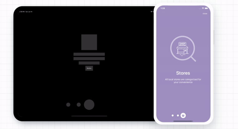
title: 'Stores',
description: 'All local stores are categorized for your convenience',
backgroundColor: '#9D8FBF',
image: /* IMAGE COMPONENT */,
icon: /* ICON COMPONENT */,
content: /* CUSTOM COMPONENT */,
},
];
const Screen = () => {
const handleOnClosePress = () => console.log('navigate to other screen')
return (
<PaperOnboarding
data={data}
onCloseButtonPress={handleOnClosePress}
/>
)
}
Props
| name | description | required | type | default |
|---|---|---|---|---|
| data | Array of pages/slides to present. | YES | Array<PaperOnboardingItemType> | |
| safeInsets | Safe area insets usually come from react-native-safe-area-context. |
NO | Insets | {top: 50, bottom: 50, left: 50, right: 50} |
| direction | Pan gesture direction. | NO | 'horizontal' | 'vertical' | horizontal |
| indicatorSize | Indicator size (width and height). | NO | number | 40 |
| indicatorBackgroundColor | Indicator background color. | NO | string | white |
| indicatorBorderColor | Indicator border color. | NO | string | white |
| titleStyle | Text style to override all page/slide title style. |
NO | StyleProp |
|
| descriptionStyle | Text style to override all page/slide description style. |
NO | StyleProp |
|
| closeButton | Custom component to be used instead of the default close button. | NO | (() => React.ReactNode) | React.ReactNode | |
| closeButtonText | Close button text. | NO | string | close |
| closeButtonTextStyle | Close button text style. | NO | StyleProp |
|
| onCloseButtonPress | Callback on close button pressed. | NO | () => void | |
| onIndexChange | Callback when index change. | NO | () => void |
PaperOnboardingItemType
| name | description | required | type |
|---|---|---|---|
| content | Slide/page content, this will replace default content. | NO | ((props: PageContentProps) => React.ReactNode) | React.ReactNode |
| image | Image cover. | NO | (() => React.ReactNode) | React.ReactNode |
| icon | Indicator icon. | NO | (() => React.ReactNode) | React.ReactNode |
| backgroundColor | Background color. | YES | string |
| title | Title text. | NO | string |
| description | Description text. | NO | string |
| titleStyle | Text style to override page/slide title default style. | NO | StyleProp |
| descriptionStyle | Text style to override page/slide description default style. | NO | StyleProp |
| showCloseButton | Show close button when page/slide is active, note: last page will always show close button. | NO | boolean |
Built With ❤️
- react-native-gesture-handler
- react-native-reanimated
- react-native-redash
- react-native-svg
- @react-native-community/bob