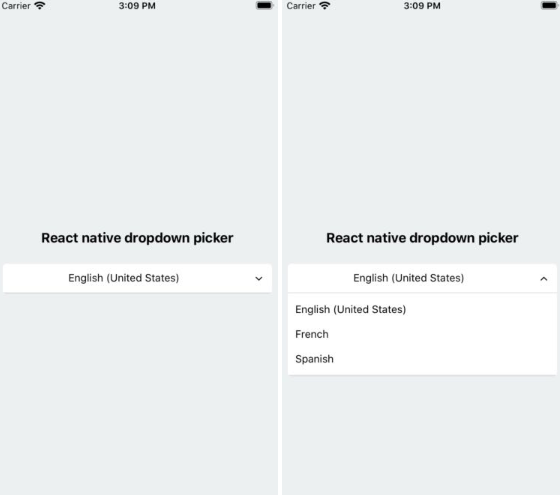
React native dropdown picker
A picker (dropdown) component for react native which supports both Android & iOS.
Installation
via NPM
npm install react-native-dropdown-picker --save
via Yarn
yarn add react-native-dropdown-picker
Basic Usage
First of all import the package.
import DropDownPicker from 'react-native-dropdown-picker';
Render the component.
<DropDownPicker
    items={[
        {label: 'Item 1', value: 'item1'},
        {label: 'Item 2', value: 'item2'},
    ]}
    defaultIndex={0}
    containerStyle={{height: 40}}
    onChangeItem={item => console.log(item.label, item.value)}
/>
Default item
You may want to select one of the items as default.
Use one of these ways:
-
Add
selected: trueto the object.items={[ {label: 'Item 1', value: 'item1'}, {label: 'Item 2', value: 'item2', selected: true}, ]} -
The
defaultIndexproperty.defaultIndex={1} -
The
defaultValueproperty.defaultValue="item2"
Placeholder
You may want to have a placeholder while the default value is null.
Add the following properties to the component.
...
defaultNull
placeholder="Select an item"
...
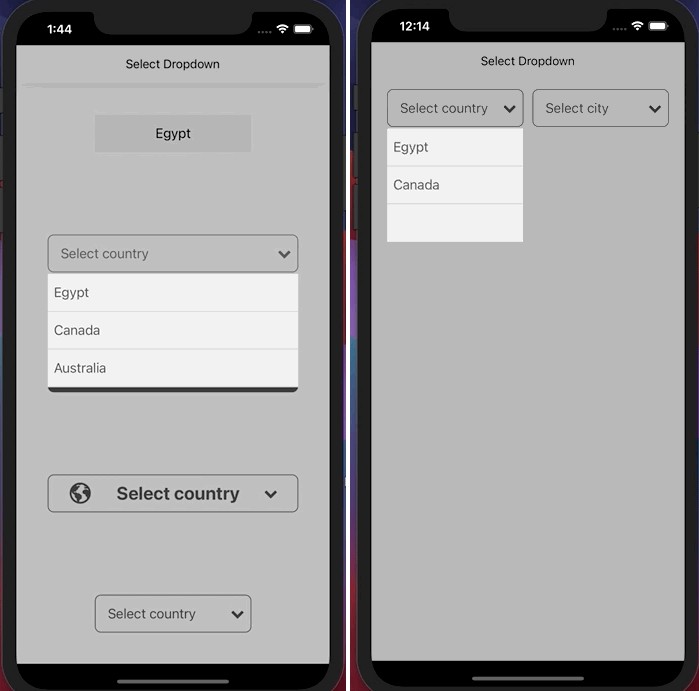
Dynamic placeholder
In some cases you're going to create two or more pickers which are linked together.
Think of a country picker and city picker, whenever you're changing the country, the city picker should be reset and show the placeholder.
import React from 'react';
export default class MyComponent extends React.Component {
    constructor(props) {
        super(props);

        this.state = {
            country: null,
            city: null,
            cities: []
        };
    }

    changeCountry(item) {
        let city = null;
        let cities;
        switch (item.value) {
            case 'fr':
                cities = [
                    {label: 'Paris', value: 'paris'}
                ];
            break;
            case 'es':
                cities = [
                    {label: 'Madrid', value: 'madrid'}
                ];
            break;
        }

        this.setState({
            city,
            cities
        });
    }

    changeCity(item) {
        this.setState({
            city: item.value
        });
    }

    render() {
        return (
            <>
                <DropDownPicker
                    items={[
                        {label: 'France', value: 'fr'},
                        {label: 'Spain', value: 'es'},
                    ]}
                    defaultNull
                    placeholder="Select your country"
                    containerStyle={{height: 40}}
                    onChangeItem={item => this.changeCountry(item)}
                />
                <DropDownPicker
                    items={this.state.cities}
                    defaultNull={this.state.city === null}
                    placeholder="Select your city"
                    containerStyle={{height: 40}}
                    onChangeItem={item => this.changeCity(item)}
                />
            </>
        );
    }
}
Dropdown Overflow
Adding borders to the component will separate or overflow elements. to solve this issue you just need to add marginTop to the dropDownStyle and specify the value which fits your component well.
dropDownStyle={{marginTop: 2}}
Styling the component
You have 9 options to style the component.
-
The
styleproperty.Use this to adjust the inner part of the picker.
style={{paddingVertical: 10}} -
The
dropDownStyleproperty.Additional styles for the dropdown box.
dropDownStyle={{backgroundColor: '#fafafa}} -
The
containerStyleproperty.Use this to adjust the outer part of the picker such as
margin,width,height.containerStyle={{width: 150, height: 70}} -
The
itemStyleproperty.If you want the labels on the
leftandrightside or to centerize them:itemStyle={{alignItems: 'flex-start|flex-end|center'}} -
The
labelStyleproperty.This property gives full control over the label.
labelStyle={{fontSize: 14, color: '#000'}} -
The
placeholderStyleproperty.It is possible to style the placeholder text with this property.
placeholderStyle={{fontWeight: 'bold'}} -
The
activeItemStyleproperty.This property allows you to style the active item.
activeItemStyle={{alignItems: 'center'}} -
The
activeLabelStyleproperty.This property allows you to style the active label.
activeLabelStyle={{color: 'red'}} -
The
arrowStyleproperty.Adds your additional styles to the
Viewelement of the arrow.arrowStyle={{marginRight: 10}}
Props
| Name | Description | Type | Default | Required |
|---|---|---|---|---|
items |
The items for the component. | array |
Yes | |
defaultIndex |
The index of the default item. | number |
0 |
No |
defaultValue |
The value of the default item. | any |
No | |
defaultNull |
This sets the choice to null which should be used with placeholder |
bool |
true |
No |
placeholder |
Default text to be shown to the user which must be used with defaultNull |
string |
'Select an item' | No |
dropDownMaxHeight |
Height of the dropdown box. | number |
150 |
No |
style |
Additional styles for the picker. | object |
{} |
No |
dropDownStyle |
Additional styles for the dropdown box. | object |
{} |
No |
containerStyle |
Additional styles for the container view. | object |
{} |
No |
itemStyle |
Additional styles for the items. | object |
{} |
No |
labelStyle |
Additional styles for the labels. | object |
{} |
No |
placeholderStyle |
Additional styles for the placeholder text. | object |
{} |
No |
activeItemStyle |
Additional styles for the active item. | object |
{} |
No |
activeLabelStyle |
Additional styles for the active label. | object |
{} |
No |
arrowStyle |
Additional styles for the arrow. | object |
{} |
No |
showArrow |
An option to show/hide the arrow. | bool |
true |
No |
arrowSize |
The size of the arrow. | number |
15 |
No |
customArrowUp |
Customize the arrow-up. | jsx |
null |
No |
customArrowDown |
Customize the arrow-down. | jsx |
null |
No |
zIndex |
This property specifies the stack order of the component. | number |
5000 |
No |
disabled |
This disables the component. | bool |
false |
No |
onChangeItem |
Callback which returns item and index. The item is the selected object. |
function |
No |