react-native-pincode
A customizable PIN Code component for react native.
Using:
- react-native-keychain to store the pin in Keychain/Keystore
- react-native-touch-id to authenticate users with FaceID/TouchID
- react-move for animations
- react-native-vector-icons to use the material icons
Installation
npm install --save @haskkor/react-native-pincode
or
yarn add @haskkor/react-native-pincode
Please note that:
If you wish to use the TouchID/FaceID authentication you will have to link the library:
react-native link react-native-touch-id
If you wish to use Keychain/Keystore to store the PIN code you will have to link the library:
react-native link react-native-keychain
Please note that you might have to link those libraries manually.
IMPORTANT:
If you decide not to use Keychain/Keystore, you will have to provide a storePin property to the PINCode component.
The library uses the Vibration from React Native.
Please note that on Android it requires the Vibrate permission as stated in the doc. (add
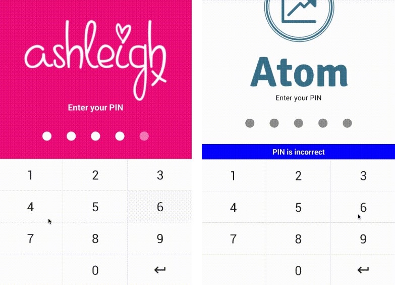
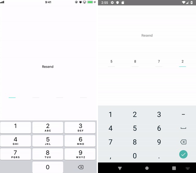
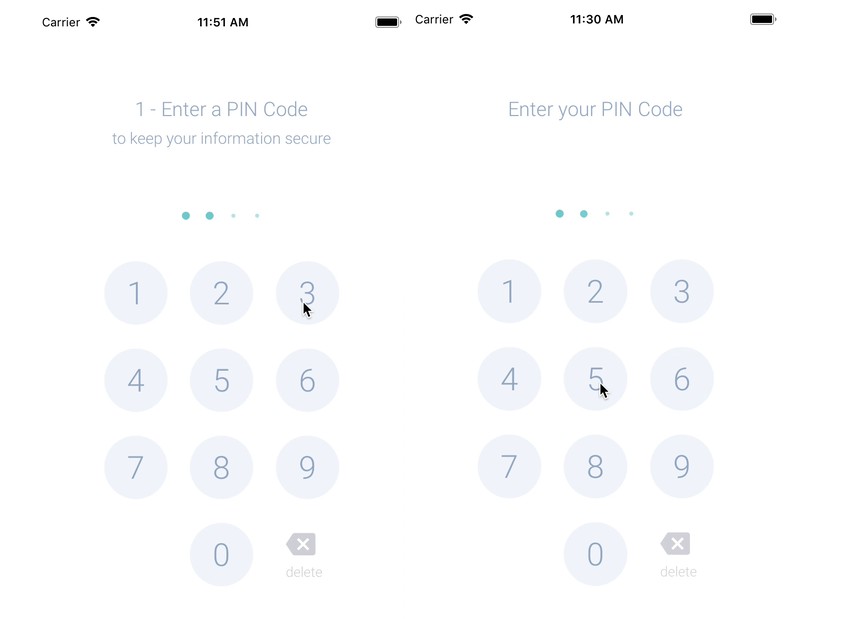
Demo
Usage
Basic usage requires choosing between the choose, enter and locked modes.
- choose : requires the user to choose and to confirm a PIN code
- enter : requires the user to enter the PIN code he previously chose
- locked : prints a locked screen for a given time if the user failed to enter his/her PIN code too many times
import PINCode from '@haskkor/react-native-pincode'
<PINCode status={'choose'}/>
One can also use a provided promise to know if a PIN code has been set by the user.
import {hasUserSetPinCode} from '@haskkor/react-native-pincode'
await hasUserSetPinCode()
Options
| Key | Description | Default | Required | Type |
|---|---|---|---|---|
buttonComponentLockedPage |
Button component to be used at the bottom of the page on the locked application page | TouchableOpacity exit button killing the application | false |
any |
buttonDeleteComponent |
Button component to be used at the bottom right of the PIN panel to delete a previous entry | TouchableHighlight button with a delete text and the backspace material icon |
false |
any |
buttonDeleteText |
Text of the of the button used to delete a previous entry on the PIN panel | delete |
false |
string |
buttonNumberComponent |
Button component to be used on the PIN panel to select a character for the PIN | TouchableHighlight button with a number text | false |
any |
finishProcess |
Function to be used when the user enters the right PIN code | Removes the values in AsyncStorage and set the status to success |
false |
any |
getCurrentPinLength |
Function returning the length of the current PIN code | None |
false |
(length: number) => void |
handleResultEnterPin |
Function to be used to handle the PIN code entered by the user. To be used with the pinStatus props |
Functions that checks the validity of the give PIN code, stores the number of failed attempts in the AsyncStorage and the time the application was locked if needed |
false |
any |
iconComponentLockedPage |
View component to be used between the timer and the text on the locked application page | A circular red View using the lock material icon |
false |
any |
iconButtonDeleteDisabled |
Boolean to remove the icon on the delete button of the PIN panel | false |
false |
boolean |
lockedPage |
View component used as a locked page if the user fails to provide the correct PIN code maxAttempts times |
A application locked page with a timer indicating to the user the remaining time locked and a button closing the application | false |
any |
maxAttempts |
Number of attempts the user is given before locking the application | 3 |
false |
number |
onClickButtonLockedPage |
Function to be used when the user taps the button on the locked application page | Kills the app by throwing Quit application |
false |
any |
onFail |
Function to be used when the user enters the wrong PIN code | Returns number of failed attempts | false |
any |
passwordComponent |
Component to be used to indicate to the user how many characters he/she typed. To be used with the getCurrentPinLength prop |
Dots growing or shrinking when the user adds or removes a character in the PIN code | false |
any |
passwordLength |
Length of the password the user has to enter | 4 |
false |
number |
pinAttemptsAsyncStorageName |
String to be used as a key in AsyncStorage to store the number of attempts the user already made | pinAttemptsRNPin |
false |
string |
pinCodeKeychainName |
String to be used as a key to store the PIN code in Keychain/Keystore | reactNativePinCode |
false |
string |
pinStatus |
Status coming back to the PIN component after the handleResultEnterPin function. The status type is a value of the PinResultStatus enum (initial, success, failure, locked) |
None |
false |
PinResultStatus enum |
status |
Indicates the mode that should be used (see Usage section for the different modes available) | None | true |
choose or enter or locked |
storedPin |
The PIN code previously stored with the storePin function |
The PIN Code previously stored in the Keychain/Keystore | false |
string |
storePin |
Function that will be used to store the PIN (pin is given as a string argument) | Stores the PIN in Keychain/Keystore | false |
any |
subtitleChoose |
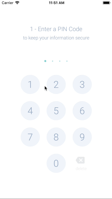
String used as a subtitle on the PIN code choose page | to keep your information secure |
false |
string |
subtitleComponent |
Component to be used as a subtitle on all the PIN code pages | Light grey Text component | false |
any |
subtitleConfirm |
String used as a subtitle on the PIN code confirmation page | None |
false |
string |
subtitleEnter |
String used as a subtitle on the PIN code enter page | None |
false |
string |
subtitleError |
String used as a subtitle on the PIN code pages when an error occurs (wrong PIN code used for enter or confirm modes) |
Please try again |
false |
string |
textButtonLockedPage |
String to be used as text on the button in the locked application page | Quit |
false |
string |
textDescriptionLockedPage |
String to be used as a description on the locked application page | To protect your information, access has been locked for {timeLocked} minutes. |
false |
string |
textTitleLockedPage |
String to be used as a title on the locked application page | Maximum attempts reached |
false |
string |
timeLocked |
Number of milliseconds where the application should be locked after maxAttempts failed attempts from the user |
300000 (5 minutes) |
false |
number |
timePinLockedAsyncStorageName |
String to be used as a key in AsyncStorage to store the time when the user locks the application | timePinLockedRNPin |
false |
string |
timerComponentLockedPage |
Component to be used on the application locked page to indicates the remaining locked time to the user | A Text component displaying a timer with the remaining locked time on the application locked page | false |
any |
titleAttemptFailed |
String used as a title on the PIN enter page when the user enters a wrong PIN code | Incorrect PIN Code |
false |
string |
titleChoose |
String used as a title on the PIN choose page | 1 - Enter a PIN Code |
false |
string |
titleComponent |
Component to be used as a title on all the PIN code pages | Light grey Text component | false |
any |
titleComponentLockedPage |
Component to be used as a title on the application locked page | Light grey Text component | false |
any |
titleConfirm |
String used as a title on the PIN confirm page | 2 - Confirm your PIN Code |
false |
string |
titleConfirmFailed |
String used as a title on the PIN confirm page when the user enters a wrong PIN code | Your entries did not match |
false |
string |
titleEnter |
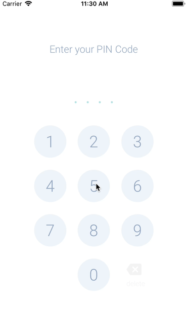
String used as a title on the PIN enter page | Enter your PIN Code |
false |
string |
touchIDDisabled |
Boolean disabling the TouchID/FaceID on the PIN code enter page | false |
false |
boolean |
touchIDSentence |
String to be used in the TouchID/FaceID popup | To unlock your application |
false |
string |
Styles
| Key | Description | Default | Type |
|---|---|---|---|
colorPassword |
Color of the dots used for the password component | turquoise |
string |
colorPasswordError |
Color of the dots used for the password component on error state | #9DAFC8 |
string |
numbersButtonOverlayColor |
Color of the PIN panel buttons when highlighted |
turquoise |
string |
styleMainContainer |
Main container of index file | flex: 1, justifyContent: 'center', alignItems: 'center' |
StyleProp<ViewStyle> |
stylePinCodeChooseContainer |
Main container of PinCodeChoose file | flex: 1, justifyContent: 'center', alignItems: 'center' |
StyleProp<ViewStyle> |
stylePinCodeEnterContainer |
Main container of PinCodeEnter file | flex: 1, justifyContent: 'center', alignItems: 'center' |
StyleProp<ViewStyle> |
styleLockScreenButton |
Button of the lock screen | backgroundColor: colors.turquoise, borderRadius: grid.border, paddingLeft: grid.unit * 2, paddingRight: grid.unit * 2, paddingBottom: grid.unit, paddingTop: grid.unit |
StyleProp<ViewStyle> |
styleLockScreenColorIcon |
Color of the icon on the lock screen | white |
string |
styleLockScreenMainContainer |
Main container of the lock screen | position: 'absolute', top: 0, backgroundColor: colors.background, flexBasis: 0, left: 0, height: '100%', width: '100%', alignItems: 'center', flex: 1, justifyContent: 'center' |
StyleProp<ViewStyle> |
styleLockScreenNameIcon |
Name of the material icon to be used on the lock screen | lock |
string |
styleLockScreenSizeIcon |
Size of the icon on the lock screen | 24 |
number |
styleLockScreenText |
Text on the lock screen (Come back..., To protect...) | fontSize: grid.unit, color: colors.base, lineHeight: grid.unit * grid.lineHeight, textAlign: 'center' |
StyleProp<TextStyle> |
styleLockScreenTextButton |
Text of the button of the lock screen | color: colors.white, fontWeight: 'bold', fontSize: 14 |
StyleProp<TextStyle> |
styleLockScreenTextTimer |
Text of the timer of the lock screen | fontFamily: Platform.OS === 'ios' ? 'Courier' : 'monospace', fontSize: 20, color: colors.base |
StyleProp<TextStyle> |
styleLockScreenTitle |
Title of the lock screen | fontSize: grid.navIcon, color: colors.base, opacity: grid.mediumOpacity, fontWeight: '200', marginBottom: grid.unit * 4 |
StyleProp<TextStyle> |
styleLockScreenViewCloseButton |
View of the button close of the lock screen | alignItems: 'center', opacity: grid.mediumOpacity, justifyContent: 'center', marginTop: grid.unit * 2 |
StyleProp<ViewStyle> |
styleLockScreenViewIcon |
View containing the icon of the lock screen | width: grid.unit * 4, justifyContent: 'center', alignItems: 'center', height: grid.unit * 4, borderRadius: grid.unit * 2, opacity: grid.mediumOpacity, backgroundColor: colors.alert, overflow: 'hidden', marginBottom: grid.unit * 4 |
StyleProp<ViewStyle> |
styleLockScreenViewTextLock |
View containing all the text of the lock screen | justifyContent: 'center', alignItems: 'center', paddingLeft: grid.unit * 3, paddingRight: grid.unit * 3, flex: 3 |
StyleProp<ViewStyle> |
styleLockScreenViewTimer |
View of the timer of the lock screen | paddingLeft: 30, paddingRight: 30, paddingBottom: 10, paddingTop: 10, borderRadius: 4, borderWidth: 2, borderColor: 'rgb(230, 231, 233)', marginBottom: grid.unit * 4 |
StyleProp<ViewStyle> |
stylePinCodeButtonCircle |
Circle button TouchableHighlight of the PinCode file | alignItems: 'center', justifyContent: 'center', width: grid.unit * 4, height: grid.unit * 4, backgroundColor: 'rgb(242, 245, 251)', borderRadius: grid.unit * 2 |
StyleProp<ViewStyle> |
stylePinCodeButtonNumber |
Color of the number buttons on the Pin code page | 'white' | string |
stylePinCodeButtonNumberPressed |
Color of the number buttons on the Pin code page when pressed | #9DAFC8 |
string |
stylePinCodeColorSubtitle |
Color of the PinCode page subtitle in normal state | #9DAFC8 |
string |
stylePinCodeColorSubtitleError |
Color of the the PinCode page subtitle in error state | #FC4349 |
string |
stylePinCodeColorTitle |
Color of the the PinCode page title in normal state | #9DAFC8 |
string |
stylePinCodeColorTitleError |
Color of the the PinCode page title in error state | #9DAFC8 |
string |
stylePinCodeColumnButtons |
Column of buttons of the PinCode file | alignItems: 'center', width: 'auto' |
StyleProp<ViewStyle> |
stylePinCodeColumnDeleteButton |
Column of the delete button of the PinCode file | width: grid.unit * 4, height: grid.unit * 4, marginLeft: grid.unit / 2, marginRight: grid.unit / 2, justifyContent: 'center', alignItems: 'center', flexDirection: 'column' |
StyleProp<ViewStyle> |
stylePinCodeDeleteButtonColorHideUnderlay |
Color of the delete button when underlay is hidden of the PinCode file | rgb(211, 213, 218) |
string |
stylePinCodeDeleteButtonColorShowUnderlay |
Color of the delete button when underlay is shown of the PinCode file | colors.turquoise |
string |
stylePinCodeDeleteButtonIcon |
Name of the icon of the delete button of the PinCode file | backspace |
string |
stylePinCodeDeleteButtonSize |
Size of the icon of the delete button of the PinCode file | 30 |
number |
stylePinCodeDeleteButtonText |
Text of the delete button of the PinCode file | fontWeight: '200', marginTop: 5 |
StyleProp<TextStyle> |
stylePinCodeEmptyColumn |
Empty column of the last line of buttons of the PinCode file | width: grid.unit * 4, height: grid.unit * 4 |
StyleProp<ViewStyle> |
stylePinCodeHiddenPasswordCircle |
Circle representing the hidden password of the PinCode file | flexDirection: 'row', height: 'auto', justifyContent: 'center', alignItems: 'center' |
StyleProp<ViewStyle> |
stylePinCodeHiddenPasswordSizeEmpty |
Size of the circle representing the hidden password of the PinCode file when empty | 4 |
number |
stylePinCodeHiddenPasswordSizeFull |
Size of the circle representing the hidden password of the PinCode file when full | 8 |
number |
stylePinCodeMainContainer |
Main container of the PinCode file | flex: 1, justifyContent: 'center', alignItems: 'center' |
StyleProp<ViewStyle> |
stylePinCodeRowButtons |
Row of buttons of the PinCode file | justifyContent: 'center', alignItems: 'center', width: '100%', height: grid.unit * 5.5 |
StyleProp<ViewStyle> |
stylePinCodeTextButtonCircle |
Text of circle button TouchableHighlight of the PinCode file | fontSize: grid.unit * 2, fontWeight: '200' |
StyleProp<TextStyle> |
stylePinCodeTextSubtitle |
Title of the PinCode file | fontSize: 20, fontWeight: '200', lineHeight: grid.unit * 2.5 |
StyleProp<TextStyle> |
stylePinCodeTextTitle |
Subtitle of the PinCode file | fontSize: grid.unit, fontWeight: '200', textAlign: 'center' |
StyleProp<TextStyle> |
stylePinCodeViewTitle |
View of the title of the PinCode file | flexDirection: 'column', justifyContent: 'center', alignItems: 'center', minHeight: grid.unit * 4 |
StyleProp<TextStyle> |