react-native-popup-stub
A popup container for implements your own popups like ActionSheet, Dialog, Alert, Toast.
Popup global controller:
- Handle popup animations
- Remove old popup with the same
zIndexautomatically - Make it easy to implement your own popup like Dialog, Toast, ActionSheet
- Support landscape and portrait automatically
Derived from @unpourtous/react-native-stub-toast/PopupStub.
Animation is based on react-native-animatable
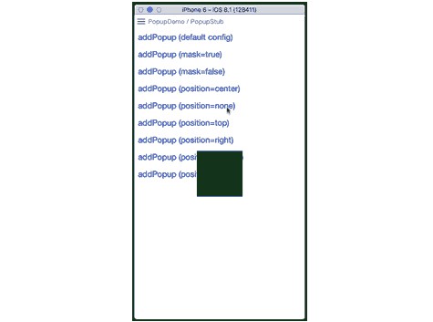
Demo

Installation
npm install @unpourtous/react-native-popup-stub --save
API Detail
Props
PopupStub properties
| param | type | description |
|---|---|---|
| maskColor | String | mask color, default 'rgba(23,26,35,0.6)' |
| maskAnimatable | Boolean | whether enable mask animation, default false |
| orientation | Enum | deprecated, no need any more |
PopupStub.init(ref)
Init PopupStub with PopupStub reference.
| param | type | description |
|---|---|---|
| ref | ref | should be the PopupStub component reference |
PopupStub.addPopup(component, option)
Add popup to PopupStub, use option to controller actions for each Component/Layers.
| param | type | description |
|---|---|---|
| component | Component | View component |
| option | Object | see below |
| .id | String | popup unique id, optional |
| .lock | Boolean | when locked, it will stop all clicks, default false |
| .mask | Boolean | has a visual mask or not, default true |
| .maskDuration | Integer | duration of mask animation (if enabled) |
| .autoClose | Boolean | enable clicking mask to close or not, default true |
| .closeCallback | Function | when close, it will support close callback |
| .enableClickThrough | Boolean | deprecated, use lock instead |
| .visible | Boolean | whether to render this popup, default true |
| .zIndex | Integer | priority of each popup in PopupStub, the bigger the higher |
| .position | Enum | position of element in screen, available: none, left, right, top, bottom, center (defualt) |
| .wrapperStyle | Object | animation wrapper style (each popup is wrapped in an Animatable.View) |
| .closingAnimation | Animation | by default, reversed animation |
| Animatable.props | -- | see Animatable.props, direction and onAnimationEnd are reserved |
returns (String) unique id
lock changed a lot, from Enum to Boolean.
PopupStub.removePopup(id)
Invoke popup exiting animation and remove it on animation end
| param | type | description |
|---|---|---|
| id | String | popup unique id |
Example
First, add PopupStub as sibling node of your Root Node
export default class example extends Component {
  render () {
    return (
      <View style={styles.container}>
        {/* Your root node */}
        <TouchableHighlight
          onPress={() => {
            // Step three: Use Toast with static function
            Toast.show('This is a Toast')
            Toast.show('This is another Toast')
          }}>
          <Text>Show Toast</Text>
        </TouchableHighlight>

        {/* Step One: Add popup stub */}
        <PopupStub maskColor='rgba(0,0,0,0.75)' ref={_ref => {
          // Step Two: Init PopupStub itself
          if (_ref) PopupStub.init(_ref)
        }} />
      </View>
    )
  }
}
Then, just push your popup instance to PopupStub
// Toast.js

export default class Toast extends Component {
  static show (msg) {
    const id = PopupStub.addPopup(<Toast msg={msg} />, {
      mask: false,
      position: 'center',
      zIndex: 500,
      delay: 0,
      duration: 100,
      animation: 'fadeIn',
      easing: 'ease'
    })
    // autoclose after 1.5s
    setTimeout(() => {
      PopupStub.removePopup(id)
    }, 1500)
  }

  render () {
    return (
      <View style={{backgroundColor: '#000', borderRadius: 5, padding: 15}}>
        <Text style={{color: '#fff', fontSize: 15}}>{this.props.msg}</Text>
      </View>
    )
  }
}
// ActionSheet.js

export default class ActionSheet extends Component {
  static _id

  static show (choices) {
    ActionSheet._id = PopupStub.addPopup(<ActionSheet choices={choices} />, {
      mask: true,
      zIndex: 300,
      delay: 0,
      duration: 100,
      animation: {from: {translateY: 210}, to: {translateY: 0}},
      easing: 'ease',
      position: 'bottom',
      // or the same, 100% width at the bottom of screen
      // position: 'none',
      // wrapperStyle: {position: 'absolute', left: 0, right: 0, bottom: 0}
    })
  }

  static hide () {
    PopupStub.removePopup(ActionSheet._id)
  }

  render () {
    // as for demo, we ignore property choices here
    return (
      <View style={{backgroundColor: 'gray'}}>
        <View style={styles.btn}>
          <Text style={{fontSize: 16}}>Option 1</Text>
        </View>
        <View style={[styles.btn, styles.line]}>
          <Text style={{fontSize: 16}}>Option 2</Text>
        </View>
        <View style={[styles.btn, styles.line]}>
          <Text style={{fontSize: 16}}>Option 3</Text>
        </View>

        <View style={[styles.btn, {marginTop: 10}]}>
          <Text style={{fontSize: 16, color: 'gray'}} onPress={() => ActionSheet.hide()}>Cancel</Text>
        </View>
      </View>
    )
  }
}

const styles = StyleSheet.create({
  btn: {
    backgroundColor: 'white',
    height: 50,
    alignItems: 'center',
    justifyContent: 'center'
  },
  line: {
    borderColor: '#ddd',
    borderTopWidth: 1
  }
})
Todo
- [x] Each popup an independent mask, rather than share a visual one
- [ ] Support popup life circle callback or so
- [x] Enable mask animation
- [x] Enable remove animation in android
- [ ] Enable reversing any valid animations
- [ ] Enable to close popup with same zIndex by configuration