react-native-ios-modal
A react-native component for displaying a modal on iOS by natively wrapping a react-native view inside a UIViewController and presenting it.
- Since this is just using a
UIViewController, this component also supports setting theUIModalPresentationStyleandUIModalTransitionStyle. - Supports setting
isModalInPresentationand separately disabling the native swipe down gesture when the modal is usingpageSheetmodalPresentationStyle. - You can use
ModalViewanywhere in your app and present a view modally either programmatically via a ref or automatically when aModalViewis mounted/unmounted. - Support for several modal events, multiple modals, and having a transparent background or a blurred background using
UIBlurEffect.
Motivation
- You can use this, but it's iOS only (so you have to use a different modal component on android, like the built-in react-native component).
- I just really liked the native iOS 13
pageSheetmodal behavior, and iOS also automatically handles the modal dismiss gesture when using a scrollview. - So this component exist to tap into native iOS modal behaviour.
1. Installation
# install via NPM
npm install react-native-ios-modal

# or install via yarn
yarn add react-native-ios-modal

# then run pod install (uses autolinking)
cd ios && pod install
1.1 Installation Notes
- This library uses autolinking: tested and runs on RN version 0.60+ (Specific versions tested includes: 0.60, 0.62.2, and 0.63.3.)
- This library is written in swift. If you are having trouble building your app after installing this library, try adding an empty swift file.
- Open up your
ios/project.xcworkspaceproject - On the project navigator panel, right click on your project (or a folder/group) and select "New File..." option
- In the popup/sheet, select swift click next
- In the "Save As" popup/sheet, rename the file if you want to and click create
- If Xcode asks you to create a "Objective-C Bridging Header", choose yes
2. Usage
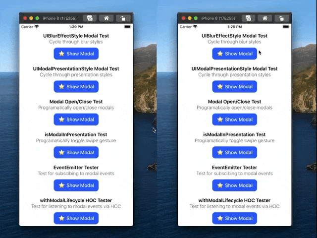
Please check out the examples directory for more on how to use it.
// import the library
import { ModalView } from 'react-native-ios-modal';

// and use it like this
<ModalView ref={r => this.modalRef = r}>
  <Text> Hello World </Text>
<ModalView/>
<TouchableOpacity onPress={() => {
  this.modalRef.setVisibility(true);
}}>
  <Text> Open Modal </Text>
</TouchableOpacity>
3. Documentation
3.1 ModalView Component Props
3.1.1 Props: Flags
| Name | Default | Description |
|---|---|---|
| presentViaMount | false | If this prop is set to true, the modal will be presented or dismissed when the ModalView is mounted/unmounted. Note: Currently buggy/wip. |
| isModalBGBlurred | true | Set whether or not the background is blurred. When true, modalBGBlurEffectStyle prop takes effect. |
| enableSwipeGesture | true | When the modal is using pageSheet or similar modalPresentationStyle, this prop controls whether or not the swipe gesture is enabled. |
| hideNonVisibleModals | false | When multiple modals are visible at the same time, the first few modals will be temporarily hidden (they will still be mounted) to improve performance when this prop is set to true. |
| isModalBGTransparent | true | Sets whether or not the modal background is transparent. When set to false, the background blur effect will be disabled automatically. |
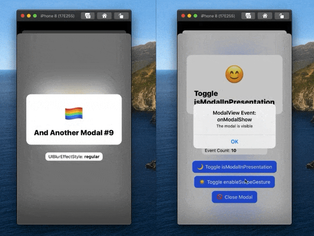
| isModalInPresentation | false | When set to true, it prevents the modal from being dismissed via a swipe gesture. The modal will still be swipeable, but the modal will not close when its swiped down but instead, it will bounce back up. |
| setEnableSwipeGestureFromProps | false | When set to true, it allows you to set the enableSwipeGesture via the setEnableSwipeGesture function. |
| setModalInPresentationFromProps | false | When set to true, it allows you to set theisModalInPresentation via the setIsModalInPresentationfunction. |
3.1.2 Props: Strings
| Name/Type | Default | Description |
|---|---|---|
modalID: string |
Default: null |
Assign a unique ID to the modal. You can use the ID to refer to this modal when using the ModalViewModule functions and programatically control it. |
modalTransitionStyle: UIModalTransitionStyles value |
Default: coverVertical |
The transition style to use when presenting/dismissing a modal. If an invalid/unsupported value is passed, the default or the last supported value will be used. |
modalPresentationStyle: UIModalPresentationStyles value |
Default: automatic when on iOS 13+, otherwise overFullScreen |
The presentation style to use when presenting/dismissing a modal. If an invalid/unsupported value is passed, the default or the last supported value will be used. |
modalBGBlurEffectStyle: UIBlurEffectStyles value |
Default: systemThinMaterial when on iOS 13+, otherwise light |
The blur style to use for the UIBlurEffect modal background. If an invalid/unsupported value is passed, the default or the last supported value will be used. |
3.1.3 Props: Modal Events
| Name | Description |
|---|---|
onModalFocus({nativeEvent}) |
Gets called when a modal is focused and is not currently the top most modal (to avoid duplicating the onModalShow event) |
onModalBlur({nativeEvent}) |
Gets called when a modal loses focus and is not currently the top most modal (to avoid duplicating the onModalDismiss event) |
onModalShow({nativeEvent}) |
Gets called after a modal is presented. |
onModalDismiss({nativeEvent}) |
Gets called after a modal is dismissed. |
onModalDidDismiss({nativeEvent}) |
Gets called after a modal is successfully dismissed via a swipe gesture. (Wrapper for UIAdaptivePresentationControllerDelegate.presentationControllerDidDismiss). |
onModalWillDismiss({nativeEvent}) |
Gets called when a modal is being swiped down via a gesture. ((Wrapper for UIAdaptivePresentationControllerDelegate.presentationControllerWillDismiss). |
onModalAttemptDismiss({nativeEvent}) |
Gets called when a modal is swiped down when isModalInPresentation is true. (Uses UIAdaptivePresentationControllerDelegate.presentationControllerDidAttemptToDismiss). |
3.1.3 Props: Misc
| Name | Description |
|---|---|
| containerStyle | The style for the view that holds the modal contents. |
3.1.4 Props: Modal Functions
| Name | Description |
|---|---|
getEmitterRef() -> ModalVIewRef |
Gets a ref to the EventEmitter instance. |
aysnc setVisibility(visibility: bool, childProps: object) -> success: bool |
Programatically present/dismiss the modal. Resolved after the modal is presented/dismissed. Note: when a modal is hidden, the modal contents/children are unmounted and vice versa when modal is visible. |
aysnc getModalInfo() -> object: NativeEvent |
Get "native" info from the modal instance. Returns a NativeEvent object. |
aysnc setEnableSwipeGesture(bool) |
When setEnableSwipeGestureFromProps prop is true, it allows you to programatically set enableSwipeGesture prop via a function. |
async setIsModalInPresentation(bool) |
When setModalInPresentationFromProps prop is true, it allows you to programatically set isModalInPresentation via function. |
3.2 ModalViewModule
A NativeModule that's a collection of functions to programmatically control a ModalView
- Import the module:
import { ModalViewModule } from 'react-native-ios-modal' - Example Usage:
ModalViewModule.dismissAllModals(true)
| Function | Description |
|---|---|
async dismissModalByID(modalID: string) |
Close the ModalView with the corresponding modalID. Useful when you don't have a direct ref to the ModalView component. |
async dismissAllModals(animated: bool) |
Closes all visible modals. |
3.3 Enum Values
3.3.1 Enum: UIBlurEffectStyles
Enum values that you can pass to the ModalView modalBGBlurEffectStyle prop. More detailed description are available in the Apple Developer Docs
- Import the enum like this:
import { UIBlurEffectStyles } from 'react-native-ios-modal' - And use the enum in the
ModalViewmodalBGBlurEffectStyleprop like this:modalBGBlurEffectStyle={UIBlurEffectStyles.systemMaterial} - Or if you prefer, just pass in a string value directly like this:
modalBGBlurEffectStyle={'systemMaterial'} - Here's an example component that cycles through all the available blur effect styles.
- Adaptable Styles — Changes based on the current system appearance. Requires iOS 13 and above.
systemUltraThinMaterialsystemThinMaterialsystemMaterialsystemThickMaterialsystemChromeMaterial
- Light Styles — Blur styles that are tinted white/light. Meant to be used for system light appearance. Requires iOS 13 and above.
systemMaterialLightsystemThinMaterialLightsystemUltraThinMaterialLightsystemThickMaterialLightsystemChromeMaterialLight
- Dark Styles — Blur styles that are tinted black/dark. Meant to be used for system dark appearance. Requires iOS 13 and above.
systemChromeMaterialDarksystemMaterialDarksystemThickMaterialDarksystemThinMaterialDarksystemUltraThinMaterialDark
- Regular Styles — Blur styles that were originally added in iOS 10.
regularprominent
- Light/Dark Styles — Blur styles that were originally added in iOS 8.
lightextraLightdark
3.3.2 Enum: UIModalPresentationStyles
Enum values that you can pass to the ModalView modalPresentationStyle prop. More detailed description are available in the Apple Developer Docs
- Import the enum like this:
import { UIModalPresentationStyles } from 'react-native-ios-modal' - And use the enum in the
ModalViewmodalPresentationStyleprop like this:modalPresentationStyle={UIModalPresentationStyles.fullScreen} - Or if you prefer, just pass in a string value directly like this:
modalPresentationStyle={'fullScreen'} - Here's an example component that cycles through all the available blur effect styles.
- Supported Presentation Styles
automatic— Requires iOS 13 to work. The default presentation style for iOS 13 and above.fullScreen— Present fullscreen but with an opaque background. The default presentation style on iOS 12 and below.overFullScreen— Present fullscreen but with a transparent background.pageSheet— The presentation style used on iPhones running iOS 13. Present a modal that can be dismissed via a swipe gesture.formSheet— The presentation style used on iPads. Same aspageSheetwhen on iPhone.
- Not Supported
nonecurrentContextcustomoverCurrentContextpopoverblurOverFullScreen
3.3.3 Enum: UIModalTransitionStyles
Enum values that you can pass to the ModalView modalTransitionStyle prop. More detailed description are available in the Apple Developer Docs
- Import the enum like this:
import { UIModalTransitionStyles } from 'react-native-ios-modal' - And use the enum in the
ModalViewmodalTransitionStyleprop like this:modalTransitionStyle={UIModalTransitionStyles.coverVertical} - Or if you prefer, just pass in a string value directly like this:
modalTransitionStyle={'coverVertical'}
- Supported Transition Styles
coverVerticalcrossDissolveflipHorizontal
- Not Supported
partialCurl
3.3.4 Enum: ModalEventKeys
Enum values that you can use in the ModalView EventEmitter instance. Use the enum values to add/remove a listener.
- Import the enum like this:
import { ModalEventKeys } from 'react-native-ios-modal' - And use the enum in the
ModalViewEventEmitterinstance like this:modalEmitter.addListener(ModalEventKeys.onModalShow, this._handleOnModalShow) - Or if you prefer, just pass in a string value directly like this:
modalEmitter.addListener('onModalShow', this._handleOnModalShow) - You can get a ref to a modal's
EventEmitterlike this:modalRef.getEmitterRef()
onModalBluronModalFocusonModalShowonModalDismissonModalDidDismissonModalWillDismissonModalAttemptDismiss
3.4 ModalContext
A context you can use inside the ModalView component.
- Import the context like this:
import { ModalContext } from 'react-native-ios-modal'
| Object Key | Value Description |
|---|---|
| getModalRef | A function that returns a ref to the ModalView |
| getEmitterRef | A function that returns a ref to the ModalView's EventEmitter instance |
| setVisibility | A function that calls the ModalView setVisibility function |
| setEnableSwipeGesture | A function that calls the ModalView setVisibility function |
| setIsModalInPresentation | A function that calls the ModalView setIsModalInPresentation function |
3.5 withModalLifecycle HOC
A HOC function that wraps a component so you can listen to the modal events in that component. The wrapped component must be a child of ModalView i.e the component must be use inside the ModalView component. This is because the HOC uses the ModalContext to subscribe to the events of the ModalView. The HOC handles consuming the ModalContext and subscribing/unsubscribing to the modal's EventEmitter instance. Check out the example for more on how to use it.
- Import the HOC function like this:
import { withModalLifecycle } from 'react-native-ios-modal' - Wrap the component using the HOC function:
export default withModalLifecycle(ModalContents); - In the wrapped component, declare a member function with the name of the event that you want to use:
onModalFocus({nativeEvent}){ ... } - The name of the function must match any of the keys/strings defined in
ModalEventKeys
3.6 Modal EventEmitter
- Each
ModalViewhas anEventEmitterinstance, so the first step to use it is to get a ref to the emitter.- If you have a reference to the
ModalView, you can callmodalRef.getEmitterRef()to get a ref to the emitter instance. - Or you can get a ref to the emitter instance via context:
this.context.getEmitterRef()orconst { getEmitterRef } = useContext(ModalContext)
- If you have a reference to the
- To subscribe to a modal event:
modalEmitter.addListener('onModalBlur', this._handleOnModalBlur) - To unsubscribe to a modal event:
modalEmitter.removeListener('onModalBlur', this._handleOnModalBlur) - The string of available events to subscribe to are in
ModalEventKeys
3.7 Modal NativeEvent object
Example {nativeEvent} object that gets passed to all the modal events.
{
  "isInFocus": true,
  "isPresented": true,
  "modalLevel": 1,
  "modalLevelPrev": -1,
  "modalUUID": "DDADB792-3F85-4849-B669-AB734EC3B610",
  "target": 197
}
isInFocus: bool— whether or not the modal is in focusisPresented: bool— whether or not the modal is visible or notmodalLevel: int— indicates the modal level (ex: 1 means it's the first modal that's currently visible, etc.)modalLevelPrev: int— indicates the modal level (-1 means it's not currently visible)modalUUID: string— the modal's auto generated unique ID.
3.8 Constants
3.8.1 AvailableBlurEffectStyles Constant
An array of UIBlurEffectStyles strings you can use on a ModalView's modalBGBlurEffectStyle prop. The available blur effect styles are based on the iOS version the app is running on.
- Example:
import { AvailableBlurEffectStyles } from 'react-native-ios-modal'; - On android,
AvailableBlurEffectStyleswill be empty.
3.8.2 AvailablePresentationStyles Constant
An array of UIModalPresentationStyles strings you can use on a ModalView's modalTransitionStyle prop. The available presentation styles are based on the iOS version the app is running on.
- Example:
import { AvailablePresentationStyles } from 'react-native-ios-modal'; - On android,
AvailablePresentationStyleswill be empty.
4. Examples
Check out the examples directory for testing out the ModalView.