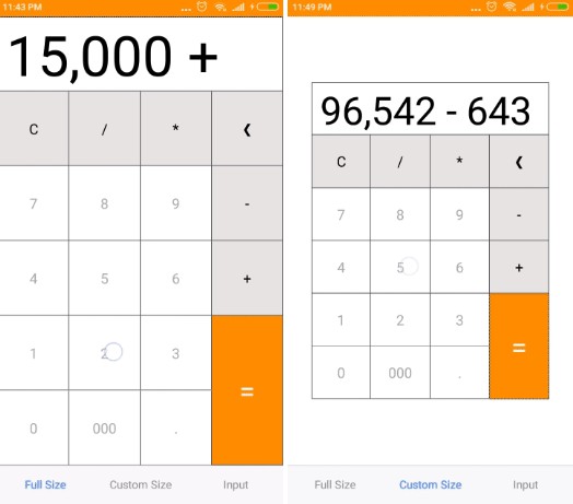
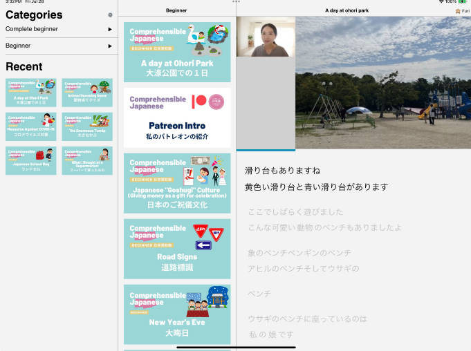
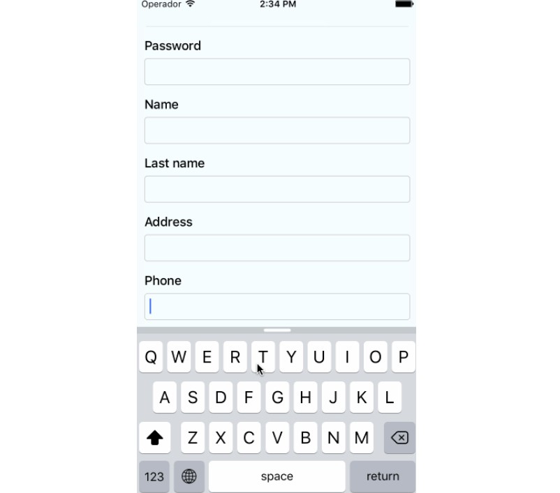
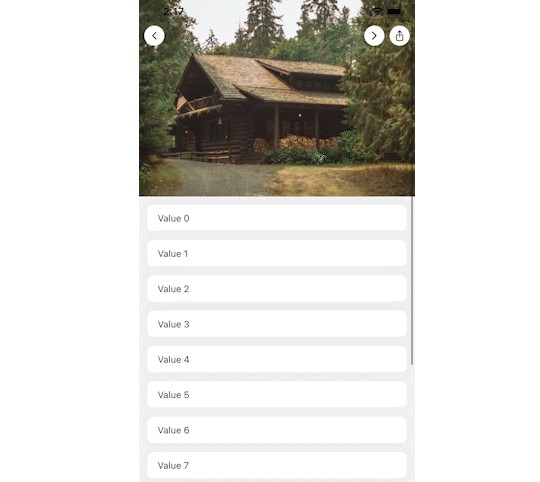
react-native-header-scroll-view
A React Native component that creates a Apple-esque large header that fades in a smaller header as you scroll.
Apple features this UI pattern in Apple Music and Books.

Installation
# yarn
yarn add react-native-header-scroll-view

# npm
npm install react-native-header-scroll-view --save
Then, import with:
import HeaderScrollView from 'react-native-header-scroll-view';
Usage
Example usage:
import React, { Component } from 'react';
import { Text } from 'react-native';
import HeaderScrollView from 'react-native-header-scroll-view';

class App extends Component {
  render() {
    return (
      <HeaderScrollView title="For You">
        <Text>...</Text>
      </HeaderScrollView>
    );
  }
}
Props
For default Apple-style settings, you only need to provide:
| Prop | Type | Description |
|---|---|---|
title |
string | The title of the header. This will show up as large text inside the scroll view and then fade in as the smaller text inside the header. |
From there, you can customize this component to get exactly what you want.
| Prop | Type | Description |
|---|---|---|
titleStyle |
React Native style or Object | Styles the large header title component inside the scroll view. |
containerStyle |
React Native style or Object | Styles the entire container wrapping the header and the scrollview. |
headerContainerStyle |
React Native style or Object | Styles the container of the header component that appears after scrolling. |
headerComponentContainerStyle |
React Native style or Object | Styles the component inside the header. Anything within this style will fade in and out as the scroll position changes. |
headlineStyle |
React Native style or Object | Styles the header text inside the header that appears after scrolling. |
scrollContainerStyle |
React Native style or Object | Styles the scroll view component. |
fadeDirection |
String | When the header component fades, it can fade 'up' or 'down', |
scrollViewProps |
Object | Pass any extra props to the scrollView. |
Visual reference of the styles containers:


