React native simple toast message
This is a React Native component that displays a toast message on the screen. It provides two types of toasts: success and error, which are customizable through the provided ToastConfig object.
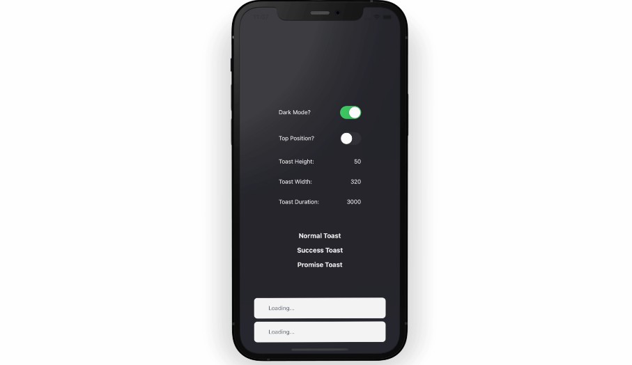
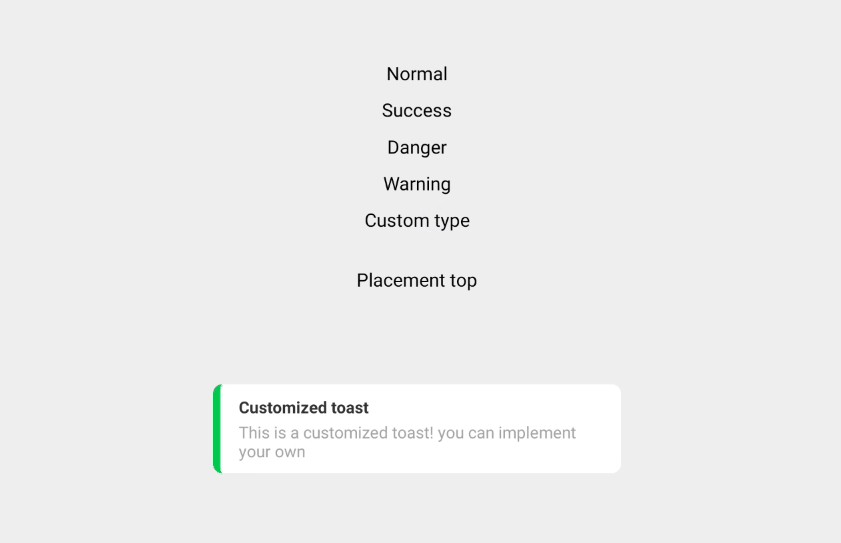
Demo
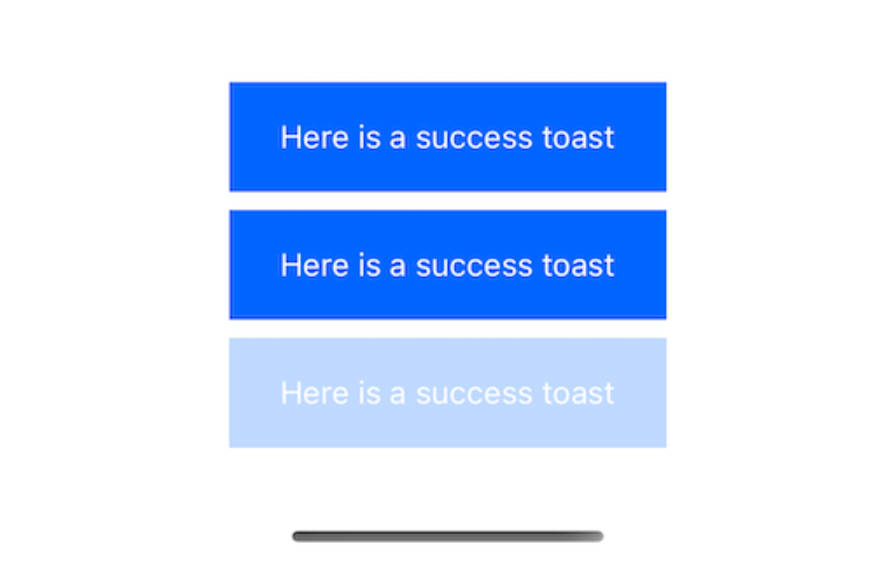
In case multiple toasts are shown, they are stacked on top of each other


Installation
To use this component, install it as an npm package:
npm install --save react-native-toast-message
or
yarn add react-native-toast-message
Usage
Import the Provider component from the package and wrap it around your main component:
import Toast from "react-native-toast-message";

const App = () => {
  return (
    <View>
      {/* Your main component */}
      <Toast.Provider />
    </View>
  );
};
This creates a toast provider that can be used to show toast messages. To show a toast message, simply call the showSuccess or showError method of the Toast object:
import Toast from "react-native-toast-message";

const ExampleComponent = () => {
  const handleButtonClick = () => {
    Toast.showSuccess("Success message");
    Toast.showError("Error message");
  };

  return (
    <View>
      <Button title="Show Toast" onPress={handleButtonClick} />
    </View>
  );
};
By default, the component will be displayed at the bottom of the screen, above the keyboard (if visible). You can customize the appearance of the toast by passing a ToastConfig object to the Provider component:
import Toast from "react-native-toast-message";

const config = {
  successStyle: {
    backgroundColor: "#00FF00",
  },
  errorStyle: {
    backgroundColor: "#FF0000",
  },
  textStyle: {
    color: "#FFFFFF",
  },
};

const App = () => {
  return (
    <View>
      {/* Your main component */}
      <Toast.Provider config={config} />
    </View>
  );
};
API
Provider
The Provider component is used to display toast messages. It has the following props:
config?: ToastConfig: An optional object containing the configuration options for the toasts. See the ToastConfig type for more information.
showSuccess
Static method that displays a success toast message.
message: string: The message to be displayed in the toast.
showError
Static method that displays an error toast message.
message: string: The message to be displayed in the toast.
Types
ToastConfig
An object containing the configuration options for the toast messages. It has the following properties:
successStyle?: ViewStyle: An optional object containing the style properties for success toasts.
errorStyle?: ViewStyle: An optional object containing the style properties for error toasts.
textStyle?: ViewStyle: An optional object containing the style properties for the text in the toasts.
ToastType
A type that represents the type of toast message. It can be either "success" or "error".