React Native Material Datetime Picker
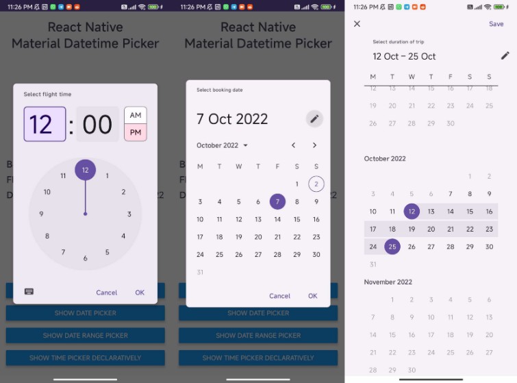
A React Native date & time picker for Android, using Google’s latest Material Design components. Built with Typescript ❤️
Table of Contents
? About The Project
This library is a React Native date & time picker component for Android, using Google’s latest Material Design components. It only works on Android, as iOS has its own native date & time picker components. For iOS, you can use the RNDateTimePicker or DatePickerIOS (deprecated).
⚙️ Getting Started
Prerequisites
- Material Design Components for Android
- Starting from version
0.2.0, you no longer have to install the Material Design Components library and update your app theme. Please make sure to remove it from your project if you have it installed.
- Starting from version
Installation
yarn add react-native-material-datetime-picker
Rebuild the project. Since iOS is not currently supported, running npx pod-install is optional.
 Expo Support
This library should work with the EAS development client library, but it has not been tested. For managed projects, a config plugin might be needed. If you would like to contribute a config plugin, please open an issue.
⚒️ Usage (Android)
Imperative API
import { MaterialDatetimePickerAndroid } from 'react-native-material-datetime-picker';

export const App = () => {
  const [date, setDate] = useState(new Date());
  const [time, setTime] = useState(new Date());

  const showTimePicker = () => {
    MaterialDatetimePickerAndroid.show({
      value: time,
      titleText: 'Select flight time',
      mode: AndroidPickerMode.TIME,
      is24Hours: true,
      inputMode: AndroidTimeInputMode.CLOCK,
      onChange: (time) => {
        setTime(time);
      },
    });
  };

  const showDatePicker = () => {
    MaterialDatetimePickerAndroid.show({
      value: date,
      titleText: 'Select booking date',
      mode: AndroidPickerMode.DATE,
      minimumDate: subWeeks(today, 3),
      maximumDate: addWeeks(today, 4),
      inputMode: AndroidDateInputMode.CALENDAR,
      type: AndroidDatePickerType.DEFAULT,
      onChange: (date) => {
        setDate(date);
      },
    });
  };


  return (
    <View>
      <Button onPress={showDatePicker} title="Show date picker" />
      <Button onPress={showTimePicker} title="Show time picker" />
      <Text>Date: {date.toLocaleString()}</Text>
      <Text>Time: {time.toLocaleString()}</Text>
    </View>
  );
};
Declarative API
import RNMaterialDatetimePicker from 'react-native-material-datetime-picker';

export const App = () => {
  const [currentDate, setCurrentDate] = useState(new Date());
  const [isVisible, setIsVisible] = useState(false)

  return (
    <View>
      {isVisible &&
        <RNMaterialDatetimePicker
          mode={AndroidPickerMode.DATE}
          value={currentDate}
          minimumDate={subWeeks(today, 3)}
          maximumDate={addWeeks(today, 4)}
          onChange={(date) => {
            setCurrentDate(date);
            setIsVisible(false);
          }}
        />
      }
    </View>
  );
};
Props
Common Options
| Name | Type | Default | Required | Description |
|---|---|---|---|---|
mode |
AndroidPickerMode |
AndroidPickerMode.DATE |
❌ | The mode of picker to show. Can be either AndroidPickerMode.DATE or AndroidPickerMode.TIME. |
value |
Date |
✅ | The current value of the picker | |
titleText |
string |
❌ | The title to be shown on the top left | |
positiveButtonText |
string |
❌ | The text used in the positive action button | |
negativeButtonText |
string |
❌ | The text used in the negative action button | |
onChange |
(date: Date) => string |
❌ | The callback invoked when a new date or time is selected | |
onError |
(error: unknown) => void |
❌ | The callback invoked when an error occured while selecting a new value |
Date Picker Options
| Name | Type | Default | Required | Description |
|---|---|---|---|---|
minimumDate |
Date |
❌ | The minimum date allowed to be selected | |
maximumDate |
Date |
❌ | The maximum date allowed to be selected | |
startDate |
Date |
❌ | The start date when using a date range picker | |
endDate |
Date |
❌ | The end date when using a date range picker | |
inputMode |
AndroidDateInputMode |
❌ | The input mode to launch the date picker in | |
fullscreen |
boolean |
❌ | Whether to show the date picker in fullscreen mode | |
type |
AndroidDatePickerType |
❌ | The type of date picker to launch. Can be either AndroidDatePickerType.DEFAULT for the regular date picker or AndroidDatePickerType.RANGE for the date range picker |
|
onDateRangeChange |
(startDate: Date, endDate: Date) => void |
❌ | The callback invoked when a date range is selected |
Time Picker Options
| Name | Type | Default | Required | Description |
|---|---|---|---|---|
is24Hours |
boolean |
❌ | The time format to launch the time picker in | |
inputMode |
AndroidTimeInputMode |
❌ | The input mode to launch the time picker in |
?️ Roadmap
- Polyfill for iOS and Web
- Theme support
See the open issues for a full list of proposed features (and known issues).
? Contributing
Contributions are what make the open source community such an amazing place to learn, inspire, and create. Any contributions you make are greatly appreciated.
If you have a suggestion that would make this better, please fork the repo and create a pull request. You can also simply open an issue with the tag “enhancement”. Don’t forget to give the project a star! Thanks again!
- Fork the Project
- Create your Feature Branch (
git checkout -b feature/AmazingFeature) - Commit your Changes (
git commit -m 'Add some AmazingFeature') - Push to the Branch (
git push origin feature/AmazingFeature) - Open a Pull Request
? License
Distributed under the MIT License. See LICENSE for more information.
? Acknowledgments
- @react-native-datetimepicker/datetimepicker – inspiration for the declarative API
