react-native-js-bottom-sheet
Modal bottom sheet component for Android and iOS that follows the guidelines of Material Design.
Getting started
$ yarn add react-native-js-bottom-sheet
Usage
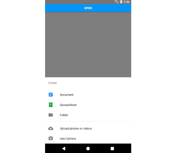
Code refers to the previous image example:
/* @flow */

import React, { Component } from 'react'
import { AppRegistry, StyleSheet, Text, View, Button } from 'react-native'
import BottomSheet from 'react-native-js-bottom-sheet'
import MaterialCommunityIcons from 'react-native-vector-icons/MaterialCommunityIcons'
import Entypo from 'react-native-vector-icons/Entypo'

export default class Example extends Component {
  bottomSheet: BottomSheet

  _onPressButton = () => {
    this.bottomSheet.open()
  }

  render() {
    return (
      <View style={styles.container}>
        <Button title="Open" onPress={this._onPressButton} />
        <BottomSheet
          ref={(ref: BottomSheet) => {
            this.bottomSheet = ref
          }}
          itemDivider={3}
          backButtonEnabled={true}
          coverScreen={false}
          title="Create"
          options={[
            {
              title: 'Document',
              icon: (
                <MaterialCommunityIcons
                  name="file-document-box"
                  color="#2186fa"
                  size={24}
                />
              ),
              onPress: () => null
            },
            {
              title: 'Spreadsheet',
              icon: <Entypo name="spreadsheet" color="#43a047" size={24} />,
              onPress: () => null
            },
            {
              title: 'Folder',
              icon: (
                <MaterialCommunityIcons name="folder" color="grey" size={24} />
              ),
              onPress: () => null
            },
            {
              title: 'Upload photos or videos',
              icon: (
                <MaterialCommunityIcons
                  name="cloud-upload"
                  color="grey"
                  size={24}
                />
              ),
              onPress: () => null
            },
            {
              title: 'Use Camera',
              icon: (
                <MaterialCommunityIcons name="camera" color="grey" size={24} />
              ),
              onPress: () => null
            }
          ]}
          isOpen={false}
        />
      </View>
    )
  }
}
API
| Prop | Type | Required | Description |
|---|---|---|---|
| coverScreen | bool | No | Will use RN Modal component to cover the entire screen wherever the modal is mounted in the component hierarchy |
| backButtonEnabled | bool | No | Close modal when receiving back button event |
| height | number | No | Height of the container. By default it has no height, due to container grows automatically depending of list of elements |
| title | string | Yes | Title displayed in top of list |
| options | Array | Yes | Array of objects to display options list |
| fontFamily | string | No | Used to display values. By default is Roboto |
| titleFontFamily | string | No | Title font family |
| isOpen | bool | No | Specifies if bottom sheet is open by default |
| itemDivider | number | No | Insert an item separator below the specified item number |