react-native-scl-alert
A pure react native javascript implementation of the package.
Road Map
- [x] Documentation to customize styles
- [ ] Handle orientation
- [x] Default images for header
- [ ] Text Field Component
- [ ] More transitions
Features
- Declarative API
- High customizable UI
- Built in themes inspired on bootstrap
Setup
yarn add react-native-scl-alert
or
npm install --save react-native-scl-alert
Usage
import React from 'react'
import {
  View,
  Button,
  StyleSheet
} from 'react-native'

import {
  SCLAlert,
  SCLAlertButton
} from 'react-native-scl-alert'

export default class App extends React.Component {
  state = {
    show: false
  }

  handleOpen = () => {
    this.setState({ show: true })
  }

  handleClose = () => {
    this.setState({ show: false })
  }

  render() {
    return (
      <View style={styles.container}>
        <Button title="Show" onPress={this.handleOpen} />
        <SCLAlert
          theme="info"
          show={this.state.show}
          title="Lorem"
          subtitle="Lorem ipsum dolor"
        >
          <SCLAlertButton theme="info" onPress={this.handleClose}>Done</SCLAlertButton>
        </SCLAlert>
      </View>
    )
  }
}

const styles = StyleSheet.create({
  container: {
    flex: 1,
    backgroundColor: '#fff',
    alignItems: 'center',
    justifyContent: 'center'
  }
})
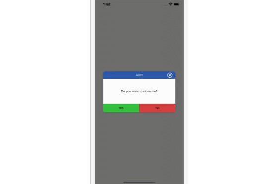
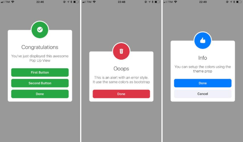
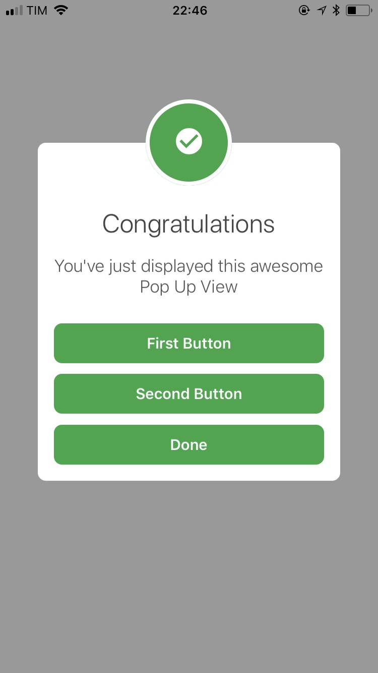
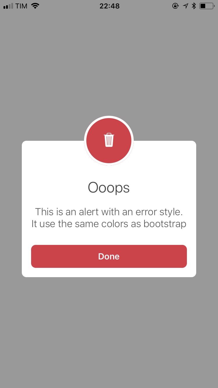
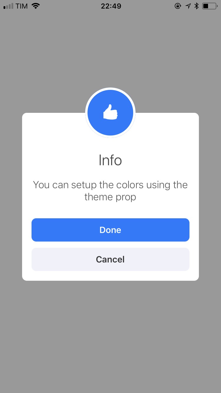
Demo
You can customized the look and feel of this library the way you want, but, if you prefer, we ship 6 themes for you:
defaultinversesuccessinfodangerwarning
SCLAlert
| Name | Type | Default | Description |
|---|---|---|---|
| show | PropTypes.bool | false | Show the alert |
| cancellable | PropTypes.bool | true | If user press in the overlay, will trigger onRequestClose func |
| onRequestClose | PropTypes.func | null | Trigger a function asking to close the alert |
| slideAnimationDuration | PropTypes.number | 250 | Duration in ms of the alert animation |
| overlayStyle | ViewPropTypes.style | {} | Extends the overlay view style |
| title | PropTypes.string | REQUIRED | A string to render in the modal title |
| titleContainerStyle | ViewPropTypes.style | {} | Extends the title container view style |
| titleStyle | Text.propTypes.style | {} | Extends the title text style |
| subtitle | PropTypes.string | REQUIRED | A string to render in the modal subtitle |
| subtitleContainerStyle | ViewPropTypes.style | {} | Extends the subtitle container view style |
| subtitleStyle | Text.propTypes.style | {} | Extends the subtitle text style |
| headerContainerStyles | ViewPropTypes.style | {} | Extends the title headerContainer view style |
| headerInnerStyles | ViewPropTypes.style | {} | Extends the title headerInner view style |
| headerIconComponent | PropTypes.node | null | A component to render inside the header |
| children | PropTypes.node | null | Custom content. Put here buttons and text inputs |
SCLAlertButton
| Name | Type | Default | Description |
|---|---|---|---|
| children | PropTypes.string or PropTypes.node | REQUIRED | String or react node |
| containerStyle | ViewPropTypes.style | {} | |
| textStyle | Text.propTypes.style | {} | |
| theme | PropTypes.string | 'default' | Check options above |
| onPress | PropTypes.func | REQUIRED | Callback after user press in the button |