Reinput
A React Native TextInput with material style.
Installation
npm install --save reinput
yarn add reinput
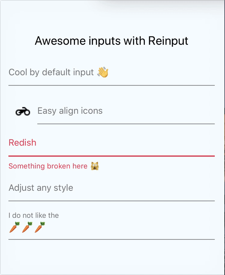
Motivation
Styling react-native inputs can be cumbersome. And most of them heavily relies
onto the material design patterns. This style layer over the regular TextInput
paves the way towards and easier and faster development.
We also expose a ReinputButton. Check the docs ;)
Usage
import Reinput from 'reinput'

const Input = () => (
  <View>
    <Reinput label='name' />
    <Reinput error='Handles error' />
    <Reinput label='name' value='control value from outside' />
    <Reinput label='name' defaultValue='initial value' />
    <Reinput label='name' onChangeText={/* any TextInput prop */} />
  </View>
)
Props
Input
| Name | Type | Default |
|---|---|---|
| activeColor | String | |
| color | String | #000000 |
| fontFamily | String | |
| fontSize | Number | 15 |
| fontWeight | String or Number | normal |
| height | Number | 64 |
| marginBottom | Number | 8 |
| marginLeft | Number | |
| marginRight | Number | |
| marginTop | Number | |
| maxHeight | Number | |
| minHeight | Number | |
| onBlur | Function | |
| onChangeText | Function | |
| onContentSizeChange | Function | |
| onFocus | Function | |
| paddingBottom | Number | 8 |
| paddingLeft | Number | 0 |
| paddingRight | Number | 0 |
| paddingTop | Number | 20 |
| register | Function | noop |
- Register exposes the
TextInputref component out
Label
| name | type | default |
|---|---|---|
| label | String | |
| labelActiveColor | String | #3f51b5 |
| labelActiveScale | Number | 0.8 |
| labelActiveTop | Number | -18 |
| labelColor | String | #757575 |
| labelDuration | Number | 200 |
Icon
| Name | Type | Default |
|---|---|---|
| icon | Element | |
| iconOverlay | Element |
Placeholder
| Name | Type | Default |
|---|---|---|
| placeholder | String | |
| placeholderColor | String | #757575 |
Underline
| Name | Type | Default |
|---|---|---|
| underlineActiveColor | String | #3f51b5 |
| underlineActiveHeight | Number | 2 |
| underlineColor | String | #757575 |
| underlineDuration | Number | 200 |
| underlineHeight | Number | 1 |
Error
| Name | Type | Default |
|---|---|---|
| error | String | |
| errorColor | String | #fc1f4a |
| errorFontSize | Number | 12 |
| errorPaddingTop | Number | 8 |
And also all the TextInput properties will work.
ReinputButton
We also expose a component that looks like an Input but it's a button so accepts onPress prop.
We do following the material design guidelines.
Props are the same as the Input but it also accepts an onPress and doesn't have hooks for focus/blur events.
import { ReinputButton } from 'reinput'

const Input = () => (
  <ReinputButton
    label='This is not an Input'
    value='If there is no value it shows the label as placeholder'
    onPress={/* whatever callback */}
  />
)
Example
I'm working on an expo demo. So far, you can clone the project and check the example dir.
It's the one of the gif ;)