? react-native-media-console
VideoPlayer for the React Native <Video> component at react-native-video.
⭐️ Features
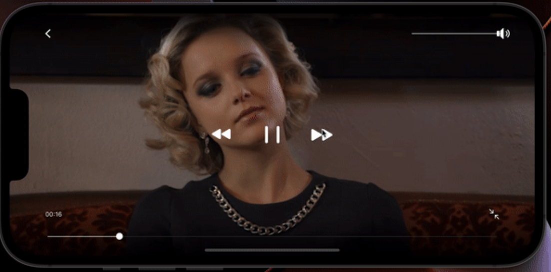
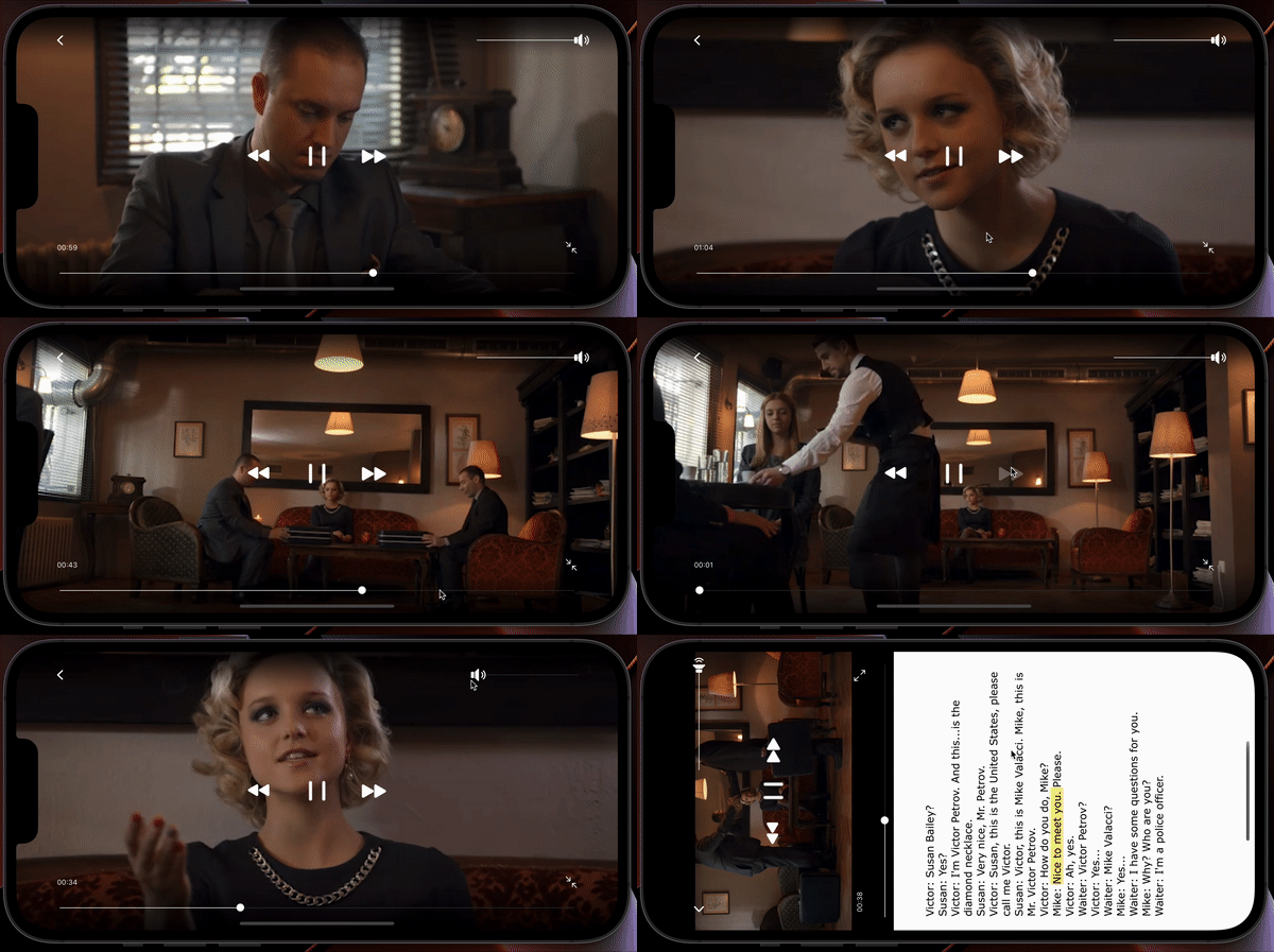
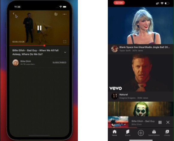
This package contains a simple set of GUI controls that work with the react-native-video <Video> component.
- Back Button
- Volume bar
- Fullscreen button
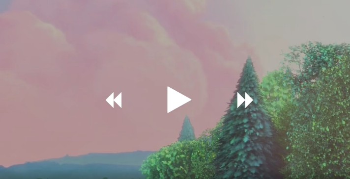
- Play/Pause button
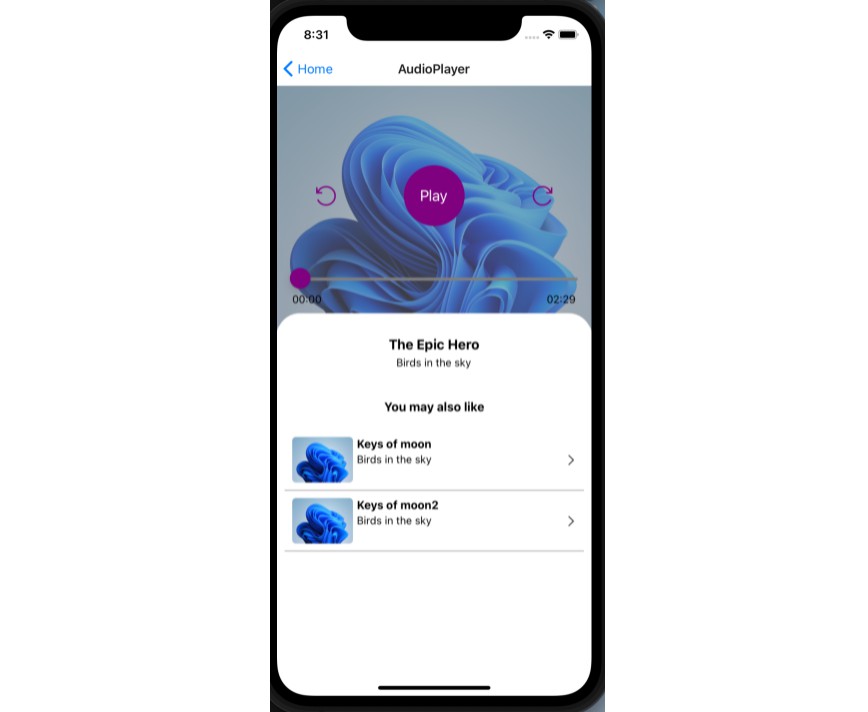
- Rewind/Forward buttons
- Seekbar
- Title
- Error handling
- Timer
- Rate button
By default the <VideoPlayer> accepts a navigator property from React’s built-in <Navigator> which pops the current scene off the stack when tapped. Alternatively you can provide your own onBack prop to the component to override this functionality. You should also provide your own onEnd prop to the component so it knows what to do when a video ends playback.
By default, tapping the screen anywhere will show the player controls. After 15s the controls disappear. Double tapping will toggle fullscreen.
⚙️ Installation
Run yarn add react-native-video react-native-media-console
Then follow installation instructions from react-native-video.
We’re actively supporting only RN < 45.
? Usage
The <VideoPlayer> component follows the API of the <Video> component
at react-native-video. It also takes a number of
additional props which are outlined in the API section.
For basic operation the <VideoPlayer> component requires a video source and a navigator property. The default back
button functionality in the component relies on using the built-in <Navigator> functionality in React Native and pops
the current scene off the stack. This can be overridden if desired, see the API for more details.
// At the top where our imports are...
import VideoPlayer from 'react-native-media-console';

// in the component's render() function
<VideoPlayer
  source={{uri: 'https://vjs.zencdn.net/v/oceans.mp4'}}
  navigator={props.navigator}
/>;
To play a local file, use require syntax like so:
<VideoPlayer source={require('path/to/file')} />
? API
The <VideoPlayer> component can take a number of inputs to customize it as needed. They are outlined below:
Props
You can pass any of the props that the <Video /> component at react-native-video takes. Simply add them onto the <VideoPlayer /> and it will pass them through to the <Video /> component.
In addition, the <VideoPlayer /> also takes these props:
| Prop | Type | Default | Description |
|---|---|---|---|
| toggleResizeModeOnFullscreen | Boolean | false | If true, clicking the fullscreen button will toggle the <Video /> component between cover/contain, set to false if you want to customize fullscreen behaviour |
| controlAnimationTiming | Integer | 500 | The amountof time (in milliseconds) to animate the controls in and out. |
| doubleTapTime | Integer | 130 | Tapping twice within this amount of time in milliseconds is considered a double tap. Single taps will not be actioned until this time has expired. |
| controlTimeoutDelay | Integer | 15000 | Hide controls after X amount of time in milliseconds |
| showOnStart | Boolean | false | Show or hide the controls on first render |
| videoStyle | StyleSheet | null | React Native StyleSheet object that is appended to the <Video> component |
| navigator | Navigator | null | When using the default React Native navigator and do not override the onBack function, you’ll need to pass the navigator to the VideoPlayer for it to function |
| rewindTime | Integer | 15 | Number of seconds to rewind or forward. |
| seekColor | String(#HEX) | ‘#FFF’ | Fill/handle colour of the seekbar |
| style | StyleSheet | null | React Native StyleSheet object that is appended to the video’s parent <View> |
| tapAnywhereToPause | Boolean | false | If true, single tapping anywhere on the video (other than a control) toggles between playing and paused. |
| showDuration | Boolean | false | Show duration of the media. |
| showTimeRemaining | Boolean | false | If true, show the time remaing, else show the current time in the Player. |
| showHours | Boolean | false | If true, convert time to hours in the Player |
| videoRef | Video | undefined | Pass ref to the <Video/> component |
Events
These are various events that you can hook into and fire functions on in the component:
| Callback | Description |
|---|---|
| onEnterFullscreen | Fired when the video enters fullscreen after the fullscreen button is pressed |
| onExitFullscreen | Fired when the video exits fullscreen after the fullscreen button is pressed |
| onHideControls | Fired when the controls disappear |
| onShowControls | Fired when the controls appear |
| onError | Fired when an error is encountered when loading the video |
| onPause | Fired when the video is paused after the play/pause button is pressed |
| onPlay | Fired when the video begins playing after the play/pause button is pressed |
| onBack | Function fired when back button is pressed, override if using custom navigation |
| onEnd | Fired when the video is complete |
Controls
These are the various controls that you can turn on/off as needed. All of these props default to false, override them to disable any controls
| Control | Description |
|---|---|
| disableFullscreen | Hide the fullscreen button |
| disablePlayPause | Hide the play/pause toggle and the rewind/forward buttons |
| disableSeekbar | Hide the seekbar |
| disableVolume | Hide the Volume control |
| disableTimer | Hide the timer |
| disableBack | Hide the back button |
