React Native Country Code Picker
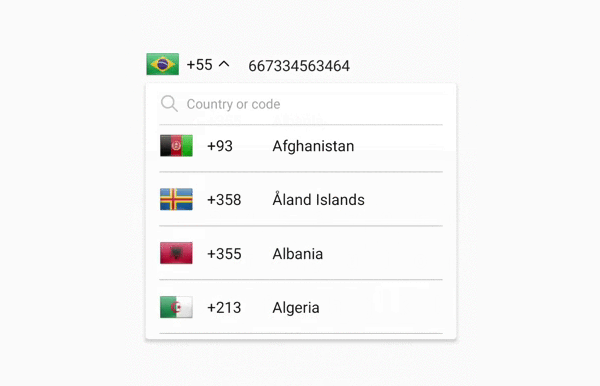
A searchable dropdown component to select a country code for your phone number input.

For Managed Workflow users using Expo
This component is not supported in the managed workflow for expo for the time being.
Getting started
npm install @digieggs/rn-country-code-picker --save
or
yarn add @digieggs/rn-country-code-picker
Also you need to manually install react-native-svg library for the icons in the component
npm install react-native-svg --save
or
yarn add react-native-svg
For [email protected] or above
As [email protected] or above supports autolinking, so there is no need to run linking process.
Read more about autolinking here.
iOS
CocoaPods on iOS needs this extra step
npx pod-install
Android
No additional step is required.
Usage
First of all, import the component.
import { CallingCodePicker } from 'rn-country-code-picker';
Then use it like this.
const [selectedCallingCode, setSelectedCallingCode] = useState('90'); // Give it a default value to show an initial flag and a code

return (
  <CallingCodePicker
    selectedValue={selectedCallingCode}
    onValueChange={value => setSelectedCallingCode(value)}
  />
);
Reference
Props
selectedValue
Value matching value of one of the items. Can be a string.
| Type | Required |
|---|---|
| string | Yes |
onValueChange
Callback for when an item is selected. This is called with the following parameters:
itemValue: the value of the item that was selected
| Type | Required |
|---|---|
| function | Yes |
togglerContainerStyle
Style to apply to the toggler container container. (for ex. you can give absolute positioning to align it inside the input.)
| Type | Required |
|---|---|
| StyleProp | No |
togglerLabelStyle
Style to apply to the picker toggler label.
| Type | Required |
|---|---|
| StyleProp | No |
listContainerStyle
Style to apply to the list container.
| Type | Required |
|---|---|
| StyleProp | No |
searchInputStyle
Style to apply to the search input.
| Type | Required |
|---|---|
| StyleProp | No |
listStyle
Style to apply to the FlatList component.
| Type | Required |
|---|---|
| StyleProp | No |
pickerItemLabelStyle
Style to apply to each of the item labels.
| Type | Required |
|---|---|
| StyleProp | No |


