React Native Segmented Control
A Segmented Control with React Native for both iOS and Android.
Installation
yarn add rn-segmented-control
# or
npm i rn-segmented-control
:arrows_clockwise: Dependencies
npm i prop-types
Usage
import React from 'react';
import { Dimensions, StyleSheet, Text, View } from 'react-native';
import SegmentedControl from 'rn-segmented-control';

const AppRoot = () => {
  const [tabIndex, setTabIndex] = React.useState(1);
  const handleTabsChange = index => {
    setTabIndex(index);
  };
  return (
    <View style={styles.container}>
      <Text style={styles.textStyle}>Hello,World !</Text>
      <Text style={styles.textStyle}>Segmented Control with 2 labels</Text>
      {/* Default Segmented Control */}
      <SegmentedControl
        tabs={['Label', 'Label']}
        onChange={() => { }}
        paddingVertical={6}
        containerStyle={{
          marginVertical: 20,
        }}
      />
      <Text style={styles.textStyle}> Segmented Control with 3 labels</Text>
      {/* Segmented Control with a custom width */}
      <SegmentedControl
        tabs={['Label', 'Label', 'Label']}
        onChange={() => { }}
        paddingVertical={10}
        containerStyle={{
          marginVertical: 20,
        }}
        width={Dimensions.get('screen').width - 200}
      />
      <Text style={styles.textStyle}> Segmented Control with 4 labels</Text>
      <SegmentedControl
        tabs={['Label', 'Label', 'Label', 'Label']}
        onChange={() => { }}
        paddingVertical={14}
        width={Dimensions.get('screen').width - 90}
        containerStyle={{
          marginVertical: 20,
        }}
        textStyle={{
          fontWeight: '300',
          fontSize: 24
        }}
      />
      <Text style={styles.textStyle}>Customised Segmented Control</Text>
      {/* Segmented Control with a custom width, container style and font weight */}
      <SegmentedControl
        tabs={['Shop', 'Explore', 'Search']}
        currentIndex={tabIndex}
        onChange={handleTabsChange}
        segmentedControlBackgroundColor='#86c4fd'
        activeSegmentBackgroundColor='#0482f7'
        activeTextColor='white'
        textColor='black'
        paddingVertical={10}
        width={Dimensions.get('screen').width - 100}
        containerStyle={{
          marginVertical: 20,
        }}
        textStyle={{
          fontWeight: '300',
        }}
      />
    </View >
  )
}


const styles = StyleSheet.create({
  container: {
    flex: 1,
    justifyContent: 'center',
    alignItems: 'center',
    marginHorizontal: 16,
  },
  textStyle: {
    fontSize: 24,
    textAlign: 'center',
    paddingVertical: 10
  }
})


export default AppRoot;
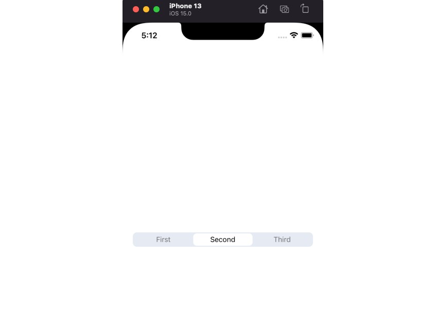
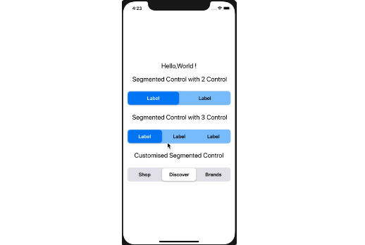
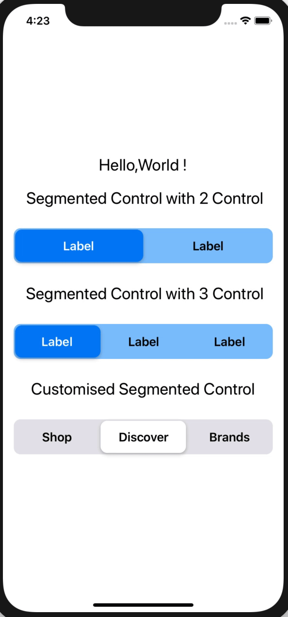
:camera: Screenshot
| iOS | Android |
|---|---|
 |
 |
:wrench: Props
| Name | Description | Required | Type | Default |
|---|---|---|---|---|
| tabs | An array of labels for segments | YES | Array | [] |
| onChange | A callback Function with pressed segment index | YES | Function | () => {} |
| currentIndex | Index for the currently active segment | YES | Number | 0 |
| activeSegmentBackgroundColor | Background color of Active Label | NO | Color | 'white' |
| segmentedControlBackgroundColor | Background color of the segment | NO | Color | '#E5E5EA' |
| textColor | Color of Label Text | NO | Color | 'black' |
| activeTextColor | Color of Active Label Text | NO | Color | 'black' |
| paddingVertical | A numeric value to manually adjust the height. | NO | Number | 12 |
| width | Sets the width of the segmented control | NO | Number | Screen Specific Width |
| containerStyle | Style object for the Segmented Control | NO | ViewPropTypes.style | {} |
| textStyle | Style object for the Labels | NO | Text.style | {} |
Color accepts all React Native Colors.
containerStyleaccepts all View styles and does not override the defaults provided by the package
textStyleaccepts all Text styles and overrides the defaults except the label colors set by props
:tada: Example
Checkout the example here.