react-native-segmented-round-display
react-native-segmented-round-display provides a simple ARC component, drawn with react-native-svg, it can have one or more segments and its easy configurable.

Features
- One segment
- Multiple segments
- Fill animation
- Control of fill animation duration
- Animated tag with value
- Custom value formater
- Configurable colors
- Configurable ARC radius and total size in degrees
- Configurable space between arc segments
- React Web version
Installation
first
This package uses react-native-svg to draw SVGs, so please install it following this installation manual.
then
yarn add react-native-segmented-round-display
or
npm install react-native-segmented-round-display --save
Usage
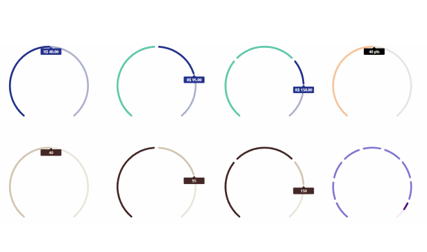
Here's a simple example. To render output like this:
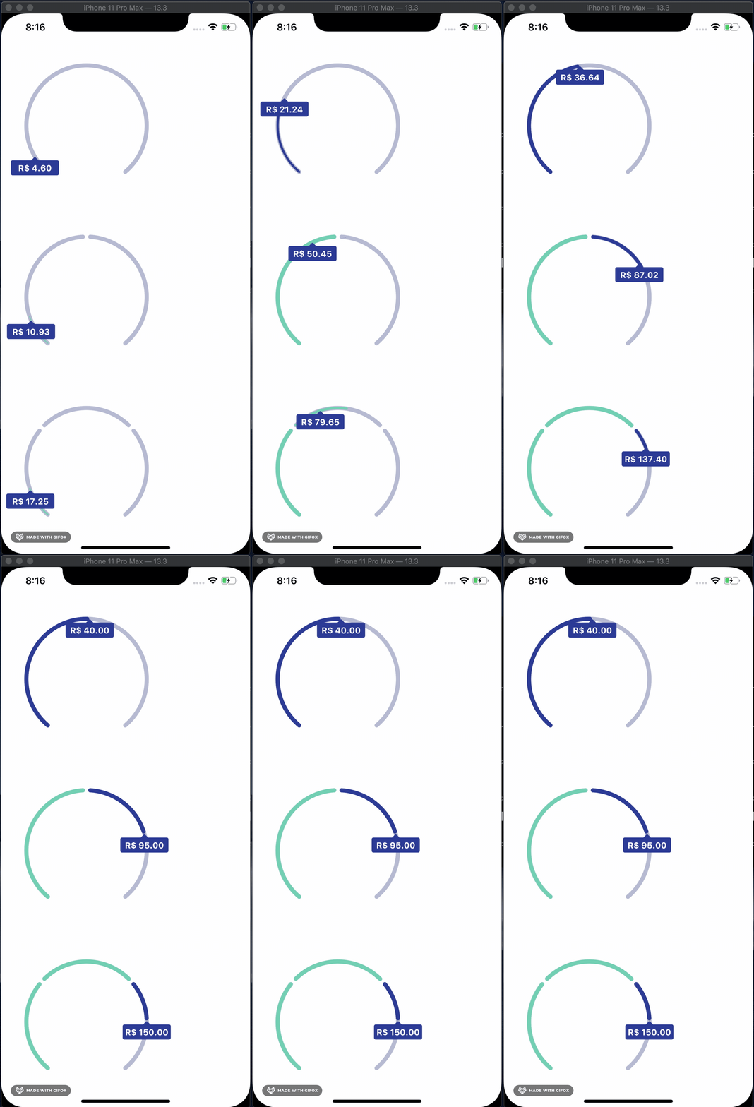
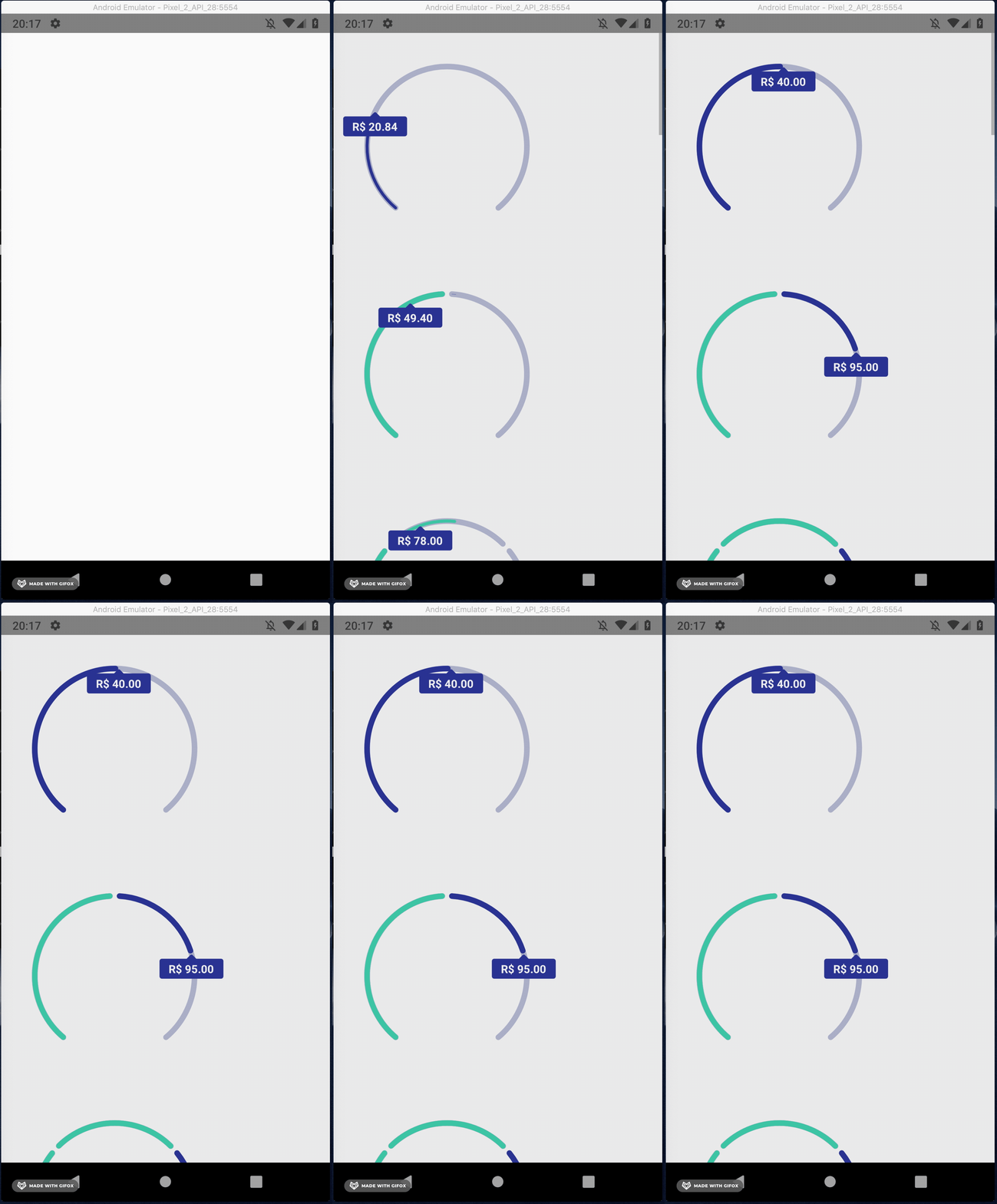
import React from 'react';
import {SafeAreaView, ScrollView, StatusBar} from 'react-native';

import SegmentedRoundDisplay from 'react-native-segmented-round-display';

const App = () => {
  const examples = [
    {
      displayValue: true,
      formatValue: (value) => `R$ ${value.toFixed(2)}`,
      segments: [
        {
          total: 80,
          filled: 40,
        },
      ],
    },
    {
      displayValue: true,
      formatValue: (value) => `R$ ${value.toFixed(2)}`,
      segments: [
        {
          total: 80,
          filled: 80,
        },
        {
          total: 30,
          filled: 15,
        },
      ],
    },
    {
      displayValue: true,
      formatValue: (value) => `R$ ${value.toFixed(2)}`,
      segments: [
        {
          total: 80,
          filled: 80,
        },
        {
          total: 30,
          filled: 30,
        },
        {
          total: 100,
          filled: 40,
        },
      ],
    }
  ];

  return (
    <>
      <StatusBar barStyle="dark-content" />
      <SafeAreaView>
        <ScrollView contentInsetAdjustmentBehavior="automatic">
          {examples.map((example, i) => (
            <SegmentedRoundDisplay key={i} {...example} />
          ))}
        </ScrollView>
      </SafeAreaView>
    </>
  );
};

export default App;
Common props
| Name | Type | Default | Description |
|---|---|---|---|
| segments | Array of { total: int, filled: int } | [] | segments to be rendered |
| filledArcWidth | int | 7 | thickness of filled arc |
| emptyArcWidth | int | 7 | thickness of empty arc |
| arcSpacing | int | 7 | space between segments |
| totalArcSize | int | 280 | total arc size in degrees |
| radius | int | 150 | radius of the arc |
| emptyArcColor | string | #ADB1CC | color of empty arc |
| filledArcColor | string | #5ECCAA | color of filled arc |
| incompleteArcColor | string | #23318C | color of incomplete arc |
| animated | bool | true | enable/disable segments fill animation |
| animationDuration | int | 1000 | duration of fill animation in MS |
| displayValue | bool | false | enable/disable the value display |
| formatValue | function | {} | function to formar the value |
| valueBoxColor | string | #23318C | color of box that holds the value if displayValue = true |
| valueFontColor | string | #FFFFFF | color of text of value if displayValue = true |
| styles | Styles object | {} | styles to be applied to container |
Run example
git clone https://github.com/ricardovcorrea/react-native-segmented-round-display.git
cd react-native-segmented-round-display/example
yarn

cd ios && pod install
cd ..

yarn start
react-native run-ios
