react-native-checkbox-form
react-native-checkbox-form is a simple checkbox’s component, it works on Android and iOS, The Icon is used in the checkbox-form depends on react-native-vector-icons.
Installation
npm install react-native-checkbox-form --save
The part of checkbox-form depends on react-native-vector-icons, so if your application haven't link react-native-vector-icons, still must run following commond:
react-native link react-native-vector-icons
In addition, you can alse redirect to react-native-vector-icons, learn more about how to link it
Note: The checkbox-form is based on ECMAScript6, if you use React Native < v0.13, maybe it don't run
Usage
1.General Use
import React, { Component } from 'react';
import { View } from 'react-native';
import CheckboxFormX from 'react-native-checkbox-form';
const mockData = [
    {
        label: 'label1',
        value: 'one'
    },
    {
        label: 'label2',
        value: 'two'
    },
    {
        label: 'label3',
        value: 'three'
    },
];

export default class PRNRadioForm extends Component {
    _onSelect = ( item ) => {
      console.log(item);
    };

  render() {
    return (
      <View style={styles.container}>
          <View style={{ marginVertical: 10, backgroundColor: "#E7E7E7" }} >
              <CheckboxFormX
                  style={{ width: 350 - 30 }}
                  dataSource={mockData}
                  itemShowKey="label"
                  itemCheckedKey="RNchecked"
                  iconSize={16}
                  formHorizontal={true}
                  labelHorizontal={false}
                  onChecked={(item) => this._onSelect(item)}
              />
          </View>
     </View>
    );
  }
}
2.Set default checked value
import React, { Component } from 'react';
import { View } from 'react-native';
import CheckboxFormX from 'react-native-checkbox-form';
const mockData = [
    {
        label: 'label1',
        RNchecked: true
    },
    {
        label: 'label2',
        RNchecked: false
    }
];

export default class PRNRadioForm extends Component {
    _onSelect = ( item ) => {
      console.log(item);
    };

  render() {
    return (
      <View style={styles.container}>
          <View style={{ marginVertical: 10, backgroundColor: "#E7E7E7" }} >
              <CheckboxFormX
                  style={{ width: 350 - 30 }}
                  dataSource={mockData}
                  itemShowKey="label"
                  itemCheckedKey="RNchecked"
                  iconSize={16}
                  formHorizontal={true}
                  labelHorizontal={false}
                  onChecked={(item) => this._onSelect(item)}
              />
          </View>
     </View>
    );
  }
}
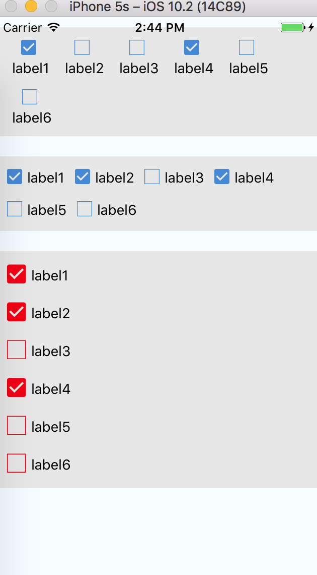
As shown above, add the attribute corresponding to the value of itemCheckedKey in the datasource.Thus whether active control is selected
Properties
| Prop | Default | Type | Description |
|---|---|---|---|
| style | - | object |
Specify the style of the checkbox-form, eg. width、backgroundColor..., but don't suggest setting height |
| textStyle | - | object |
Specify the text style in the check box |
| dataSource | - | array |
Specify the display data of checkbox-form. array type value must match the specified format and it's required |
| itemShowKey | 'label' | string |
Specify the display property of checkbox-form's each item from dataSource |
| itemCheckedKey | 'checked' | string |
Specify the real-selected property of checkbox-form's each item from dataSource |
| iconSize | 20 | number |
Specify the size of checkbox-form's icon |
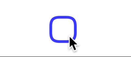
| iconColor | '#2f86d5' | string |
Specify the color of checkbox-form's icon |
| onChecked | - | function |
This is called when the user click the Checkbox's item in the UI, The first and only argument will return whole dataSource, and what property is specified by itemCheckedKey is used for confirm the item whether is selected |
| formHorizontal | false | boolean |
Specify the form whether can horizontal arrangement |
| labelHorizontal | true | boolean |
Specify between icon and label whether can horizontal arrangement |