? Simple Dropdown List – React Native ?
• No dependencies • Customizable

Compatibility
Expo ✅ | iOS ✅ | Android ✅
✔ Installation
$ npm install react_native_simple_dropdown_select_list
OR
$ yarn add react_native_simple_dropdown_select_list
? Example for use ?
import { SelectList } from 'react_native_simple_dropdown_select_list';
import { useTheme } from 'styled-components/native';
const App = () => {
const [selected, setSelected] = React.useState("");
const theme = useTheme();
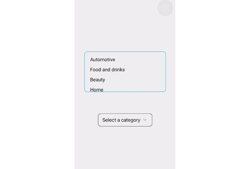
const data = [
{ key: '1', value: 'Automotive' },
{ key: '2', value: 'Food and drinks' },
{ key: '3', value: 'Beauty' },
{ key: '4', value: 'Home' },
{ key: '5', value: 'Eletronic' },
{ key: '6', value: 'Games' },
];
return(
<SelectList
//requireds
data={data}
whatWithSelected={value => setSelected(value)}
maxHeightList={150}
placeholder="Select a category"
notFoundText="Date not found"
valueToBeSaved="key"
//optionals
afterSelecting={() => console.log('return function')}
containerStyle={{ width: 200, borderColor: 'black' }}
containerDataStyle={{ width: 200, borderColor: 'gray' }}
infoFontStyle={{ fontSize: 18, fontWeight: 'bold' }}
containerFontsStyle={{ fontSize: 18, fontWeight: 'normal' }}
/>
-- USING GLOBAL THEME --
<SelectList
//requireds
data={data}
whatWithSelected={value => setSelected(value)}
maxHeightList={150}
placeholder="Select a category"
notFoundText="Date not found"
valueToBeSaved="key"
//optionals
afterSelecting={() => console.log('return function')}
containerStyle={{ width: 300, borderColor: theme.colors.primary }}
containerDataStyle={{width: 300, borderColor: theme.colors.primary }}
infoFontStyle={{ fontSize: 18, fontFamily: theme.fonts.regular }}
containerFontsStyle={{ fontSize: 18, fontFamily: theme.fonts.bold }}
/>
)
};
? General Props
| Name | Type | Required | Description |
|---|---|---|---|
| data | Array[object] | ✅ | Data passed to the view in the component |
| initialListValue | Object | ❌ | List initial value |
| notFoundText | String | ✅ | Text in case of error when reading data |
| valueToBeSaved | Object | ✅ | value that will be saved in your local state |
| whatWithSelected | Function | ✅ | Fn to set Selected option value which will be stored in your local state |
| afterSelecting | Function | ❌ | Trigger an action when option is selected |
| maxHeightList | Number | ✅ | maximum size of the list to be re-rendered |
| placeholder | String | ✅ | Placeholder text that will be displayed in the select box |
| containerStyle | ViewStyle | ❌ | override styles of the container |
| containerFontsStyle | TextStyle | ❌ | override container font styles |
| containerDataStyle | ViewStyle | ❌ | override styles of the data container |
| infoFontStyle | TextStyle | ❌ | override data font styles |
| icon | JSX Element | ❌ | Add your own icon |