React Native Timer Picker ⏰?️⏳
A simple, flexible, performant duration picker component for React Native apps ?
Great for timers, alarms and duration inputs ⏰?️⏳
Works with Expo and bare React Native apps.
Demos ?


Peer Dependencies ?
This component will work in your React Native Project without any peer dependencies.
If you want the numbers to fade in/out at the top and bottom of the picker, you will need to install either:
- expo-linear-gradient (if using Expo)
- react-native-linear-gradient (if using in a bare React Native project)
To enable the linear gradient, you need to supply the component as a prop to either TimerPickerModal or TimerPicker.
Installation ?
Supports React Native >= 0.59.0 and React >= 16.8.0.
Just run:
npm install react-native-timer-picker
or
yarn add react-native-timer-picker
Examples ?
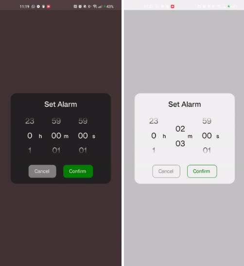
Timer Picker Modal (Dark Mode) ?
import { TimerPickerModal } from "react-native-timer-picker";
import { LinearGradient } from "expo-linear-gradient"; // or `import LinearGradient from "react-native-linear-gradient"`

....
const [showPicker, setShowPicker] = useState(false);
const [alarmString, setAlarmString] = useState<
        string | null
    >(null);

return (
    <View style={{backgroundColor: "#514242", alignItems: "center", justifyContent: "center"}}>
        <Text style={{fontSize: 18, color: "#F1F1F1"}}>
            {alarmStringExample !== null
                ? "Alarm set for"
                : "No alarm set"}
        </Text>
        <TouchableOpacity
            activeOpacity={0.7}
            onPress={() => setShowPicker(true)}>
            <View style={{alignItems: "center"}}>
                {alarmString !== null ? (
                    <Text style={{color: "#F1F1F1", fontSize: 48}}>
                        {alarmString}
                    </Text>
                ) : null}
                <TouchableOpacity
                    activeOpacity={0.7}
                    onPress={() => setShowPicker(true)}>
                    <View style={{marginTop: 30}}>
                        <Text
                            style={{
                                paddingVertical: 10,
                                paddingHorizontal: 18,
                                borderWidth: 1,
                                borderRadius: 10,
                                fontSize: 16,
                                overflow: "hidden",
                                borderColor: "#C2C2C2",
                                color: "#C2C2C2"
                                }}>
                            Set Alarm ?
                        </Text>
                    </View>
                </TouchableOpacity>
            </View>
        </TouchableOpacity>
        <TimerPickerModal
            visible={showPicker}
            setIsVisible={setShowPicker}
            onConfirm={(pickedDuration) => {
                setAlarmString(formatTime(pickedDuration));
                setShowPicker(false);
            }}
            modalTitle="Set Alarm"
            onCancel={() => setShowPicker(false)}
            closeOnOverlayPress
            LinearGradient={LinearGradient}
            styles={{
                theme: "dark",
            }}
            modalProps={{
                overlayOpacity: 0.2,
            }}
        />
    </View>
)
Timer Picker Modal (Light Mode) ?
import { TimerPickerModal } from "react-native-timer-picker";
import { LinearGradient } from "expo-linear-gradient"; // or `import LinearGradient from "react-native-linear-gradient"`

....
const [showPicker, setShowPicker] = useState(false);
const [alarmString, setAlarmString] = useState<
        string | null
    >(null);

return (
    <View style={{backgroundColor: "#F1F1F1", alignItems: "center", justifyContent: "center"}}>
        <Text style={{fontSize: 18, color: "#202020"}}>
            {alarmStringExample !== null
                ? "Alarm set for"
                : "No alarm set"}
        </Text>
        <TouchableOpacity
            activeOpacity={0.7}
            onPress={() => setShowPicker(true)}>
            <View style={{alignItems: "center"}}>
                {alarmString !== null ? (
                    <Text style={{color: "#202020", fontSize: 48}}>
                        {alarmString}
                    </Text>
                ) : null}
                <TouchableOpacity
                    activeOpacity={0.7}
                    onPress={() => setShowPicker(true)}>
                    <View style={{marginTop: 30}}>
                        <Text
                            style={{paddingVertical: 10,
                            paddingHorizontal: 18,
                            borderWidth: 1,
                            borderRadius: 10,
                            fontSize: 16,
                            overflow: "hidden",
                            borderColor: "#8C8C8C",
                            color: "#8C8C8C"
                            }}>
                            Set Alarm ?
                        </Text>
                    </View>
                </TouchableOpacity>
            </View>
        </TouchableOpacity>
        <TimerPickerModal
            visible={showPicker}
            setIsVisible={setShowPicker}
            onConfirm={(pickedDuration) => {
                setAlarmString(formatTime(pickedDuration));
                setShowPicker(false);
            }}
            modalTitle="Set Alarm"
            onCancel={() => setShowPicker(false)}
            closeOnOverlayPress
            LinearGradient={LinearGradient}
            styles={{
                theme: "light",
            }}
        />
    </View>
)
Timer Picker with Customisation (Dark Mode) ?
import { TimerPicker } from "react-native-timer-picker";
import { LinearGradient } from "expo-linear-gradient"; // or `import LinearGradient from "react-native-linear-gradient"`

....
const [showPicker, setShowPicker] = useState(false);
const [alarmString, setAlarmString] = useState<
        string | null
    >(null);

return (
    <View style={{backgroundColor: "#202020", alignItems: "center", justifyContent: "center"}}>
        <TimerPicker
            padWithNItems={2}
            hourLabel=":"
            minuteLabel=":"
            secondLabel=""
            LinearGradient={LinearGradient}
            styles={{
                theme: "dark",
                backgroundColor: "#202020",
                pickerItem: {
                    fontSize: 34,
                },
                pickerLabel: {
                    fontSize: 32,
                    marginTop: 0,
                },
                pickerContainer: {
                    marginRight: 6,
                },
            }}
        />
    </View>
)
Timer Picker with Customisation (Light Mode) ?
import { TimerPicker } from "react-native-timer-picker";
import { LinearGradient } from "expo-linear-gradient"; // or `import LinearGradient from "react-native-linear-gradient"`

....
const [showPicker, setShowPicker] = useState(false);
const [alarmString, setAlarmString] = useState<
        string | null
    >(null);

return (
    <View style={{backgroundColor: "#F1F1F1", alignItems: "center", justifyContent: "center"}}>
        <TimerPicker
            padWithNItems={3}
            hideHours
            minuteLabel="min"
            secondLabel="sec"
            LinearGradient={LinearGradient}
            styles={{
                theme: "light",
                pickerItem: {
                    fontSize: 34,
                },
                pickerLabel: {
                    fontSize: 26,
                    right: -20,
                },
                pickerLabelContainer: {
                    width: 60,
                },
                pickerItemContainer: {
                    width: 150,
                },
            }}
        />
    </View>
)
Props ?
TimerPicker ⏲️
| Prop | Description | Type | Default | Required |
|---|---|---|---|---|
| onDurationChange | Callback when the duration changes | (duration: { hours: number, minutes: number, seconds: number }) => void |
– | false |
| initialHours | Initial value for hours | Number | – | false |
| initialMinutes | Initial value for minutes | Number | – | false |
| initialSeconds | Initial value for seconds | Number | – | false |
| hideHours | Hide the hours picker | Boolean | false | false |
| hideMinutes | Hide the minutes picker | Boolean | false | false |
| hideSeconds | Hide the seconds picker | Boolean | false | false |
| hourLabel | Label for the hours picker | String | h | false |
| minuteLabel | Label for the minutes picker | String | m | false |
| secondLabel | Label for the seconds picker | String | s | false |
| padWithNItems | Number of items to pad the picker with on either side | Number | 1 | false |
| disableInfiniteScroll | Disable the infinite scroll feature | Boolean | false | false |
| LinearGradient | Linear Gradient Component | expo-linear-gradient.LinearGradient or react-native-linear-gradient.default | – | false |
| pickerContainerProps | Props for the picker container | React.ComponentProps<typeof View> |
– | false |
| pickerGradientOverlayProps | Props for the gradient overlay | LinearGradientProps | – | false |
| styles | Custom styles for the timer picker | CustomTimerPickerStyles | – | false |
Custom Styles ?
The following custom styles can be supplied to re-style the component in any way. Various styles are applied by default – you can take a look at these here.
| Style Prop | Description | Type |
|---|---|---|
| theme | Theme of the component | “light” | “dark” |
| backgroundColor | Main background color | string |
| text | Base text style | TextStyle |
| pickerContainer | Main container for the picker | ViewStyle |
| pickerLabelContainer | Container for the picker’s labels | ViewStyle |
| pickerLabel | Style for the picker’s labels | TextStyle |
| pickerItemContainer | Container for each number in the picker | ViewStyle |
| pickerItem | Style for each individual picker number | TextStyle |
| pickerGradientOverlay | Style for the gradient overlay (fade out) | ViewStyle |
TimerPickerModal ⏰
The TimerPickerModal component accepts all TimerPicker props, and the below additional props.
| Prop | Description | Type | Default | Required |
|---|---|---|---|---|
| visible | Determines if the modal is visible | Boolean | – | true |
| setIsVisible | Callback to set modal visibility | (isVisible: boolean) => void |
– | true |
| onConfirm | Callback when the user confirms the selected time | ({ hours, minutes, seconds }: { hours: number, minutes: number, seconds: number }) => void |
– | true |
| onCancel | Callback when the user cancels the selection | () => void |
– | false |
| closeOnOverlayPress | Determines if the modal should close on overlay press | Boolean | false | false |
| hideCancelButton | Hide the cancel button within the modal | Boolean | false | false |
| confirmButtonText | Text for the confirm button | String | Confirm | false |
| cancelButtonText | Text for the cancel button | String | Cancel | false |
| modalTitle | Title text for the modal | String | – | false |
| modalProps | Props for the main modal component | React.ComponentProps<typeof Modal> |
– | false |
| containerProps | Props for the main container | React.ComponentProps<typeof View> |
– | false |
| contentContainerProps | Props for the content container | React.ComponentProps<typeof View> |
– | false |
| buttonContainerProps | Props for the button container | React.ComponentProps<typeof View> |
– | false |
| modalTitleProps | Props for the modal title text component | React.ComponentProps<typeof Text> |
– | false |
| styles | Custom styles for the timer picker modal | CustomTimerPickerModalStyles | – | false |
Custom Styles ?
The following custom styles can be supplied to re-style the component in any way. You can also supply all of the styles specified in CustomTimerPickerStyles. Various styles are applied by default – you can take a look at these here.
| Style Prop | Description | Type |
|---|---|---|
| container | Main container’s style | ViewStyle |
| contentContainer | Style for the content’s container | ViewStyle |
| buttonContainer | Style for the container around the buttons | ViewStyle |
| button | General style for both buttons | TextStyle |
| cancelButton | Style for the cancel button | TextStyle |
| confirmButton | Style for the confirm button | TextStyle |
| modalTitle | Style for the title of the modal | TextStyle |
Methods ?
TimerPickerModal
reset – imperative method to reset the selected duration to their initial values.
timerPickerModalRef.current.reset();
License ?
This project is licensed under the MIT License.