react-native-global-props
A simple javascript implementation to add custom, default props to react-native components.
Ever wish you could set global styles that would apply to react-native components like in CSS?
body {
    background-color: 'teal'
}
p {
    font-size: 12,
    font-family: 'Helvetica Neue'
}
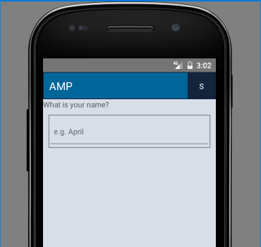
or get rid of that ugly line at the bottom of every TextInput in Android?

BLEGH! Now you can!
Installation
npm i react-native-global-props --save
How to use
The example source code can be found under example/.
Once you've installed react-native-global-props, go ahead choose which components you want to add custom props to.
In my example, I want to customize the View, TextInput, Text, Image, and TouchableOpacity.
Go to your highest order component that contains your whole application. In my case that is example/Main.js.
First I import the set functions that will allow me to create my custom components.
import {
  setCustomView,
  setCustomTextInput,
  setCustomText,
  setCustomImage,
  setCustomTouchableOpacity
} from 'react-native-global-props';
Then I create the custom props I want to add to each of these components.
// Setting a default background color for all View components.
const customViewProps = {
  style: {
    backgroundColor: '#d3d3d3' // light gray
  }
};

// Getting rid of that ugly line on Android and adding some custom style to all TextInput components.
const customTextInputProps = {
  underlineColorAndroid: 'rgba(0,0,0,0)',
  style: {
    borderWidth: 1,
    borderColor: 'gray',
    paddingVertical: 5,
    paddingHorizontal: 10,
    backgroundColor: 'white'
  }
};

// Setting default styles for all Text components.
const customTextProps = {
  style: {
    fontSize: 16,
    fontFamily: Platform.OS === 'ios' ? 'HelveticaNeue' : 'Roboto',
    color: 'black'
  }
};

// Makes every image resize mode cover by default.
const customImageProps = {
  resizeMode: 'cover'
};

// Adds a bigger hit box for all TouchableOpacity's.
const customTouchableOpacityProps = {
  hitSlop: { top: 15, right: 15, left: 15, bottom: 15 }
};
You can pass in any valid props as seen on react-native documentation. All of these props can easily be overridden.
Now plug your custom props into the set functions like so
setCustomView(customViewProps);
setCustomTextInput(customTextInputProps);
setCustomText(customTextProps);
setCustomImage(customImageProps);
setCustomTouchableOpacity(customTouchableOpacityProps);
And Voila, your react-native components will have these certain props wherever you use them.
Here is an example of me using the components and overriding props. The below example source code can be found in example/src/App.js
import React from 'react';
import {
  View,
  TextInput,
  Text,
  Image,
  TouchableOpacity
} from 'react-native';

const images = {
  whosThatCoolCat: require('./img/MyNormPic.jpeg')
};

class App extends React.Component {
  constructor(props) {
    super(props);
    this.state = {
      inputValue: '',
      hiddenText: true
    }
  }
  render() {
    return (
      <View style={{ flex: 1, alignItems: 'center', justifyContent: 'center' }}>
        <Text style={{ marginBottom: 20 }}>react-native-global-props</Text>
        <Image
          source={images.whosThatCoolCat}
          style={{ width: 80, height: 80, borderRadius: 40 }}
        />
        <View style={{ marginVertical: 20 }}>
          <TextInput
            style={{ width: 200, height: 30 }}
            placeholder="Enter text"
            onChangeText={(text) => this.setState({ inputValue: text })}
            value={this.state.inputValue}
          />
        </View>
        <TouchableOpacity onPress={() => this.setState({ hiddenText: !this.state.hiddenText })}>
          <View style={{ backgroundColor: 'orange' }}>
            <Text style={{ color: 'white' }}>Press me to show or hide the input text</Text>
          </View>
        </TouchableOpacity>
        <Text style={{ color: 'red' }}>{this.state.inputValue}</Text>
      </View>
    );
  }
}

export default App;
And this is the result

This module is useful for
1.) Creating an amazing modular experience with your react-native components
2.) Adding customization to react-native components without having to create completely new ones
3.) Setting global styles like fontFamily and color
And much more!
Contributing
Please contribute!
All contributions are greatly appreciated no matter how small or large the contribution is.
Whether it's a small grammar fix in the README, a huge bug fix, or just an issue report, you will be recognized as a 'Contributor' to this project.
Some great contributions would be to add customization for the components that currently aren't implemented.
The following components have been implemented.
- Image
- ListView
- Modal
- Picker
- Refresh Control
- ScrollView
- Slider
- StatusBar
- Switch
- Text
- TextInput
- TouchableWithoutFeedback
- TouchableOpacity
- TouchableHighlight
- TouchableNativeFeedback
- View
- WebView
- KeyboardAvoidingView
- ActivityIndicator


