react-native-toaster
Simple top-pop toast feedback messages for React Native, also Redux compatible
Example
import React, { Component } from 'react'
import { View } from 'react-native'
import Toaster, { ToastStyles } from 'react-native-toaster'
class App extends Component {
constructor (props) {
super(props)
this.state = { message: null }
const messages = [
{ text: 'FYI' },
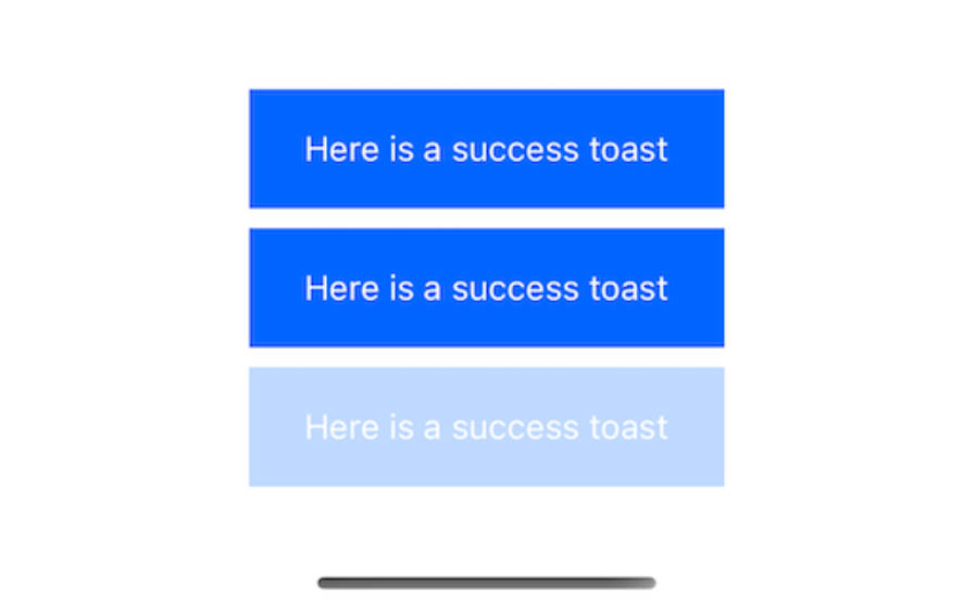
{ text: 'Hooray!', styles: ToastStyles.success },
{ text: 'Eek', styles: ToastStyles.warning },
{ text: 'Oh noe!', styles: ToastStyles.error }
]
// Send each message 1 second apart
messages.forEach((message, i) => {
setTimeout(() => this.setState({ message }), i * 1000)
})
}
render () {
return (
<View>
<Toaster message={this.state.message} />
</View>
)
}
}
Properties
| Prop | Default | Type | Description |
|---|---|---|---|
| message | - | object / array |
The current toast message to display (see below). Multiple messages are shown one at a time after each other. |
| onShow | null | func |
Callback called when a message is shown, passed the message as the first parameter |
| onHide | null | func |
Callback called when a message is hidden, passed the message as the first parameter |
| onPress | null | func |
Callback called when the user press a message, passed the message as the first parameter |
message
| Prop | Default | Type | Description |
|---|---|---|---|
| text | - | string / node |
Text message to display, or custom element (see below) |
| styles | ToastStyles.info | object |
Styles for the container and text (see below) |
| duration | 3000 | number |
Duration in ms the toast is shown for |
| height | 100 | number |
Height of the toast message |
| onShow | null | func |
Callback called when this message is shown |
| onHide | null | func |
Callback called when this message is hidden |
| onPress | null | func |
Callback called when this message is pressed |
text
The text property can be either a simple string or a custom element to be rendered. If a string is passed, it is wrapped in a container View and Text element:
text = (
  <View>
    <Text>{text}</Text>
  </View>
)
Both the container View and Text element can be styled using the styles property.
styles
An object used to style the container View and Text elements when message.text is a string. Defaults to ToastStyles.info if not set and should look like this:
{
  container: {
    backgroundColor: '#2487DB',
    paddingTop: 25,
    paddingRight: 15,
    paddingBottom: 15,
    paddingLeft: 15
  },
  text: {
    color: '#ffffff',
    fontWeight: 'bold'
  }
}
Example with Redux
App.jsx
import React, { Component } from 'react'
import { View } from 'react-native'
import { connect } from 'react-redux'
import Toaster from 'react-native-toaster'

class App extends Component {
  render () {
    return (
      <View>
        <Toaster message={this.props.toastMessage} />
        <LoginForm />
      </View>
    )
  }
}

const mapStateToProps = ({ toastMessage }) => ({ toastMessage })
export default connect(mapStateToProps)(App)
LoginForm.jsx
import React, { Component } from 'react'
import { View, TextInput, TouchableHighlight } from 'react-native'
import { connect } from 'react-redux'
import { ToastStyles } from 'react-native-toaster'
import { addToast } from './redux/actions'
import styles from './styles'

class LoginForm extends Component {
  state = { email: '', password: '' }

  onEmailChange = (email) => this.setState({ email })
  onPasswordChange = (password) => this.setState({ password })

  onLoginButtonPress = () => {
    const { email, password } = this.state

    // TODO: Send to server, on response call addToast:

    this.props.addToast({
      text: 'Successfully logged in',
      styles: ToastStyles.success
    })

    // --- or ---

    this.props.addToast({
      text: 'Login failed, check your email or password',
      styles: ToastStyles.error
    })
  }

  render () {
    return (
      <View>
        <TextInput onChangeText={this.onEmailChange} value={this.state.email} placeholder='Email' />
        <TextInput onChangeText={this.onPasswordChange} value={this.state.password} placeholder='Password' />
        <TouchableHighlight onPress={this.onLoginButtonPress}>
          <Text>Login</Text>
        </TouchableHighlight>
      </View>
    )
  }
}

const mapDispatchToProps = { addToast }
export default connect(null, mapDispatchToProps)(LoginForm)
redux/actions.js
export const ADD_TOAST = 'ADD_TOAST'
export function addToast (message) {
  return { type: ADD_TOAST, message }
}
redux/reducers.js
import { combineReducers } from 'redux'
import { ADD_TOAST } from './actions'

function toastMessage (state = null, action) {
  switch (action.type) {
    case ADD_TOAST:
      return action.message
    default:
      return state
  }
}

export default combineReducers({
  appState,
  toastMessage,
  connect: (state = null) => state
})