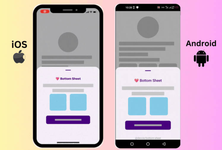
React Native Bottom Sheet 💖
The smart 😎, tiny 📦, and flexible 🎗 bottom sheet your app craves 🚀
Web Preview

✨Features
- 📦 Very tiny and lightweight
- 0️⃣ No dependency (yeah!, just plug and play 😎)
- ✨ Modal and standard (non-modal) bottom sheet support
- ⌨ Smart & automatic keyboard and orientation handling for iOS & Android
- 💪 Imperative calls
- 📜 Supports FlatList, SectionList, ScrollView & View scrolling interactions
- 📟 Handles layout & orientation changes smartly
- 💯 Compatible with Expo
- 🔧 Flexible config
- 🚀 Supports props live update
- 🎞 Configurable animation
- 🎨 Follows Material Design principles
- 🌐 Runs on the web
- ✅ Written in TypeScript
💻 Installation
npm install @devvie/bottom-sheet
or
yarn add @devvie/bottom-sheet
📱 Minimal Usage
Opening and closing the bottom sheet is done imperatively, so just pass a ref to the bottom sheet and call the open or close methods via the ref instance to open and close the bottom sheet respectively.
Examples
Typescript
import React, { useRef } from 'react';
import BottomSheet, { BottomSheetMethods } from '@devvie/bottom-sheet';
import { Button } from 'react-native';

const App = () => {
  const sheetRef = useRef<BottomSheetMethods>(null);
  return (
    <Button title="Open" onPress={() => sheetRef.current.open()} />
    <BottomSheet ref={sheetRef}>
      <Text>
        The smart 😎, tiny 📦, and flexible 🎗 bottom sheet your app craves 🚀
      </Text>
    </BottomSheet>
  );
};

export default App;
Javascript
import React, { useRef } from 'react';
import BottomSheet, { BottomSheetMethods } from '@devvie/bottom-sheet';
import { Button } from 'react-native';

const App = () => {
  const sheetRef = useRef(null);
  return (
    <Button title="Open" onPress={() => sheetRef.current.open()} />
    <BottomSheet ref={sheetRef}>
      <Text>
        The smart 😎, tiny 📦, and flexible 🎗 bottom sheet your app craves 🚀
      </Text>
    </BottomSheet>
  );
};
⚠ Warning
The bottom sheet component uses and handles pan gestures internally, so to avoid scroll/pan misbehavior with its container, DO NOT put it inside a container that supports panning e.g ScrollView. You can always put it just next to the ScrollView and use React Fragment or a View to wrap them and everything should be okay.
❌ Don’t do this
<ScrollView>
  <BottomSheet>
    ...
  </BottomSheet>
</ScrollView>
✅ Do this
<>
<ScrollView>
  ...
</ScrollView>

<BottomSheet>
  ...
</BottomSheet>
</>
🛠 Props
The bottom sheet is highly configurable via props. All props works for both Android and iOS except those prefixed with android_ and ios_, which works for only Android and iOS respectively.
| Property | Type | Default | Description | Required |
|---|---|---|---|---|
android_backdropMaskRippleColor |
string | OpaqueColorValue |
Color of the ripple effect when backdrop mask is pressed (Android Only). | No | |
android_closeOnBackPress |
boolean |
true |
Determines whether the sheet will close when the device back button is pressed (Android Only). | No |
animationType |
'slide' | 'spring' | 'fade' | ANIMATIONS |
'slide' |
Animation to use when opening and closing the bottom sheet. | No |
backdropMaskColor |
string | OpaqueColorValue |
'#00000052' |
Color of the scrim or backdrop mask. | No |
children |
ViewProps['children'] | React.FunctionComponent<{_animatedHeight: Animated.Value}> |
null |
Contents of the bottom sheet. | Yes |
closeDuration |
number |
500 |
Duration for sheet closing animation. | No |
closeOnBackdropPress |
boolean |
true |
Determines whether the bottom sheet will close when the scrim or backdrop mask is pressed. | No |
closeOnDragDown |
boolean |
true |
Determines whether the bottom sheet will close when dragged down. | No |
containerHeight |
ViewStyle['height'] |
DEVICE SCREEN HEIGHT |
Height of the bottom sheet’s overall container. | No |
customBackdropComponent |
React.FunctionComponent<{_animatedHeight: Animated.Value}> |
null |
Custom component for sheet’s scrim or backdrop mask. | No |
customBackdropPosition |
"top" | "behind" |
'behind' |
Determines the position of the custom scrim or backdrop component. 'behind' puts it behind the keyboard and `’top’“ puts it atop the keyboard. |
No |
customDragHandleComponent |
React.FC<{_animatedHeight: Animated.Value}> |
Custom drag handle component to replace the default bottom sheet’s drag handle. | No | |
customEasingFunction |
AnimationEasingFunction |
ANIMATIONS.SLIDE |
Custom easing function for driving sheet’s animation. | No |
disableBodyPanning |
boolean |
false |
Prevents the bottom sheet from being dragged/panned down on its body. | No |
disableDragHandlePanning |
boolean |
false |
Prevents the bottom sheet from being panned down by dragging its drag handle. | No |
dragHandleStyle |
ViewStyle |
Extra styles to apply to the drag handle. | No | |
height |
number | string |
'50%' |
Height of the bottom sheet when opened. Relative to containerHeight prop |
No |
hideDragHandle |
boolean |
false |
When true, hides the sheet’s drag handle. | No |
modal |
boolean |
true |
Determines whether the sheet is a modal. A modal sheet has a scrim or backdrop mask, while a standard (non-modal) sheet doesn’t. | No |
openDuration |
number |
500 |
Duration for sheet opening animation. | No |
style |
Omit<ViewStyle, 'height' | 'minHeight' | 'maxHeight' | 'transform:[{translateY}]'> |
Extra styles to apply to the bottom sheet. | No |
Examples
Flexibility is a focus for this bottom sheet, these few examples shows certain behaviors of the bottom sheet and what can be achieved by tweaking its props.
1️⃣ Smart response to keyboard pop ups and orientation changes (automatic behavior)
| Android | iOS |
|---|---|
 |
 |
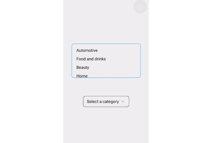
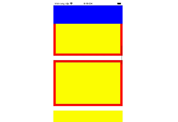
2️⃣ Handles deeply nested list and scroll views interactions (automatic beavior)
| Android | iOS |
|---|---|
 |
 |
3️⃣ Auto adjusts layout when height and containerHeight props change (automatic behavior)

4️⃣ Extend sheet height when its content is scrolled

5️⃣ Use as SnackBar

6️⃣ Custom Drag Handle Animation Interpolation

7️⃣ Custom Scrim/Backdrop Mask

More Examples and code samples comign soon…
Contributing
See the contributing guide to learn how to contribute to the repository and the development workflow.
License
MIT
see LICENSE
</> with 💖 by Devvie ✌
