react-native-theming
An efficient and StyleSheet.create compatible theming library for React Native.
Installation
$ yarn add react-native-theming
or
$ npm install --save react-native-theming
Usage
Create themes
import { createTheme } from 'react-native-theming'

const themes = [
  createTheme({
    backgroundColor: 'white',
    textColor: 'black',
    buttonColor: 'blue',
    buttonText: 'white',
    icon: require('./icons/default.png'),
    statusBar: 'dark-content',
  }, 'Light'),
  createTheme({
    backgroundColor: 'black',
    textColor: 'white',
    buttonColor: 'yellow',
    buttonText: 'black',
    icon: require('./icons/colorful.png'),
    statusBar: 'light-content',
  }, 'Dark'),
];
Create Styles
Create styles as you would with StyleSheet.create. Except you can
now use theme variables on your styles with an @ prefix followed by
the name of the theme variable as declared in the theme. You can also
construct your style including the theme variable, like 'rgba(@backgroundColor, 0.2)'.
import { createStyle } from 'react-native-theming';

const styles = createStyle({
  container: {
    flex: 1,
    justifyContent: 'center',
    alignItems: 'center',
    backgroundColor: '@backgroundColor',
  },
  welcome: {
    fontSize: 20,
    textAlign: 'center',
    margin: 10,
    color: '@textColor',
  },
  instructions: {
    textAlign: 'center',
    color: '#888',
    marginBottom: 5,
  },
  button: {
    margin: 10,
    padding: 10,
    backgroundColor: '@buttonColor',
    borderRadius: 3,
    flex: 1,
    alignItems: 'center',
  },
});
Create custom components
The theming library provides Theme.View, Theme.Image, Theme.Text,
Theme.AnimatedView, Theme.AnimatedImage, Theme.Animated.Text components,
which needs to be used in place of respective View, Image and Text for the theme
to take affect. Custom components could be easily made themable as well.
import { createThemedComponent } from 'react-native-theming';
import { TouchableOpacity, StatusBar } from 'react-native';

const Button = createThemedComponent(TouchableOpacity);
const Bar = createThemedComponent(StatusBar, ['barStyle', 'backgroundColor']);
Create your themed view
It is not just the styles, but the themes could even be applied to the props.
Not all properties will however support theming. For example, with the builtin
components, only Theme.Image and Theme.AnimatedImage supports theming with
source property. You can however create custom components with an array of
props that needs theming support. In the above example, the StatusBar component
has been themed with barStyle and backgroundColor props.
import React from 'react';
import Theme from 'react-native-theming';
import { View, Text, StatusBar } from 'react-native';
... Create your themes
... Create the styles
... Create custom components
export default class ThemeDemo extends Component {
render() {
return (
<Theme.View style={styles.container}>
<Bar barStyle="@statusBar" backgroundColor="@backgroundColor" />
<Theme.Image source="@icon" />
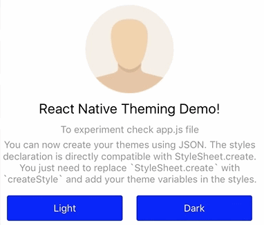
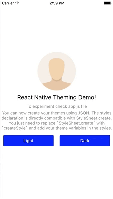
<Theme.Text style={styles.welcome}>
React Native Theming Demo!
</Theme.Text>
<Theme.Text style={styles.instructions}>
To experiment check app.js file
</Theme.Text>
<Text style={styles.instructions}>
You can now create your themes using JSON. The styles declaration
is directly compatible with StyleSheet.create. You just need to
replace `StyleSheet.create` with `createStyle` and add your theme
variables in the styles.
</Text>
<View style={{ flexDirection: 'row' }}>
{ themes.map(theme => (
<Button key={theme.name} style={styles.button} onPress={() => theme.apply()}>
<Theme.Text style={{ color: '@buttonText' }}>{theme.name}</Theme.Text>
</Button>
))
}
</View>
</Theme.View>
);
}
}
Applying Theme
Applying themes is just a matter of invoking apply method on the theme instance
returned by the createTheme method. Check out the Button.onPress event in the
above example. The first created theme becomes the default theme.