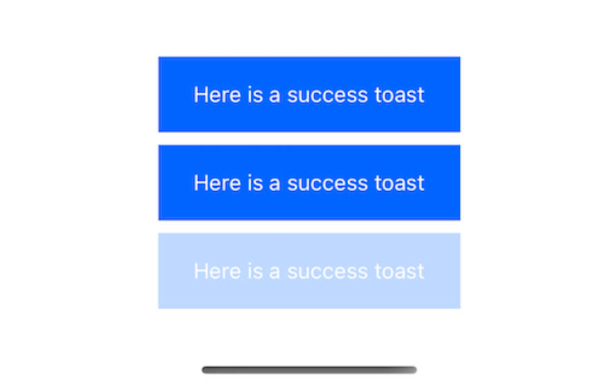
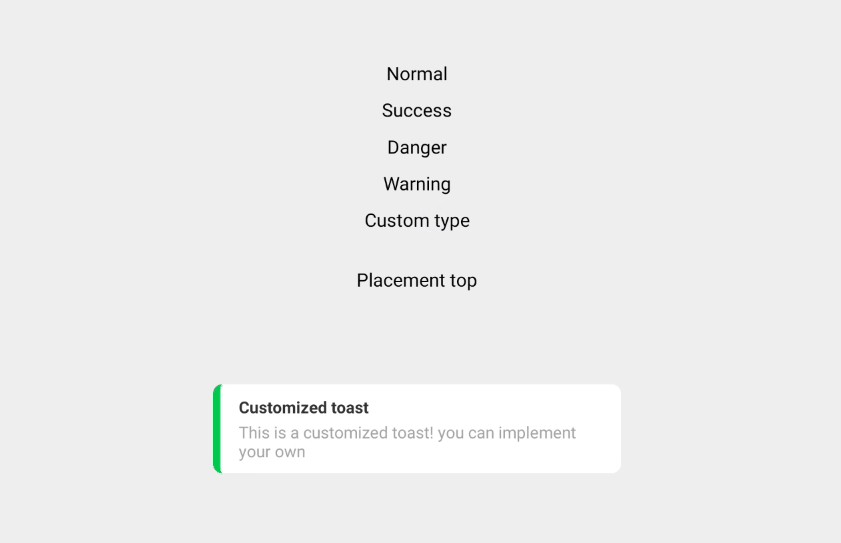
React Native Toast
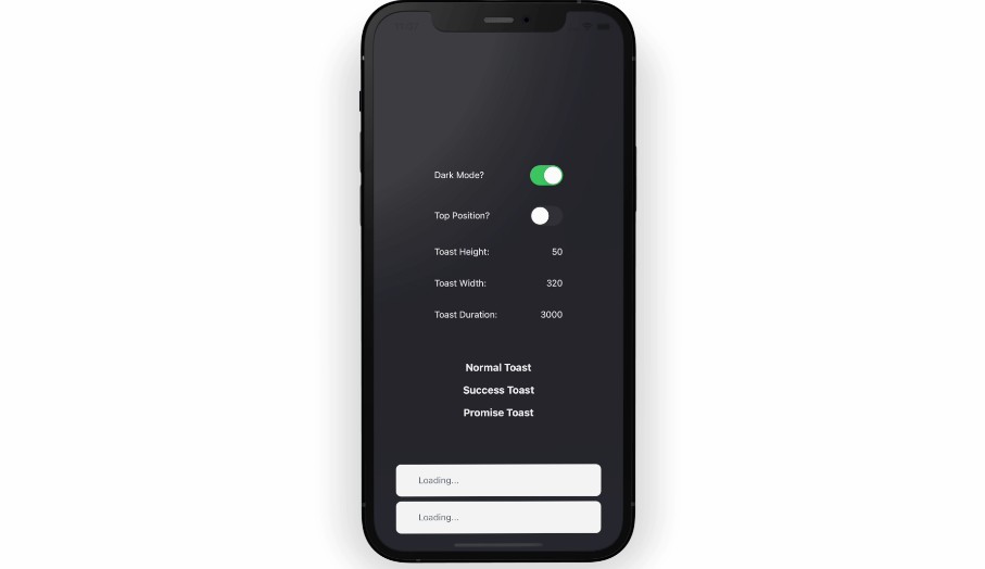
A toast library for react-native, built on react-hot-toast. It supports features such as multiple toasts, keyboard handling, swipe to dismiss, positional toasts, and JS promises. It runs on iOS, android, and web.
Why?
I know what you might be thinking (jeez, another toast library?). Trust me here, this is the last toast library you will need. I built this library to meet my specific app needs and decided to open-source it after realizing that it truly is a top-notch toast library. Just give it a try.
Features
- Multiple toasts, multiple options. Want a toast on the top, bottom, different colors, or different types at the same time? Got it.
- Keyboard handling (both iOS and Android). Move those toasts out of the way and into view when the user opens the keyboard
- Swipe to dismiss
- Positional toasts (top & bottom)
- Customizable (custom styles, dimensions, duration, and even create your own component to be used in the toast)
- Add support for promises <– Really! Call
toast.promise(my_promise)and watch react-native-toast work its magic, automatically updating the toast with a custom message on success — or an error message on reject. - Runs on web
Getting Started
Installation
yarn add @backpackapp-io/react-native-toast
# or
npm i @backpackapp-io/react-native-toast
Peer Dependencies
Install and link react-native-reanimated, react-native-safe-area-context, and react-native-gesture-handler
yarn add react-native-reanimated react-native-safe-area-context react-native-gesture-handler
Ensure you follow the installation of each package
Using expo?
expo install react-native-reanimated react-native-safe-area-context react-native-gesture-handler
Cool, now what?
Add the <Toasts /> component into the root of your app. Whenever you are ready, call toast("My Toast Message") from anywhere in your app.
import { StyleSheet, Text } from 'react-native';
import { toast, Toasts } from '@backpackapp-io/react-native-toast';
import { useEffect } from 'react';

export default function App() {
  useEffect(() => {
    toast('Hello');
  }, []);

  return (
    <View style={styles.container}>
      <View>{/*The rest of your app*/}</View>
      <Toasts /> {/* <---- Add Here */}
    </View>
  );
}

const styles = StyleSheet.create({
  container: {
    flex: 1,
    alignItems: 'center',
    justifyContent: 'center',
  },
});
Example
Regular Toast
toast("This is my first toast", {
  duration: 3000,
});
Promise Toast
const sleep = new Promise((resolve, reject) => {
  setTimeout(() => {
    if (Math.random() > 0.5) {
      resolve({
        username: 'Nick',
      });
    } else {
      reject('Username is undefined');
    }
  }, 2500);
});

toast.promise(
  sleep,
  {
    loading: 'Loading...',
    success: (data: any) => 'Welcome ' + data.username,
    error: (err) => err.toString(),
  },
  {
    position: ToastPosition.BOTTOM,
  }
);
Loading Toast
const id = toast.loading('I am loading. Dismiss me whenever...');

setTimeout(() => {
  toast.dismiss(id);
}, 3000);
Success Toast
toast.success('Success!', {
  width: 300
});
Error Toast
toast.error('Wow. That Sucked!');
Documentation
toast() API
Call it to create a toast from anywhere, even outside React (hello errors from controllers). Make sure you add the <Toasts/>component to your app first.
Available toast options
You can provide ToastOptions as the second argument. All arguments are optional.
toast('Hello World', {
  duration: 4000,
  position: ToastPosition.TOP,
  icon: '?',
  styles: {
    view: ViewStyle,
    pressable: ViewStyle,
    text: TextStyle,
    indicator: ViewStyle
  },
});
Creating a toast
Blank
toast('Hello World');
The most basic variant.
Success
toast.success('Successfully created!');
Creates a notification with a success indicator on the left.
Error
toast.error('This is an error!');
Creates a notification with an error indicator on the left.
Custom (JSX)
toast("", {
  customToast: (toast) => (
    <View>
      <Text>{toast.message}</Text>
    </View>
   )
})
Creates a custom notification with JSX. Have complete control over your toast.
Full example
toast(Math.floor(Math.random() * 1000).toString(), {
  width: screenWidth,
  disableShadow: true,
  customToast: (toast) => {
    return (
      <View
        style={{
          height: toast.height,
          width: toast.width,
          backgroundColor: 'yellow',
          borderRadius: 8,
        }}
      >
        <Text>{toast.message}</Text>
      </View>
    );
  },
});
Loading
const id = toast.loading('Waiting...');

//Somewhere later in your code...

toast.dismiss(id);
This will create a loading notification. Most likely, you want to update it afterwards. For a friendly alternative, check out toast.promise(), which takes care of that automatically.
Promise
This shorthand is useful for mapping a promise to a toast. It will update automatically when the promise resolves or fails.
Simple Usage
const myPromise = fetchData();

toast.promise(myPromise, {
  loading: 'Loading',
  success: 'Got the data',
  error: 'Error when fetching',
});
Advanced
You can provide a function to the success/error messages to incorporate the result/error of the promise. The third argument is toastOptions.
toast.promise(
  myPromise,
  {
    loading: 'Loading',
    success: (data) => `Successfully saved ${data.name}`,
    error: (err) => `This just happened: ${err.toString()}`,
  },
  {
    duration: 2000
  }
);
Default durations
Every type has its own duration. You can overwrite them duration with the toast options.
| type | duration |
|---|---|
blank |
4000 |
error |
4000 |
success |
2000 |
custom |
4000 |
loading |
Infinity |
Dismiss toast programmatically
You can manually dismiss a notification with toast.dismiss. Be aware that it triggers the exit animation and does not remove the Toast instantly. Toasts will auto-remove after 1 second by default.
Dismiss a single toast
const toastId = toast('Loading...');

// ...

toast.dismiss(toastId);
You can dismiss all toasts at once, by leaving out the toastId.
Dismiss all toasts at once
toast.dismiss();
To remove toasts instantly without any animations, use toast.remove.
Remove toasts instantly
toast.remove(toastId);

// or

toast.remove();
Update an existing toast
Each toast call returns a unique id. Use in the toast options to update the existing toast.
const toastId = toast.loading('Loading...');

// ...

toast.success('This worked', {
  id: toastId,
});
Prevent duplicate toasts
To prevent duplicates of the same kind, you can provide a unique permanent id.
toast.success('Copied to clipboard!', {
  id: 'clipboard',
});
ToastOptions all optional
| Option Name | Type | Possible Values |
|---|---|---|
| id | string |
Given an id, update the toast with the following options |
| message | string |
The message to render in the toast |
| position | ToastPosition.TOP, ToastPosition.BOTTOM, number |
The position of the toast. Use the ToastPosition enum to effectively set it |
| duration | number |
the duration (in ms) to show the toast for |
| customToast | function |
override the toast body and apply a custom toast. Receives the toast as a parameter I.e. (toast: Toast) => JSX.Element |
| height | number |
the height of the toast Must set here even if you are using a custom toast or applying it in the styles.view/pressable to ensure calculations are accurate |
| width | number |
the width of the toast |
| icon | JSX.Element, string |
Render an icon to the left of the message |
| styles | object |
the styles to apply to the toast |
| disableShadow | boolean |
Disable the shadow underneath the toast |
Styles object
{
  pressable?: ViewStyle;
  view?: ViewStyle;
  text?: TextStyle;
  indicator?: ViewStyle;
};
Thank you react-hot-toast
react-native-toast is built with modified react-hot-toast internals? Why? Well, react-native doesn’t really need all the unnecessary web fluff (aria what?). So, I trimmed it down and made it perfect for mobile development by battle testing it on mobile devices and creating react-native components built specifically for iOS and Android development.
Author
Email me directly: [email protected]
Contributing
See the contributing guide to learn how to contribute to the repository and the development workflow.
License
Made with create-react-native-library
Todos
- Add support for multiline toasts
- Add unit tests for Components and hooks
- Allow theming in
<Toasts /> - Queue manager
- Explore native modal fixes
- Add callbacks for onOpen, onTap, onClose
