react-native-custom-slider

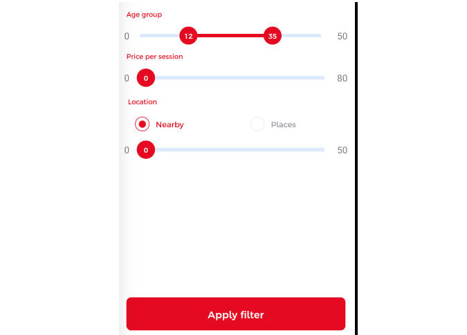
CustomSlider is a versatile React Native component for range selection. Users can slide thumbs to pick values. Smooth animations, multi-select support. Ideal for prices, dates & more. GitHub repo available. CustomSlider React Native Component
import CustomSlider from ‘./CustomSlider’;
const MyComponent = () => { const handleSliderChange = ({ min, max }) => { // Handle the selected range values console.log(‘Selected Range:’, min, max); };
return ( <CustomSlider sliderWidth={300} min={0} max={100} step={5} onValueChange={handleSliderChange} multiSelect={true} style={{ marginTop: 20 }} /> ); }; Props
sliderWidth (number): Total width of the slider component. min (number): Minimum value of the slider. max (number): Maximum value of the slider. step (number): Step interval for the slider. onValueChange (function): Callback function called when the slider values change. It receives an object with the selected min and max values. multiSelect (boolean): Enable multi-select mode (default: false). When set to true, users can select multiple value ranges. style (object): Additional styles to customize the appearance of the slider container. Notes
The slider’s width is controlled by the sliderWidth prop. Users can slide the thumbs to select the desired value range. The min and max props determine the minimum and maximum values available for selection. The step prop sets the interval at which users can select values. When the slider values change, the onValueChange callback is triggered, providing the selected min and max values. By setting multiSelect to true, the slider supports multi-select mode, enabling users to select multiple value ranges. With these props, you can easily customize and integrate the CustomSlider component into your React Native projects, providing a user-friendly range selection solution.