
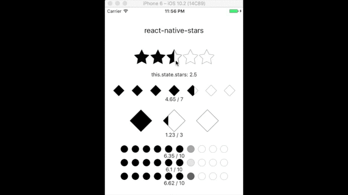
react-native-stars
react-native-stars is a versatile react native star review component with half star compatibility and custom images, star sizes, star count, star spacing, and value display.
Installation
npm install react-native-stars --save
Usage
Basics
For Selection
<View style={{alignItems:'center'}}>
  <Stars
    half={true}
    rating={2.5}
    update={(val)=>{this.setState({stars: val})}}
    spacing={4}
    starSize={40}
    count={5}
    fullStar={require('./images/starFilled.png')}
    emptyStar={require('./images/starEmpty.png')}
    halfStar={require('./images/starHalf.png')}/>
</View>
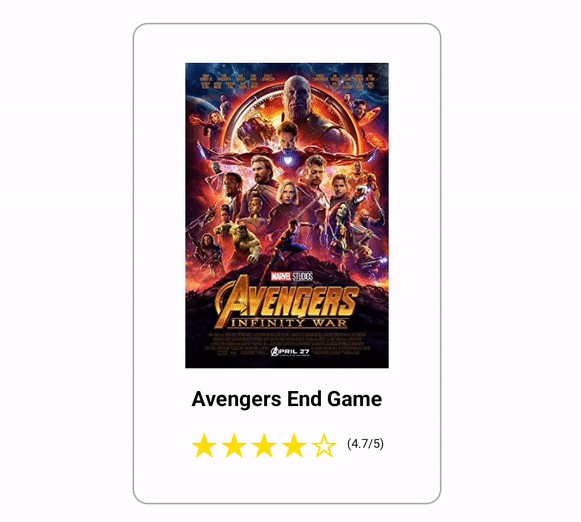
For Display
<View style={{alignItems:'center'}}>
  <Stars
    value={3.67}
    spacing={8}
    count={5}
    starSize={40}
    backingColor='cornsilk' {/* will break if 'transparent' is passed unless opacity prop is true */}
    fullStar= {require('./images/starFilled.png')}
    emptyStar= {require('./images/starEmpty.png')}/>
</View>
Custom Components for Stars

import { StyleSheet } from 'react-native';
import Stars from 'react-native-stars';
import Icon from 'react-native-vector-icons/MaterialCommunityIcons';

<View style={{alignItems:'center'}}>
  <Stars
    rating={2.5}
    count={5}
    half={true}
    fullStar={<Icon name={'star'} style={[styles.myStarStyle]}/>}
    emptyStar={<Icon name={'star-outline'} style={[styles.myStarStyle, styles.myEmptyStarStyle]}/>}
    halfStar={<Icon name={'star-half'} style={[styles.myStarStyle]}/>}
  />
</View>

const styles = StyleSheet.create({
  myStarStyle: {
    color: 'yellow',
    backgroundColor: 'transparent',
    textShadowColor: 'black',
    textShadowOffset: {width:1, height:1},
    textShadowRadius: 2,
  },
  myEmptyStarStyle: {
    color: 'white',
  }
});
Modes
Selection Mode
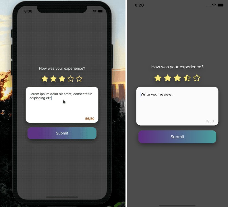
For when you want the component to respond to user input. Pressing the stars (or half stars) will call the function passed to the update prop. This is the default mode. Use the rating prop to define a default star value on page load. Use the half prop to allow for half star input granularity.
Display Mode
For when you want to display an aggregate value. The rating will remain static unless updated through value prop. Passing any value data will activate this mode and will override the presence of any Selection Mode specific props. Display mode defaults to a straight bar proportion - overridden by opacity prop which maps star values to opacity as a percentage instead.
Props
| Prop | Type | Description | Required | Default |
|---|---|---|---|---|
fullStar |
image or component | Image of the form require('./path/to/image.png'). Component may be any valid React component. |
Yes | NA |
emptyStar |
image or component | see above | Yes | NA |
halfStar |
image or component | see above | No | null |
count |
int | the total number of stars | No | 5 |
starSize |
int | width,height of individual star (ignored when stars are components) | No | 30 |
rating |
0 <= rating <= count |
(in Selection Mode) initial default rating, int x or x.5 only | No | 0 |
update |
function | (in Selection Mode) function to be run on ratings selection ex: update={(val)=> this.setState({stars: val})} |
No | ()=>{} |
spacing |
number | pixel amount of separation between each star (ignored when stars are components) | No | 0 |
value |
0 <= value <= count |
(passing any value sets to Display Mode) star value to be displayed eg. 3.6 (of 5), 7.8 (of 10) | No | null |
backingColor |
string/color | (in Display Mode) color behind the component (cannot be transparent) | No | white |
opacity |
bool | (in Display Mode) displays star values as opacity percentages (0 - 1.0) | No | false |
half |
bool | (in Selection Mode) allows for half star ratings | No | false |
disabled |
bool | Disables onPress/buttons in Selection mode | No | false |
Image Input
Props fullStar, emptyStar, and halfStar may be either components or image files.
Components may be any valid React component / element. When using components for stars, the starSize and spacing props are ignored. The component has the responsibility of sizing and spacing itself.
Images should have transparent backgrounds (.pngs), close to uniform dimensions, consistency between images (both fullStar.png and emptyStar.png are 100px/100px). Half star images are expected to be cropped as though they were full, with the center of the image intersecting the right edge of the half star object. If you're using Adobe Illustrator you can check the 'Use Artboards' box to ensure that empty space in the artboard is included during the export to .png. Half star images can, but don't need to have full outlines - both formats below are acceptible.
example compatible images:

I've included a set in example-images if you need something basic.
